


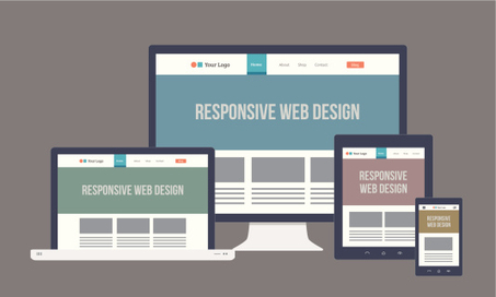

...There are two major methods for creating a mobile websites Responsive Design and Mobile Templates. Responsive design requires you only have one website that is coded to adapt to all screen size no matter what the device it’s being displayed on.In contrast, a mobile template is a completely separate entity requiring you to have a second mobile only website or sub-domain.
Mobile templates are also built for each specific, not per screen size. This can cause some issues as we will discuss below.
Responsive design, a term originally coined in a 2010 A List Apart article by Ethan Marcotte, responsive design has been by far the most popular and widely used method for designing a mobile website. Here are just a few of the undeniable reasons your website needs to be responsive....
Via Jeff Domansky


 Your new post is loading...


![SEO For Lawyer: Ultimate Guide to Improve Your Law Firm Rankings [With Video Tutorials] | LawRank - Law Firm SEO | Scoop.it](https://img.scoop.it/tgyMrVeYehIWtPv0ckA0Tzl72eJkfbmt4t8yenImKBVvK0kTmF0xjctABnaLJIm9)

![5 Data-Backed Reasons to Redesign an Ugly Website [Infographic] | LawRank - Law Firm SEO | Scoop.it](https://img.scoop.it/ggTN-yh0Zlc4RZP6mYyaWDl72eJkfbmt4t8yenImKBVvK0kTmF0xjctABnaLJIm9)


Luke Summerfield explains why having a responsive website is so critical to your marketing and some key considerations to keep in mind when designing a responsive website.
As a new WordPress blogger (but not a noob by any stretch of the imagination!), I'd become confused between all the choices in themes that promised to be "super-responsive." I had no idea what that really meant.
Or why it even mattered. A blog is a blog is a blog, right? Right?
I am not 100% wrong, but I am 100% not-right.
6 Undeniable Reasons Why The Future of Web Design is Responsive