 Your new post is loading...
My video landing page is the highest converting page I’ve ever had, bar none. Ever since I started using that video on the homepage, my conversions took a noticeable upturn, and haven’t slowed a bit!In this article, I’m going to show you some of the principles that I’ve learned as I’ve split test my videos, tweaked my home page, and watched the conversions pour in. And, just to up the ante, consider how much time and money you’re wasting with a low-converting landing page....
I've scoured the web for the strategies that have performed best in numerous tests and case studies.
In this article, I’ll show you 14 data-driven techniques to optimize the conversion rates of your landing pages (and how you can implement them).
First, take a look at this infographic on the landing page design best practices to get an idea of what I'm talking about....
You asked and we answered! Learn the top 15 most FAQ to Instapage customer service, answered by Head of Customer Support, Marius Laza.
On your landing page, those muscles, organs, and electrical signals are replaced by buttons, visuals, copy, and code. They work together to perform one incredibly difficult function: convince the most powerful supercomputer known to man, a.k.a. the human brain, to take action.
Whether it’s to buy, subscribe, or download, when a landing page is “anatomically correct,” it can move its visitors to click a CTA button. Different shapes and colors scream “look here” and “press me,” while headlines capture attention and testimonials build trust.
The anatomy of a landing page isn’t as complex as our own, but to the untrained eye, it’s still difficult to understand. Today we’re going to break it down to help you piece together the puzzle that is a persuasive landing page.
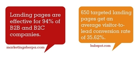
When you’re building a landing page for the purpose of converting leads into customers, you must take bold steps to eliminate all potential credibility killers. Landing pages, in general, are effective tools for building your business. According to MarketingSherpa, “landing pages are effective for 94% of B2B and B2C companies.” In this in-depth article, I want to show you 4 landing page credibility killers that you should eliminate right now....
Your landing page must be the central point of your online marketing campaign. Designed wisely, it can generate more leads and increase the ROI rate of your bottom line. Today, we’d like to share 10 of the best landing pages that convert 100%.
Read on the post to check their designs and find out what features make them a win-win solution for your marketing strategy.
Pricing pages have a huge impact on online sales. Designing the right pricing page is key to increasing checkouts and revenue, but there’s a lot more to a pricing page than its design.
Since emotions and psychological triggers influence purchasing behavior, and since consumers depend on products and services to fulfill emotional needs in their lives, pricing pages should meet those needs.
The way things are presented to people affects their decision-making. In this post, we’ll take a look at psychological triggers that influence purchasing behavior. We’ll also go over how to incorporate the triggers into pricing pages.
1. Decoy Effect
According to the decoy effect, consumers have a hard time making up their minds. So, when they are given two options, they tend to prefer the first option because it looks better, even though both options could be exactly the same.
People have a noticeable change in preference according to the way choices are presented. Sometimes, using a third option helps to guide them toward a specific choice. Considering the decoy effect, make sure you offer pricing plans that lead customers to purchase the plan you want them to purchase.
Let’s take a look at The Economist’s famous pricing page to better understand how to incorporate the decoy effect into your pricing page design. The first plan costs $59 for the online version only, the second plan costs $125 for the print version only, and the third plan costs $125 for both print and online versions...
There are numerous landing page variations that impact conversion rate. It’s amazing how something as simple as a color change or a different font can result in an avalanche of new conversions.
There are at least three basic features that killer landing pages all have in common. These features have less to do with button size or color, and more to do with the underlying reasons about why people, think, click, act and decide. Conversion optimization is really about how people think. It’s psychology.
And that’s what each of these features is built upon: buyer psychology. Here are the three features of a landing page that compel people to click.
Decisions, decisions, decisions! Every day we are faced with a constant series of decisions. Whether it is deciding to eat that piece of cake, or make a career change, the decisions we make shape our lives and who we are.
We like to think that all of our decisions are rational and that we are in control, however our unconscious mind, drives how we respond to advertising, brands, products, and in the end determines all of our buying decision. As a result, our landing page design plays an integral role in how our brains make a decision to buy a product or not. The reasons unconscious triggers determine our decisions can be found in the structure of our brain. We can break our mind into three separate parts....
It takes a lot of work to get people to your site and its landing pages—SEO, paid search, banner ads, email marketing, social media, word of mouth …
However you get them, it takes time, money, and effort.
But getting them there is only half the battle. You still have to get your visitors to convert (whether it’s buying a product or engaging with your content), otherwise all your marketing efforts will go to waste. To get a visitor to convert, you need a killer landing page. Different sites for different goals require different landing pages, and you should always A/B test to find the perfect page for your site. Having said that, there are some universal do’s and don’ts to keep in mind when designing your landing page...
|
Are you looking for the best and proven solution to build a professional web presence for your business or personal project? Ask any marketing specialist and he will tell you that a well-built landing page is exactly what you need to make people talk about you. But how to build a landing page that will convert accidental visitors into loyal customers? How to generate new leads for your business? How to design a powerful landing page? Let’s cover all of these aspects in one blog post. A landing page is a place where the online story of your business begins. A landing page is the first spot that the users come across when looking for some general information about your business. This is the simplest and the most effective way of engaging the audience and inviting them for a productive dialogue. Depending on the way a landing page is designed, we can judge the potential success that a business standing behind it will attain. The more user-friendly a landing page is designed, the higher chances of triggering the users’ curiosity you have. It’s not a rocket science to build a professional landing page. Let’s consider the most effective tips on how to get started right and appeal to a wider audience....
Think about all the times you've signed up for things in your life. Did you once download Evernote? Dropbox? Spotify? Maybe you've even taken a class on General Assembly.
Each one of these signups is likely a result of an effective call-to-action.
And it's really important to guide your visitors through the buying journey using strategic calls-to-action (CTAs). Think about it: If you hadn't been drawn in by the copy or design of the CTA, or been guided so eloquently through your sign-up process, you would probably use a lot fewer apps and websites than you do now.
Download our full collection of 101 call-to-action examples here for even more CTA ideas.
To help you identify what's effective and what's not, we've listed out 30 examples of CTAs that totally rock. These call-to-action examples are broken out into three categories: simple and effective design, click-worthy copy, and balancing multiple CTAs on one page....
Pablo Picasso once said: “Good artists copy; great artists steal.”
There are plenty of lead generation tips on the web to help you create the perfect lead generation landing page. There's even lead generation landing page templates to help you speed up the process. But, how do you know which elements are appropriate for your page and conversion goal?
Today we’re going to help you heed Picasso's advice by critiquing 30 lead generation landing pages from which you can steal great ideas, and eliminate bad ones. But, before we jump in, let's define the term...
In this article, we’re going to take a look at how you can use a landing page to generate customers.
We’ll take a look at what makes a landing page work effectively. But, we’ll also discuss what constitutes a high converting sales funnel.
By the end of this post, you’ll be able to take what you’ve learned and use it to improve the revenues of your own business.
Each week a new member of DigitalMarketer Engage (our 8,000+ Lab member mastermind group) asks a very important question surrounding their landing pages:
Is this page compliant on [enter your preferred ad network]?!
The first bit of advice I give is to stop tailoring different landing pages to different ad networks based on compliance. Pick the strictest one and develop all your pages with that as the baseline.
Not only will this save you time and help you better organize your landing pages, it protects you when less strict networks, e.g., Facebook, decide to change their terms!
Google is hands down the stricter of the ad networks, so I created this 9-point checklist outlining everything your landing page needs to stay in their good graces — along with this nifty download for you to swipe....
Friction confuses your visitors; it creates anxiety and frustration in their minds, so much so that they abandon your landing page.
Working so closely with landing pages, I have seen my fair share of landing page elements that cause friction, and while we have covered how to eradicate friction from desktop landing pages. We were yet to cover how to fight friction on mobile landing pages. This is our agenda for today. We’re going to identify points of friction on your mobile landing pages and will tell you ways to get rid of them....
Good landing pages are designed to focus attention towards visitors engaging in one action. A landing page could be designed to convert traffic into sales, gather new enquiries, gain social media followers or email sign-ups....
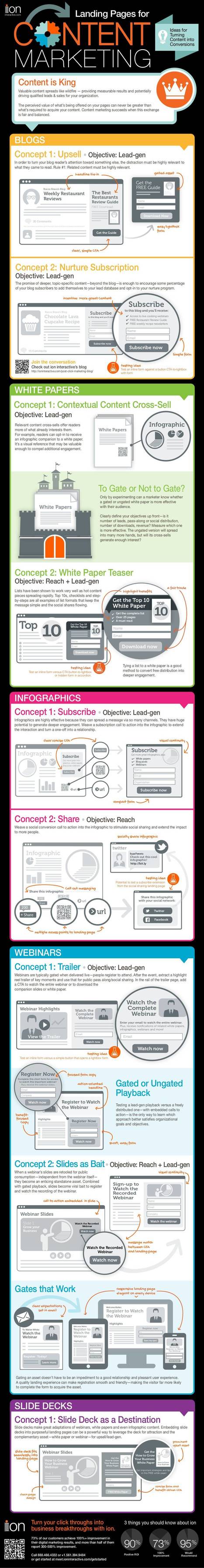
Landing Pages for Content Marketing
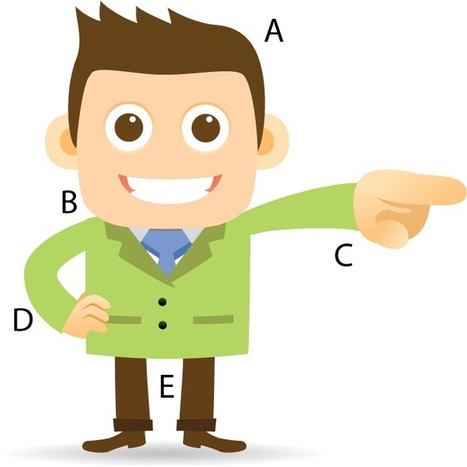
What are the five parts of your landing page that help it succeed?
This little guy, you may be surprised to learn, is your landing page.
No, seriously. it is.
This article will give you the five parts of your landing pagethat help it succeed. Without even one of these variables your page will collapse, your web traffic will bounce, and your conversion rate will suffer.
A landing page is just the page someone “lands on” when an ad or email directs them to take a specific action such as sign up for a free webinar, subscribe to a newsletter, download free videos or buy a new product. The landing page is used instead a site’s homepage.
Effective landing pages make it very clear what a visitor is going to get from a page and how to get it. That’s it plain and simple. They don’t have links to other pages or any other distractions.There are many great articles on how to create better landing pages including this one from Unbounce but today I want to focus on some reason I think every business needs to create and use landing pages as a core online tool...
|


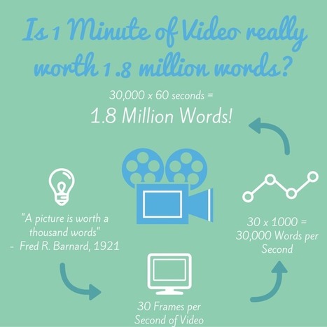


Neil Patel shows how to use video to create a high conversion landing page.