 Your new post is loading...
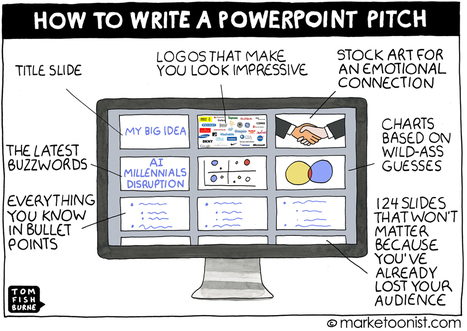
The surest way to stifle an idea is to write a long-winded presentation deck about it. PowerPoint, Keynote, and Prezi are powerful tools, but the power comes in how they’re used. A weighty presentation deck can get in the way of the idea itself. The classic Mark Twain quote applies equally when writing a presentation — “I didn’t have time to write a short letter, so I wrote a long one instead.” Born out venture capital work as a recipient of many of PowerPoint deck, Guy Kawasaki has been advocating the 10/20/30 Rule for a decade.
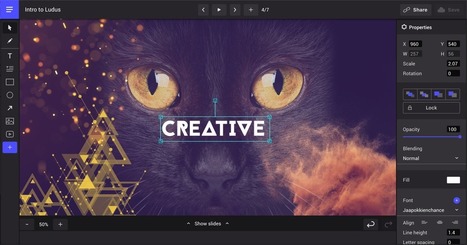
The web is full of beautiful ideas and services. Ludus is the first one to provide an easy way to gather them all in a single place.
Via Baiba Svenca
We, the digital natives, are visual learners. We prefer to watch a video tutorial rather than go through a PDF document, prefer an infographic over a bullet-point article and a picture quote over a text quote. Several sources claim that the human brain processes visual information 60,000 times faster than text. Studies prove our visual memory is also far superior to auditory one. We are able to recall only 10-20% of a spoken lecture but 65% if the lecture is visual and verbal.
These claims become all the more worthy of our attention if the reports of human attention span shrinking to just 8 seconds- below that of goldfish- are true. What does this mean for your presentations? Make the most of the power of visuals!
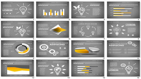
Wait, you must be asking “Where do I put all the text?”. First of all, try to brutally cut down the word count on your slide. Keep ONLY the most important words on the slide (we have to free up space for visuals!). Now what? Now, get ready to turn those slides into a visual masterpiece with these 11 hacks
Someone once told me that most PowerPoint presentations have neither power nor a point. I cannot recollect, in 30 years of work, a single PowerPoint presentation I saw or gave that altered the course of anything. Yet in meeting after meeting around the world, PowerPoint is the medium of choice. In fact, according to Microsoft, there are over 30 million PowerPoint presentations given every day.
When someone chooses to use PowerPoint or any other slide deck program, the choice has consequences. It establishes a power structure that is less relevant in today’s networked world, with the subject matter expert speaking at the front of the room and the audience passively receiving information. It keeps teams indoors, in closed rooms, in a seated position for prolonged periods which, as Mayo Clinic reports, increases the risk of cardiovascular disease and shortens life expectancy. And, most unfortunate, PowerPoint places technology at the center of the room with a heavy weight toward text, charts, sound bites, and bullet points.
When I helped start a social innovation organization called Civilla, in partnership with Adam and Lena Selzer, we gave ourselves an operating constraint: There would be no PowerPoint. None.
But saying no to something is easy. Figuring out what takes its place is harder....
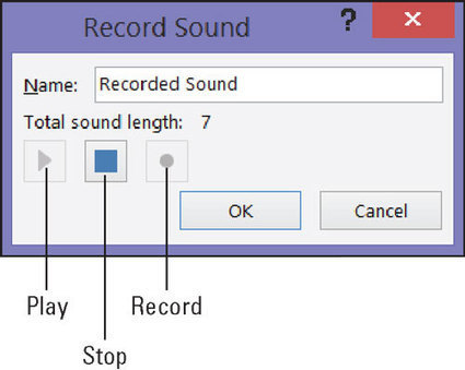
AA voice narration in a PowerPoint 2016 presentation is sophisticated indeed. A self-playing, kiosk-style presentation can be accompanied by a human voice such that the narrator gives the presentation without actually being there.
To narrate a presentation, a working microphone must be attached or built in to your computer. You record the narration for slides one slide at a time or all at one time, and the recording is stored in the PowerPoint file, not in a separate audio file.
The best way to record voice narrations is to do it on a slide-by-slide basis. You can record across several slides, but getting your voice narration and slides to be in sync with one another can be a lot of trouble....
The best designers in the world are not only known for their amazing designs, but also for their inspirational and motivational quotes about design.
Many of the lessons they teach can, unsurprisingly, be directly related to PowerPoint design!
If you need some inspiration and guidance for your next PowerPoint presentation, look no further:
We have compiled a list of 20 of the BEST inspirational quotes about design that relate directly to PowerPoint.
After each designer’s quote, we’ve given a short explanation of how it relates to your presentation, and what you can do to make it amazing....
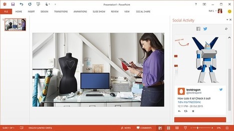
Microsoft has released Social Share, a free plug-in for PowerPoint that lets you share your slides to Facebook and Twitter as images or video.
The tool lets you share individual slides as images and your entire presentation as a photo album.
If you like, you can package your entire deck as a video. This keeps your transitions and other animations intact.
The plug-in also adds a pane to PowerPoint, where you can see comments people leave on your shared presentations without leaving the app....
Researchers at Purdue University have some bad news for the 40 million people worldwide who deliver “standard” PowerPoint presentations each and every day.
When PowerPoint is used, the researchers concluded, the audience retains nearly 30 per cent less than if presenters eliminate PowerPoint and simply talk to their audience.
In other words, by simply turning off your projector and using your slides as notes, you can significantly enhance your communication effectiveness.
Professional PowerPoint templates are a great way to look your best and impress your audience the next time you give a presentation. Here's an excellent set of 16 PowerPoint templates to impress in your next marketing presentation.
In the introduction of the iPad Air 2 Apple presentation designers created a great example of using a simple visual to tell a complex story.
Some people might use the excuse, “We use PowerPoint in my company and it’s not as elegant as Apple Keynote.” Maybe it’s the story—or a lack of one—that’s the problem!
I asked Cory to re-create the Apple pencil slide a second time in PowerPoint. You can see it here. It’s simple and clean. Corporate America doesn’t have a PowerPoint problem; it has a storytelling problem. Learn to tell a story and use visual comparisons to bring the story alive....
|
Your title slide sets the stage for your entire presentation. We all make instant judgments that either give us hope or lower expectations. Think of your title slide as the all-important first introduction. It’s a taste of things to come for the rest of your presentation. An exceptional title slide gives your audience hope that the presentation will be exceptional. Conversely, a poorly designed or low-quality title slide conveys a lack of attention to detail.
Your audience will mostly assume that if you rushed your cover, you rushed your entire presentation. Therefore, before you get up on stage to present, take the time to make sure your cover slide rocks.
If you have no idea where to begin creating a dynamic title slide, don’t worry. I have got you covered!
There are many ways go about creating your title slide. To give you a little slide inspiration, here are some PowerPoint title slide examples that look great.
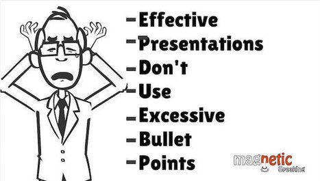
Beware if you are still creating slides full of bullet points! Very soon, you will find audiences leave the hall in disgust or hold a placard in protest “No Bullet Points, Please.” Already you will find them moan in pain as soon as they see a bullet-ridden slide. That’s not surprising. The audiences are intelligent enough to know what will follow that boring slide on screen: a far boring talk with presenter reading the slides and audience figuring out whether to listen to the presenter or read the slides. Such is the bullet-point terror in the presentation world that cognitive psychologist Chris Atherton writes, “Bullets don't kill, bullet points do.” What are you supposed to do as a presenter then? All presentation experts will advise you to keep 1 message per slide. So if you have 6 bullet points on a slide, you can simply make 6 slides and save the audience a headache. But what if you do not want to follow this advice. What if you wish to keep those 6 bullet points on your slide. Perhaps you are not presenting your slides on a stage. You want to send the presentation as an attachment to one of your prospective clients. You would therefore need descriptive slides in such instances. Or maybe you have a slide full of steps and you do not wish the break the process into multiple slides that’ll make it complicated for you as well as the reader. What to do then?...
According to one recent survey, the top two reasons why people loathe PowerPoint presentations so march are that "the speaker reads the slides" and uses "full sentences for text." By now everyone should know not to read whole blocks of text to audiences verbatim. But it’s not enough to just convert them to bullet points, then present slide after slide of those, either.
If you really want to engage your audience and enhance your message, you need to use PowerPoint to tell a story—and you need to tell it as visually as possible. The good news is that you don't need to be a professional graphic designer (or even necessarily hire one) in order to do that. What might not look particularly sleek or aesthetically compelling can still be effective. Here's how to use imagery to get your point across and maximize your narrative impact, even if you aren't the most visually minded person....
How to Start your Presentation or Story... Some recommend to tell the 'agenda' of the presentation right away. That might work is some specific situations (urgency)… But there's a better and much more effective way to start your story....
PowerPoints are awful. Long and uninteresting, they are the corporate drone of visual media—synonymous with endless meetings, academic conferences, and corporate retreats. For graphic designers, however, slide-based presentations like PowerPoint are synonymous with "client decks," and they're necessary for pitching a design to a client or potential client. These are not your typical boardroom slide show presentations. They can be impeccably designed and visually engaging because, if done right, they'll persuade the client to go the direction the designer wants. Presentations can be a designer’s best tool for selling an idea. Admittedly, it’s not graphic designers' favorite part of the job, but there is a lot that others can learn from how they do it. We asked five designers from four top studios and agencies for tips on creating slide-based presentations—whether on PowerPoint, Keynote, or some other program....
Tufte writes, “Graphical excellence is that which gives to the viewer the greatest number of ideas in the shortest amount of time with the least ink in the smallest space.” These are words to live by for the slide designer.
I thought I would share five lessons I’ve learned from Tufte over the years that could easily contribute to more effective presentations.
While he emphasizes simplicity and clarity in his graphics, he focuses on the importance of balance and complete, accurate presentation of information. This allows the audience to form opinions and make informed decisions about what they see....
Microsoft has enhanced each version of PowerPoint with killer features and visual elements like templates and themes. However, the inbuilt themes and stock templates may seem inadequate for some users.If you’re among those users looking beyond the routine, then we have a list of resources that will add visual flair to your slideshows without pinching your pocket....
The motion path end position tool has been merged into this new motion path tools add-in which will now feature all future additions made to it.
This freeware add-in features the following handy tools: 1. Motion Path End Position: It will create duplicate shapes at the position where each of the selected motion path animation ends. Using this tool you can quickly determine the end position of the animation at design time. 2. Align/Join Motion Paths: This tool can align the selected motion path assigned to a shape end to end. It can also consolidate the individual segments of motion to create a single continuous path....
The secret to bringing “old school” PowerPoint into the new age of presentation can be found in the concept of “picture superiority.” Information is easier to retain and more robustly processed by a person’s brain if it is presented in text and pictures. Deliver information verbally and your audience might retain 10 percent of the information. Add a picture and retention soars to 65 percent. Here are three examples of how to visualize data.
|


![Turn Boring PowerPoint Slides into Visual Masterpieces using these 11 Image Hacks [Presentation Hackathon Part 2] | Public Relations & Social Marketing Insight | Scoop.it](https://img.scoop.it/6XaR9jf1KN5H88Bnf66CFDl72eJkfbmt4t8yenImKBVvK0kTmF0xjctABnaLJIm9)


![15 Ways to Turn a Very Text-Heavy, Bullet-Ridden Slide into Amazing! [Presentation Hackathon Part 3] | Public Relations & Social Marketing Insight | Scoop.it](https://img.scoop.it/Q9NvKGxsTYqCEJkhpEq5Vzl72eJkfbmt4t8yenImKBVvK0kTmF0xjctABnaLJIm9)


Don't let PowerPoint or Prezi squash your ideas and creativity reminds Tom Fishburne.