


 Your new post is loading...


During my stint working for a newspaper, I recall their simple design philosophy: Big, bold text headlines on a white background. As we well know, the web is a totally different animal than print. But many principles of good design are applicable to both mediums. The use of large headline text is one of them.
Typography on the web has changed a lot over the past decade or so. Whereas we used to have just a few basic fonts to choose from, we now have more than enough options to satisfy our appetites for beautiful, attention-grabbing headlines.
Unlike that newspaper (which generally used one font for its headlines), web designers are exercising their creative freedom to use different types of fonts. Some are using the more traditional bold, serif and sans-serif fonts while others take advantage of more modern styles and weights.
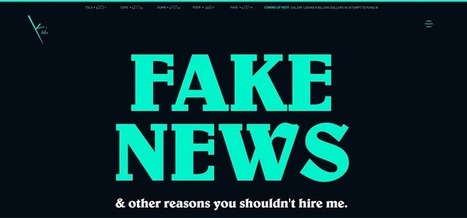
Let’s take a look at how designers are utilizing large headlines to convey a message. Most don’t apply to news, per se – they’re more about branding. But, as you’ll see, there is more than one way to successfully approach them....


Newspaper style big headlines can be very effective.