


 Your new post is loading...

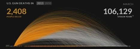

2013 was another exciting year for visualization. Between many new developments in data storytelling, a new wave of news graphics, new visualization blogs, better automated infographics, and visuals designed to hit you hard, it is difficult to decide what was most important. Here is a look back, and some ideas about where we’re going....


Presentación y análisis, entender las diferencias permite establecer buenos criterios de presentación y narración