Public Relations & Social Marketing Insight
443.4K views | +2 today
Follow
Public Relations & Social Marketing Insight
Social marketing, PR insight & thought leadership - from The PR Coach
Curated by Jeff Domansky
Your new post is loading...
Scooped by Jeff Domansky
Scoop.it!

Create Professional Diagrams & Charts with These 6 Free Tools

Create Professional Diagrams & Charts with These 6 Free Tools | Public Relations & Social Marketing Insight | Scoop.it

That’s why something as simple as a PowerPoint presentation with accompanying background music and an element of user input has been shown to encourage learning. It strategically engages students in the learning process and lets teachers appeal to multiple learning styles at the same time.


Similarly, in the office a clear and well-presented chart has become a tool to elicit specific emotional reactions in employees, with the consequence of making them become more committed to a certain project.


So, without further ado, here are some of the best chart making tools out there....
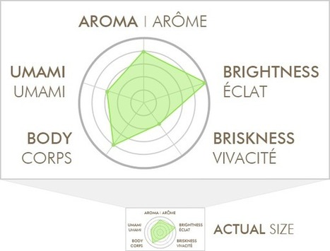
Jeff Domansky's insight:

Here's a look at six really useful chart making tools. Plot.ly is my favorite.

clawsgland's comment, June 25, 2015 5:07 AM

This is so great!
Marinhos's curator insight, June 25, 2015 1:33 PM

Representações gráficas, uma forma mais palatável de mostrar dados numéricos.

Jeff Domansky's curator insight, June 25, 2015 2:36 PM

Here's a look at six really useful chart making tools. Plot.ly is my favorite.

Scooped by Jeff Domansky
Scoop.it!

How Not to Visualize Your Data | SEOmoz

How Not to Visualize Your Data | SEOmoz | Public Relations & Social Marketing Insight | Scoop.it

This is an ode to a data visualization I found on my box of tea. It's a perfect reminder of how we sometimes get carried away as marketers, especially as our tools make visualization easier. 


...I’m not attacking the company that made this, and I’m not going to “out” them here – their product is actually pretty great. I just want to use this visualization to illustrate some of the wrong ways to do things, in hopes that we can all raise our game a bit.


But It’s So Pretty! I admit – the earth tones are nice, and it’s not entirely unappealing. I guess, for a moment, it made me feel better about shelling out $11 for an ounce-and-a-half of leaves. Maybe that’s even good marketing, although I really doubt this 1” tall graphic on the back of the box has ever swayed anyone’s decision. I’m not trying to say that it’s an ugly picture. The problem is that it’s a pleasant distraction disguised as meaningful data.


The job of a data-visualization is to communicate an idea better than the raw data itself could. Of course, that also implies that there’s actual data behind the visualization. So, how do we get it wrong?...

Jeff Domansky's insight:

Get much better impact with your charts, infographics and charticles with these tips.

No comment yet.