


 Your new post is loading...


We’re literally drowning in data. Everyday, 2.5 quintillion bytes of data are created. This is the equivalent of 90% of the world’s information–created in the last two years alone. Now this is what we call “big data.”
But where does it come from? Everywhere, from sensors and social media sites to digital images and videos. We have more data than we know what to do with, so it’s time now to organize and make sense of it all.
This is where data visualization comes into the picture. In the seismic shift awaiting us, referred by some as the Industrial Revolution of Data, we have to get better and more efficient at creating innovative data visualization that make the complex easy to understand.
In the hopes of inspiring your own work, we’ve compiled 15 data visualizations that will not only blow your mind, they will also give you a clearer understanding of what makes a good visualization–and what makes a bad one....

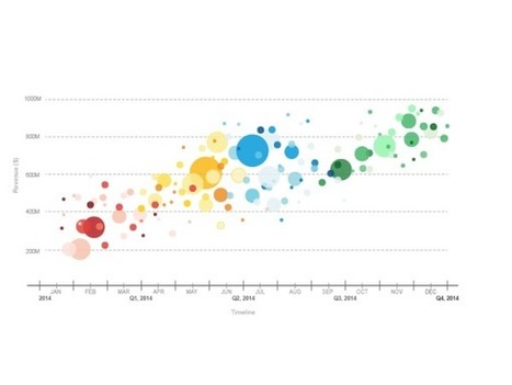


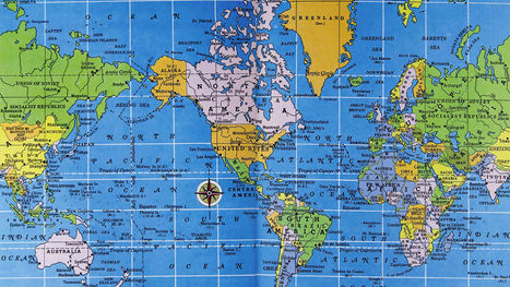


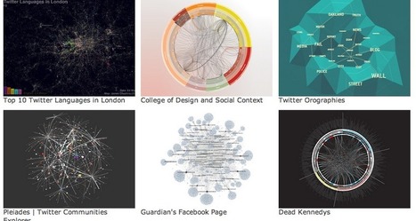

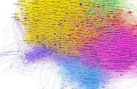


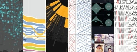


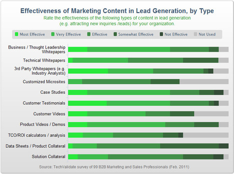


15 examples of data visualizations that will give you a clearer understanding of what makes a good visualization--and what makes a bad one.