Public Relations & Social Marketing Insight
443.6K views | +0 today
Follow
Public Relations & Social Marketing Insight
Social marketing, PR insight & thought leadership - from The PR Coach
Curated by Jeff Domansky
Your new post is loading...
Scooped by Jeff Domansky
Scoop.it!

The 37 best tools for data visualization

The 37 best tools for data visualization | Public Relations & Social Marketing Insight | Scoop.it

Not a web designer or developer? You may prefer free tools for creating infographics.


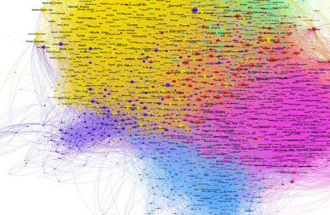
As author, data journalist and information designer David McCandless said in his TED talk: “By visualizing information, we turn it into a landscape that you can explore with your eyes, a sort of information map. And when you’re lost in information, an information map is kind of useful.”


There are many different ways of telling a story, but everything starts with an idea. So to help you get started we’ve rounded up some of the most awesome data visualization tools available on the web....

Jeff Domansky's insight:

This great list of valuable data visualization tools is recommended reading. 9/10

Winners Education's curator insight, March 26, 2015 12:24 PM

Adressing the visula part of the learning brain with easy-to-use, web-dased tools 

Vinicius Vinny Araujo's curator insight, April 17, 2015 12:55 AM

#data

Nora Morton's curator insight, April 22, 2015 6:23 PM

Colorful charts/graphs/maps are my type of eye candy!  This site illustrates the vast ways you can visually present data.  Among the many: iChart, Polymaps, Google Charts, Many Eyes, Leaflet, Exhibit, and Zing Chart. 

Scooped by Jeff Domansky
Scoop.it!

Silk Makes it Easier to Explore and Visualize Online Data

Silk Makes it Easier to Explore and Visualize Online Data | Public Relations & Social Marketing Insight | Scoop.it

Silk is a beautiful website building platform for people who want to create and manage a specialized database online. Now, it’s rolling out a new ‘Explore’ page format so that visitors can easily search and filter the information that they’ve published online.


When you hit the Explore tab on the homepage of any website built using Silk, you’ll see the new design shown below. By selecting the Filter button at the top, you can start setting new filters based on the categories, fields or values that the creator has defined for each entry in their directory....

Jeff Domansky's insight:

Silk is a cool tool for blogging and data visualisation and it allows visitors to search and filter through large amounts of data on a site.

No comment yet.
Scooped by Jeff Domansky
Scoop.it!

30 thought leaders in Data Visualization | Big Data Made Simple

30 thought leaders in Data Visualization | Big Data Made Simple | Public Relations & Social Marketing Insight | Scoop.it
This list of top 30 thought leaders in Data Visualization is based on recommendations and opinions by visualization experts in various social media channels. The names are listed alphabetically....
Jeff Domansky's insight:
Searching for big data visualization best practices and ideas? Here's a great place to start.
No comment yet.
Scooped by Jeff Domansky
Scoop.it!

What Does Big Data Look Like? Visualization Is Key for Humans | Innovation Insights | Wired.com

What Does Big Data Look Like? Visualization Is Key for Humans | Innovation Insights | Wired.com | Public Relations & Social Marketing Insight | Scoop.it

One of the most valuable means through which to make sense of big data, and thus make it more approachable to most people, is through data visualization. Data visualization is wayfinding, both literally, like the street signs that direct you to a highway, and figuratively, where colors, size, or position of abstract elements convey information. In either sense, the visual, when correctly aligned, can offer a shorter route to help guide decision making and become a tool to convey information critical in all data analysis. However, to be truly actionable, data visualizations should contain the right amount of interactivity. They have to be well designed, easy to use, understandable, meaningful, and approachable....

Jeff Domansky's insight:

Data visualisation will help readers get the picture big data.

Chris Farrance's curator insight, January 12, 2014 3:24 AM

I see big data as being at the crossroads of the art and science of building a growing and sustainable business in today's global marketplace.