 Your new post is loading...
It’s expected that only 6% of all data (read: information) comes from books and printed materials – the other 94% is digital. 90% of all data has been created and stored digitally within just the past 3 years, which is striking considering human recordkeeping dates back thousands of years! To top that off, we’re generating about 2.5 quintillion bytes of data daily, which just adds to the amount of data we have available to us. But the question is – what do we do with the data we collect? Many people (entrepreneurs, business owners, and data scientists) are beginning to visualize it....
A good infographic is a graphical story. It basically says “Here is a quick way to understand something important.” If it is a story about something that people care about, it will spread. Here’s what happens in the reader’s mind when they see an infographic worth spreading: “What’s this? Oh, it’s about [topic I care about]. Wow, this is everything I agree with in one place. It explains it so simply. I’m going to print this out/post this on Facebook/email it to the whole department, because maybe then people will understand.” Unless you can imagine a lot of readers saying something like this, you’ve probably got the wrong topic for an infographic....
Do you want to improve the quality of the infographics you create? Want more people to share and link to your work?
Infographics are a great way of showing the world (especially Google) that you’re an expert in your field, but only if the design is of a sufficient standard. Graphics that are hard to read or poorly designed simply won’t generate the desired results.
For help improving your infographic design skills take a read of this infographic from Venngage....
Data presentation should be elegant, detailed and beautiful. There are different ways to show the data that can be a pie charts, tables, histograms, and bar graph. However, to send a clear and effective message to your readers, you just need more than just a simple table or histogram, etc.
There are some data visualization techniques that present your data much better than expected, intelligent, beautiful, original and in an excellent way. We have gathered some of the most attractive and unique ideas of data visualization examples....
The success of infographics has evolved since that time. Just a few years ago, infographics became extremely popular with the eruption of digital marketing and search engine optimization.
With their popularity came several changes in the way they were presented. Only the best of the best were shared on social media, resulting in higher brand awareness and consumer engagement.
As the traditional infographic evolved to keep up with consumers’ changing tastes, it brought the world the interactive infographic, which is becoming the most sought after form of data representation to date, even rendering some static infographics as outdated and irrelevant.
To help you stay ahead of the game with your graphic design and create an infographic with the potential to go viral, take a look at this list of awesome interactive infographics....
Infographics are a powerful tool for capturing the attention of your target audiences. In fact, businesses that publish infographics grow their traffic an average of 12% more than those that don't.
The hard part, of course, is finding the time and resources to create these infographics.That's why we've created ten fully customizable infographic templates that will give you the inspiration and foundation you need to build your own infographics right in PowerPoint....
Infographics have become the design darling of visual marketing.
It’s no wonder organizations and individuals are taking advantage of them as a communication tool. We’ve scoured the web to compile a collection of 45 inspiring infographics that show what’s possible in this design category. Browse through them to get some ideas for your next project....
Creativity and great ideas can be dosed in a masterly way of aninfographic. Those 14 infographics is proof of that. They are tremendously useful information, it does so with full creativity and originality. Although most of them are about web design, some of those is also for SEO professionals or graphic designers themselves. I recommend you take a look at them because from the visual and composition view are very well developed....
Wouldn't it be great if creating infographics was just as simple as writing regular ole text-based blog posts? Unfortunately, the reality is that making visual content like this usually takes a lot more time, effort, and let's face it -- skill -- than the written word.
Usually.But considering the popularity and effectiveness of visual content in marketing today, you can't just afford to throw in the towel. That's why we decided to take all the pain and suffering out of infographic creation.
Seriously -- don't throw in the towel just yet. You, too, can create professional-looking, high-quality infographics ... quickly! And I'm going to prove it. First things first ...
Well, I’m here to tell you that it’s definitely possible to create some awesome infographics in any category that you choose, EVEN if you’re not a designer. In this blog post, I’m going to introduce you to three awesome tools to create the best infographics, tell you how to use them AND how you can share your infographics in different channels all over the web. So, let’s get started!..
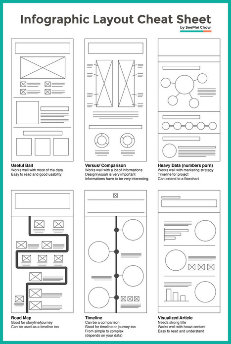
Infographic layouts refer to the arrangement of your visual elements and your content. When you begin working on a piece of infographic, you should have a story to tell hence, you will need to select a layout that best suits your story. Using the right layout will ensure good readability and convey your message well.
We have put together a cheat sheet for your quick reference to the right arrangement to use, here are six common ones you can quickly work with....
The increase in the number of easy-to-use digital tools has made the creation of infographics widely available to everyone. Social media sites allow for individual infographics to be shared and spread around the world.
Visual.ly and Piktochart are two companies that offer great platforms for creating infographics. We, at BarnRaisers, are big believers in the value of infographics for our clients. Here’s a recent one we did for the Interactive Advertising Bureau (IAB) on Eight Reasons Why Digital Advertising Works for Brands.
What makes infographics so effective. Infographics tell stories that are in sync with way we like to learn and retain information as human being.Here are 20 powerful reasons to use infographics....
|
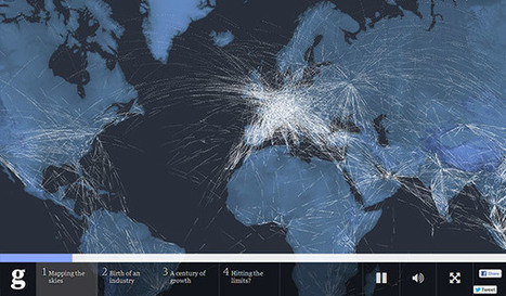
If you have a ton of data and you want to tell a good story, interactive infographics are a fantastic tool. They entice your audience to explore the content, whether it’s a data set or a guided storytelling experience, and they can provide far more information than a static infographic. So, what makes a good interactive infographic? Whether it’s super simple or incredibly complex, it comes down to good design, engaging interactivity, and an interesting subject. The options are pretty much endless. If you’re thinking about experimenting with interactive infographics or looking for some serious inspiration for your next project, we’ve rounded up our favorites. Scroll through the whole list (they’re listed, not ranked), and click on the images to visit the interactive infographic....
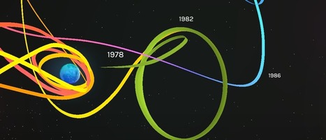
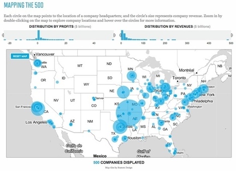
Visualizing the Fortune 500 is an experiment by the team at Fortune magazine. This is an interactive data visualization site that shows the location of each company's headquarters and the size of the circle represents the company's annual revenue.
People visit and revisit the Fortune 500 for lots of reasons, chief among them: job prospects, sales leads, corporate research and investor information. And bragging rights, of course. Below are two visualizations that allow you to explore the Fortune 500. On the map you'll find every one of the U.S. headquarters from the 2016 list, on the line chart below it, you'll see how each of the companies on the 2016 list has moved through the ranks for the past 20 years.
They also show an interactive visualization of how the companies have moved through the ranks over the last 20 year history of the Fortune 500....
Creating a really cool, memorable and–above all–shareable infographic comes down to investing the necessary time and attention in all the steps that lead up to an awesome data visualization.
In a previous series of posts, we discussed the steps to creating your own infographic. One of the key elements in this process is understanding that information can be categorized in one of five ways: - Chronologically
- Alphabetically
- Geographically
- Categorically
- Hierarchically
The visual format you choose will depend on how you want to organize your information. To help you identify which type of infographic will best serve your purpose and audience, we’ve compiled a list of the most-used types, along with advice on when to use them and examples of each....
Infographics are such a fun and effective visual way to display information. We at Buffer have certainly used them quite a few times to share information.
There are so many tools being released every day allowing us to easily create better and better images— including infographics—to share and use in our marketing efforts.
Even folks (like me!) who never thought it possible to create one ourselves!I had a lot of fun researching and testing out a handful of different infographic makers, and I’d love to share the seven tools I liked best to easily create beautiful infographics....
Do you want to make your infographics iconic? Okay, so we don’t mean “iconic” in the usual sense. We mean using icons in your infographic design. Icons are those little illustrative graphic images/clip art that represent an object, action or idea. They are often stylized and simplified designs. N
Using icons can make your infographic design more cohesive and more professional. With Venngage you can choose from over 10,000 icons in our icon library and stylize them to your preference by editing their colors, sizes and positions. Here are some tips for how to use icons in your infographics....
A 2013 study by Louis Alfieri published on Educational Psychologist suggested that case comparison activities commonly led to greater learning outcomes over other forms of case study including sequential, single case, and non-analogous, as well as traditional instruction.
Today, we are going to learn how to take advantage of this concept and apply it to design an excellent educational infographic.Keep reading!...
This infographic about infographics utilizes a cool blueprint flowchart concept.. something you’d think of as stereotypical for a blueprint. It’s cool, but it might be a tad ironic – it’s harder to read than you’d like it to be. Let’s jump into the things that you should focus on to make sure your infographic looks simple, readable and beautiful.
The main reason why infographics are so successful is that they transpose written data into a visual representation of the ideas that information contains. Visual data is absorbed much more quickly and easily, which leads to faster understanding. The majority of the population learns best through visual stimuli as shown in research undertaken into Individual learning styles, which is why for advertising companies, such as those involved in ecig marketing, relevant information is delivered in a visually interesting, coherent and direct way.
Not a web designer or developer? You may prefer free tools for creating infographics.
As author, data journalist and information designer David McCandless said in his TED talk: “By visualizing information, we turn it into a landscape that you can explore with your eyes, a sort of information map. And when you’re lost in information, an information map is kind of useful.”
There are many different ways of telling a story, but everything starts with an idea. So to help you get started we’ve rounded up some of the most awesome data visualization tools available on the web....
Data is crucial. However, displaying a chunk of plain data can be monotonous. Infographics visualize plain data and make it visually more appealing. Data turned into infographic has a higher potential to go viral and be effective. While many of us are designers who can design amazing infographs, Infographic Generators can come in handy to Designers and non-designers alike. They can be a time saving resource. So here is a list of 17 fantastic Infographic Generators I compiled together:...
Crafting excellent social media posts and calendars is vital if you want your social stay to be a powerful and successful one. However, you might be hitting the proverbial brick wall with your posts, and might not be sure just how to go about crafting great posts all the time. Fret no more; I have gathered several great templates that can help you begin planning excellent social posts and content!
Throughout this post, I will be focusing on a great resource from Content Marketing Institute with a great list of awesome templates. Take a look and see which will be perfect for you and your brand....
You could sift through piles of dense data sets in an attempt to understand the trends and discoveries that emerged in history, psychology, current events, and even fictional dragons in 2014. Or you could look at these infographics, which visualize otherwise overwhelming data as beautiful charts, graphs, and maps.
Co.Design's Infographic of the Day series regularly showcases the best in data visualization, and this past year saw many stellar examples of the power of the well-designed visualization to illuminate information about nearly any subject, from the serious (the daily activities of Congress) to the frivolous (a visual compendium of the world's best dogs).
We couldn't resist promoting Co.Design's own in-house data visualizations: the Great Wheel of Food Mashups and a map of each U.S. state's weirdest eating patterns (we're a bit food-fixated, apparently). Here, our favorite infographics from the past year.
|


![How to Create an Infographic in Under an Hour [+10 Free Templates] | Public Relations & Social Marketing Insight | Scoop.it](https://img.scoop.it/jKldflV4zNqvqJirZoFfwTl72eJkfbmt4t8yenImKBVvK0kTmF0xjctABnaLJIm9)


We are generating more data than ever. But what can you do with that data? Data visualization can help engage your audience and increase conversions.