 Your new post is loading...
So how do you balance your remarkable content creation with your web design needs? It all starts with the "About Us" page.
For a remarkable about page, all you need to do is figure out your company's unique identity, and then share it with the world. Easy, right? Of course it's not easy. That said, the "About Us" page is one of the most important pages on your website, and it can't go neglected. It also happens to be one of the most commonly overlooked pages, which is why you should make it stand out.
But it can be accomplished. In fact, there are some companies out there with remarkable "About Us" pages, and there are elements of them that you can emulate on your own website. By the end of this post, showing off how your company's greatness won't seem like such a challenging feat....
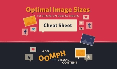
What if you wanted to place text or an arrow on your Facebook cover photo without it getting covered by the profile photo? And what about the shared link thumbnails on Facebook or in-stream photos on Twitter ... how big should those be?
If you're looking for a detailed guide to social media photo sizes -- including recommended dimensions, minimum and maximum dimensions, image scale, and more -- then this is it.
The infographic below from Jamie Spencer of MakeAWebsiteHub.com is a great reference to bookmark or keep close-at-hand the next time you're creating an image for your social media profile.
Presenting the recipients of Best In Class, a special award to commend the most impressive sites in each of the WOTY 2015 award categories.
When it comes to social media, it’s a pretty well-known fact that images automatically do well. Users are attracted to visuals much more than they are plain text. However, sharing an image that isn’t the right size can be terrible for you or your brand.
SurePayroll has created an infographic (featured below), giving you the inside scoop on making sure your image is perfect, no matter where you choose to share it.
From Twitter and Facebook, to Pinterest and Tumblr, this infographic has guidelines for getting your image sizing right on the seven most popular social media sites. The next time you have an image you’d like to share, double check the size before posting to ensure that your picture isn’t too big – or too small – to make an impact....
Hand-picked collection of brand style guide examples, pattern libraries and design manuals for inspiration. Find all the best style guides in one place. Maintained by Saijo George, find me on Twitter or LinkedIn.
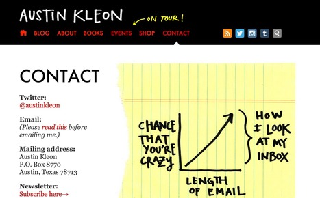
Looking for contact pages worth turning into role models for your page? Here are 20 Contact Us pages for you to learn from!
If you're a small business owner and you run your own website with Wordpress, check out this list of common errors and how to avoid them.Wordpress has made it easy for anybody to set up a site and blog, but there are a number of pitfalls that you can easily avoid by following these tips!
Learn how to decide what should be in your website navigation, and where, with a scientific and objective approach.It takes up just a few pixels, but your main navigation is arguably the most essential and ever-present aspect of your website. What to include as part of your main navigation can be a hotly contested topic inside your organization, and it could mean the difference between a website conversion and a bounce.
The good news is, when making navigation decisions, there are a lot of tools at your disposal to help you make the right call. What should be included in it?...
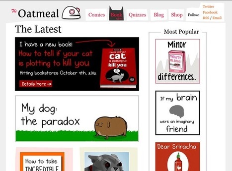
There are two main reasons people utilize the web: to share things and to be informed. Sure, we could pick up a newspaper or switch on the television, but I’d argue that it’s much easier to whip out your phone or laptop to find info. The wonderful thing about the web is that you’re never alone. No matter your interests, there’s probably a group of like-minded individuals who have made your interests available online. The most popular way of doing this is via blogging. With news websites and most blogs, you don’t need a journalism degree, you just need an interest and a passion. Other than specific interests, blogs show their personality in their layouts and designs. Today, we want to showcase some of these wonderful blogs that have amazing and beautiful designs....
|
It’s an easy mistake to make.
You slap some words on your About page, wrench them apart, shovel in a bit fluff, a pinch of jargon; and give it no more thought. Because it’s not that important, right?
Not exactly.
You see, this is where so many of us get it wrong, and leak piles of cash in the process. Even though we may pay it less attention, our About page is one of our most visited - which makes it low-hanging fruit, just waiting to be plucked.
By which I mean, if your visitors aren’t captivated, bewitched, mesmerized or just plain hungry-for-more after reading your About page, you can grab yourself a hanky and wave them goodbye.
In other words, you just lost a sale.
Because your About page isn’t just about painstakingly-crafted words that make you look good. Your About page is like speed dating
Let me explain.
It’s that time of the year again - the time we look back on all of the success that our clients have had with our tools.
So I scoured through the top landing pages of the year with the highest number of conversions and selected the most noteworthy.
I definitely learned a thing or two looking back on these campaigns and I think you will as well.
In this article, I’ve detailed seven of the most successful landing pages of the year, the results they got and why they have such high conversions....
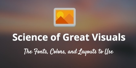
If you’ve been looking to supercharge your social media strategy, you probably know a lot about the benefits of using images.
But, how much do you know about actually creating scientifically shareable images?
Turns out, there’s tons of actionable, research-backed advice on how to create social media images that get shared—the ideal colors, fonts, text, and more, all leveraging what we know about design, psychology and the Internet to get more shares and engagement.
By the end of this article you’re going to be fully aware of how to make images that your readers can’t help but share. All backed by science....
We have compiled a list of 10 predictions that in our opinion will turn out to be correct to a varying degree. We have excluded flat style and responsiveness because of their obviousness. The first one has got an enormous stimulus from material design, and the second one, well, it is hard to name a trend actually, nowadays it is a must-have requirement. Also, we do not include ghost buttons since they are literally everywhere. So let's get acquainted with our prognoses...
A grey website design looks very professional and gives a very neat and sophisticated feel. Grey is one of the most widely used colors in web designs because it is a neutral color that is a perfect option to be used for website backgrounds.
Here, we are presenting a creative and inspirational collection of some clean grey website designs for you. All the website designs presented in this collection are handpicked. This means we have spent hours in finding out the best and creative grey website designs. We went through hundreds of websites to find the cream of the crop. Enjoy!
Minimalist web designs, when properly done, are always a great source of inspiration. It is very interesting to see how designers approach the task of delivering a project in a simple way. Keeping only important elements in the layout and getting rid of things that are not essential. And remember that you can still use colors in a minimalist website, so don’t worry about having to stick to neutral colors. Check out the examples we have here and give a shot to the minimalist approach in your next project....
If you’re looking for examples of niche, it’s difficult to imagine a slimmer area of focus than one page websites. It sounds obvious, but you’re building a site for an audience — so why wouldn’t you consider their experience and ways to communicate with them?
Hope explained that he personally contacted the teams behind the first 500 sites he found to let them know they’d been featured and ask if they thought their work had been presented in the best way possible.
They then visited his site and shared the fact that they’d been featured with their followers on social media, forming the foundation of One Page Love’s own following. When they asked if he could make an award banner for their own sites so they could show thatthey’d been featured, he did it — now they’re passively sending him traffic.
Hope suggested that you focus on your users’ experience – don’t make them jump through hoops to find the content, enter a gallery, or navigate around. Don’t have unnecessary clutter, ugly ads or, as he puts it a “social Christmas tree of sharing buttons” if they don’t add any value. Make it easy for visitors to follow you and subscribe to your site, and try out new features often to see what works best for them...
Online analytics can be fascinating. They can provide insight into the quality of your online content, let you know just how engaged your Twitter followers are or simply provide a timely ego boost. However, in amongst all the good news, bad news and insight, there are certain analytics that rarely change. Wherever you go, from B2B service providers to fashion retailers, the most visited web pages are usually the same. The most visited page on almost every website is the “About” page. No matter what you sell, your website visitors, social media followers and online prospects all want to know about you. More than want to know, they actually expect to get information about you. There are common questions every prospect expects to have answered by your online presence....
In today’s post we’re going to go over 10 websites that have left a lasting impression on their visitors. Now, they are not all business websites – but they are inspirational. On this blog we talk a lot about websites that have effective calls to action, non-cluttered home pages, and trustworthy designs with the intention of showing what techniques help improve conversions. After years of showing our readers examples of what works and what doesn’t, one thing we have noticed is an awful lot of similarity between website designs in the same space. My hunch is that either: 1. After years of people copying each other’s designs, SaaS businesses have determined that this is what a SaaS website should look like.
2. Or, after years of individual A/B testing, this is the winning outcome of what an effective website should look like.
I guess I lean more toward point #1…
But why not make your site unforgettable? [This is a terrific post by @seanvwork. The 11 examples show website design, creativity and usability best practices. Lots of great lessons! ~ Jeff ]
|


![Starting a website? Tips on going niche, working smart and growing fast [WCCT] | Public Relations & Social Marketing Insight | Scoop.it](https://img.scoop.it/4TpVOxjwv_F9OS5pp7yvEDl72eJkfbmt4t8yenImKBVvK0kTmF0xjctABnaLJIm9)


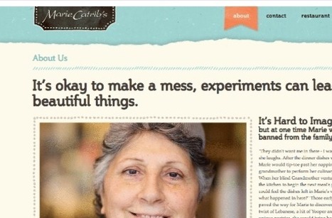
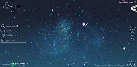
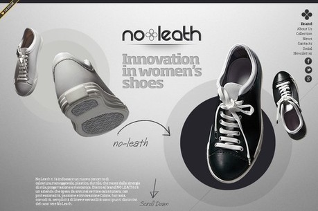
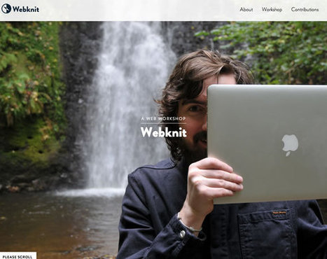
Here's some inspiration for your "About Us" page.