Public Relations & Social Marketing Insight
443.6K views | +1 today
Follow
Public Relations & Social Marketing Insight
Social marketing, PR insight & thought leadership - from The PR Coach
Curated by Jeff Domansky
Your new post is loading...
Scooped by Jeff Domansky
Scoop.it!

How to Create Infographics for Content Marketing

How to Create Infographics for Content Marketing | Public Relations & Social Marketing Insight | Scoop.it

Infographics can be powerful content marketing tools.


The format can help brands easily explain complicated subjects, processes, or data-driven insights. Research has found that people who follow directions with text and illustrations do so 323% better than those using just text. And nearly 50% of the brain is focused on visual processing. 


Plus, social media networks prioritize visual content – and strong visuals catch peoples’ eyes. Tweets with images get 313% more engagement. At NewsCred, we’ve found infographics to be valuable top-of-funnel content....

Jeff Domansky's insight:

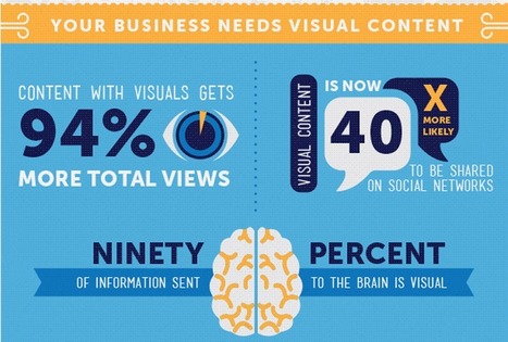
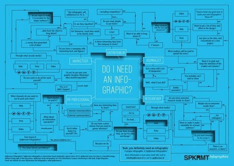
IBM THINK Marketing created this helpful infographic and article that details the steps required to create effective Infographics for content marketing.

No comment yet.
Scooped by Jeff Domansky
Scoop.it!

Here's Why Infographics Outperform Blog Posts

Here's Why Infographics Outperform Blog Posts | Public Relations & Social Marketing Insight | Scoop.it

Sure, articles let brands talk directly to customers about solving problems, like how to save for a home while paying off student loans, for example. Blog posts have relatively low overhead compared to, say, a national ad campaign or video product release, and in some industries such as finance, they are necessary to edge out competitors trying to capture the same audience.


But a content plan with only blog posts is like a diet that consists solely of bananas. Sure they provide some value and it’s safe to eat one per day, but without diversity you’re going to become malnourished.


The problem for many brands is they don’t have the data to justify alternative approaches that may cost more than a 600-word article.


When our data scientists examined 3,200 stories produced on the Contently platform over the last year, they found that a different type of content outperforms blog posts across most industries:

- Infographics reach 54 percent more readers than blog posts.

- The median cost to reach one reader for an infographic was $0.04 versus $1.77 for a blog post.

-Infographics have a 73 percent completion rate. Blog posts have a 66 percent completion rate....

Jeff Domansky's insight:

Brands love blog posts. But if they're serious about content marketing, they may want to focus on infographics as well. Time to rethink your blog content.

No comment yet.
Scooped by Jeff Domansky
Scoop.it!

We Live In A Visual World | Ethos

We Live In A Visual World | Ethos | Public Relations & Social Marketing Insight | Scoop.it
The full infographic we designed to highlight the many reasons why you should rely on visuals to create impactful design, no matter the project.
Jeff Domansky's insight:

Here's why you need to add visuals to your content marketing.

No comment yet.
Scooped by Jeff Domansky
Scoop.it!

How to Give a Bad Infographic a Makeover | HubSpot

How to Give a Bad Infographic a Makeover | HubSpot | Public Relations & Social Marketing Insight | Scoop.it
Given the popularity and effectiveness of visual content for marketing, it's no surprise that today's marketers are creating more and more infographics. They're a more enjoyable way of digesting statistics, data sets, and timelines, and they can drive more traffic and engagement than plain text.

Even though there are a lot of good infographics out there, there are still a ton of bad infographics out there, too. You usually know one when you see one: Either it's jam-packed with information, or it hardly shows any useful information at all. Sometimes it's loud with clashing colors; other times, it's plain and boring.

But "knowing it when you see it" doesn't help you prevent from making a bad infographic. Here to dissect what a bad infographic looks like is an infographic from Vertical Measures. Check it out below.
Jeff Domansky's insight:

Here's an infographic with a couple of basic tips on, what else, how to make a bad infographics good.

No comment yet.
Scooped by Jeff Domansky
Scoop.it!

The Science Behind the Most Popular Infographics of 2016 | HubSpot

The Science Behind the Most Popular Infographics of 2016 | HubSpot | Public Relations & Social Marketing Insight | Scoop.it

What makes people want to share an infographic?

Is it a certain color scheme that catches the eye? Do certain formats work better than others? Or, in the end, is it all about the content? At Visme, we set out to answer these questions by performing a content analysis of the most shared infographics on social media.


Using BuzzSumo, we identified every infographic with more than 5,000 shares across some major social media platforms -- Facebook, Pinterest, Twitter, LinkedIn, and Google+ -- and analyzed them for different characteristics. Those were things like word count, size, colors used, format, and topic.


Here's what we found after analyzing over 200 infographics -- and takeaways on how you can apply these insights to your own infographics, making them more shareable....

Jeff Domansky's insight:

HubSpot shares valuable tips on producing effective infographics.

Elita Torres's curator insight, January 1, 2017 9:30 AM
Interesting read for those who do Infographics
Scooped by Jeff Domansky
Scoop.it!

How To Create An Infographic Your Audience Will Love

How To Create An Infographic Your Audience Will Love | Public Relations & Social Marketing Insight | Scoop.it

Infographics are used heavily in just about every niche now, and vary from deadly boring to downright amazing.

But what makes the difference between the two?

It all boils down to this: infographics go viral because they catch the attention of the audience they are intended for. If the person or organization creating the infographic doesn’t know their audience and doesn’t know what that audience wants or needs, the infographic is going to be dead in the water. Before you ever sit down to create an infographic, take a good long look at hat

Before you ever sit down to create an infographic, take a good long look at who you’re creating it for and why....

Jeff Domansky's insight:

Tips to help you produce a better infographic.

No comment yet.
Scooped by Jeff Domansky
Scoop.it!

7 Steps to turn data into a clear, concise infographic

7 Steps to turn data into a clear, concise infographic | Public Relations & Social Marketing Insight | Scoop.it

This infographic about infographics utilizes a cool blueprint flowchart concept.. something you’d think of as stereotypical for a blueprint. It’s cool, but it might be a tad ironic – it’s harder to read than you’d like it to be. Let’s jump into the things that you should focus on to make sure your infographic looks simple, readable and beautiful.

Jeff Domansky's insight:

Not sure where to start with your first infographic? Follow these simple 6 steps to transform your information into a clear and concise infographic.

Jeff Domansky's curator insight, June 9, 2015 1:58 AM

Usefl tips for better Infographics.