An infographic illustrating sufferers of infectious diseases by state took the top prize at the 2015 Kantar Information is Beautiful Awards.
Launched four years ago by data visualizer David McCandless, author ofInformation is Beautiful, and Kantar creative director Aziz Cami, the Kantar Information is Beautiful Awards is a platform to promote global best practice for a nascent design form that is now big business.
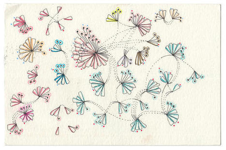
This year’s other Gold Winners include:Dear Data, an experiment in creating and sending data visualizations relating to life as it happens around us using analogue instead of digital means, by Giorgia Lupi and Stefanie Posavec won Gold in the Data Visualization Project category....


 Your new post is loading...


aggiungere la vostra comprensione ...