 Your new post is loading...
 Your new post is loading...
While many imaging apps’ tools closely resemble those used by artists in the real world – such as brushes and pens – the color picker feels like a completely digital device. A new project from the folks at Adobe Research and University of Toronto reimagines it as a skeuomorphic palette that’s designed to be more natural and intuitive, while allowing for the creation of harmonious color schemes and works of art. Instead of forcing users to choose from colors from across the entire spectrum, Playful Palette presents you with an interface that’s more like how you’d mix paint in real life. Pick a bunch of colors represented as paint blobs, make a puddle with them, blend them with lighter and darker hues by pushing in different directions and get a gradient of colors to work with. Hit ‘play’ on the clip for a better idea of what I’m talking about:...
In the 1970s, designers were treated as rock stars–album cover designers, that is.“You were regarded almost like the fifth member of the band,” says Aubrey Powell, whose studio Hipgnosis was responsible for the album cover designs for artists like Pink Floyd, Paul McCartney, Genesis, and Led Zeppelin. A new book, Vinyl. Album. Cover. Art, revives Hipgnosis’s complete catalogue, displaying 480 illustrations from the studio’s archive. It’s a glimpse into a pre-digital era when a single illustration could take months to complete. Hipgnosis got its start in 1968, when Aubrey Powell and his creative partner Storm Thorgerson were asked to do an album cover for their friends’ second album. Lucky for Powell and Thorgerson, their friends happened to be the members of Pink Floyd; lead singer and guitarist Syd Barrett was their roommate. At the time, Powell was sneaking into the darkrooms at the Royal College of Art in London, where Thorgerson was a student, and experimenting with infrared film....
Working with color can be so much fun. Color can set the mood and tone of a design. Color can make a design appear clean or messy. Another thing we can use color for is to draw attention to a desired piece of content or element. In this post, we’ll go over the various way in which color can be manipulated to draw attention to something. Some of the examples will talk about repetitiveness, some about photography and others about how a lack of color can be a strategic thing too. Let’s get started in analyzing how to draw attention through color....
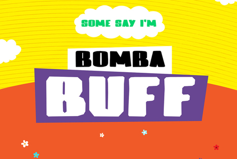
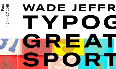
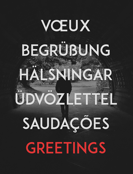
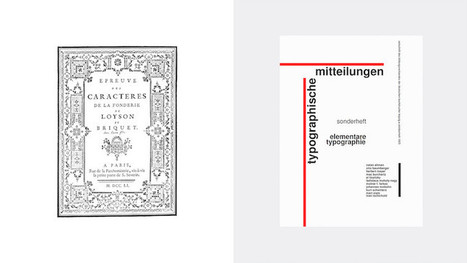
Everyone, even non-designers, can agree that the smallest typographical change can make a world of difference (*cough* Warren Beatty *cough*). Elevating designs through typography is a skill every designer should have in their back pocket. Do you want to become a typography wiz—and, ultimately, an even better designer? We want that for you too! That’s why we’ve gathered a list of the best free typography resources—handpicked, just for you. Free typography education Check out these e-courses, e-books, and workshops to get started on your typographical journey....
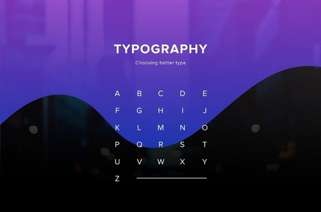
One of the most important skills you can learn as a designer is how to choose type. This is because text is one of the primary ways designers can communicate with users. Typography can make or break a design. There’s a beauty and complexity to typography. Some people devote their entire careers to type. Thankfully, their work is well documented, so we have tons of online resources for typography. This article is designed to serve as a starting point for helping you learn how to choose type for your designs. It will encourage you to explore fonts and font combinations beyond those you’re familiar with....
2017 is the year we return to the organic roots and we will see a return to the natural. In terms of colors, the start has been given by Pantone (as every year, in fact), who has crowned the color for 2017 as Greenery, based on it’s meaning of new beginning, freshness and environmentalism. Manifesting as a “fresh and zesty yellow-green shade that evokes the first days of spring”, Greenery envelops the notion of breathing, reinvigorating and appreciating the great outdoors. That said, let’s take a closer look at the graphic design trends that define 2017. Most of them influence both print and web design, but some of them are just for the web....
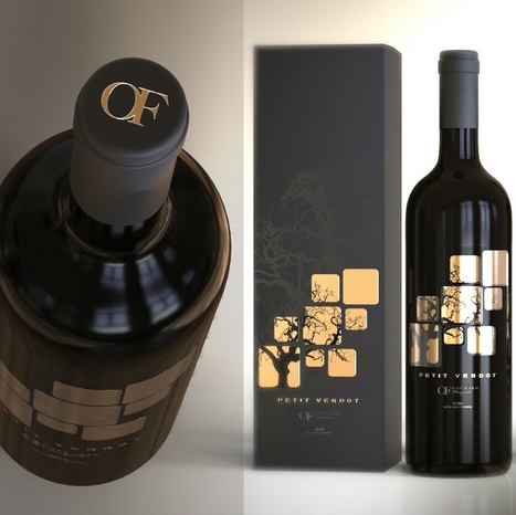
Your label is one of the first thing people are going to notice about your bottle. And a label can tell you a lot about the wine inside: what kind of occasion it’s best for, whether it’s a red or a white (or a sparkling or a rose), what varietal it is, what type of flavor to expect… seriously, your customer is drawing a LOT of information from your label. And because they’re looking for your label to get all of that information, you want to make sure that your label is an accurate representation of who you are and what your customer can expect from your wine. It’s a big deal! Here’s a roundup of 30 of our favorite cool wine labels for inspiration...
One Page Love is a One Page website design gallery showcasing the best Single Page website designs from around the web.
Fresh, innovative, creative, minimalist award winning web design agencies websites for inspiration. Today we've selected 26 best web design agencies' websites. Beautiful examples of Web Design Agencies websites for inspiration. These agencies are are using the latest technologies “HTML5, CSS3 and JavaScript” for their websites to create perfect and eye catching design. Let’s take a quick look at some amazing new web trends to keep in mind when designing your next website project.
When I worked as a web designer, I was fascinated by how design trends changed each year. Since hanging up my design boots and focusing on being CEO of Envato, my focus has shifted from visual trends, to industry and technology ones. As I did in 2014 and 2015, here’s my take on where the world is moving!...
Trends are mysterious things. Some stay for years and others are just a swift shimmer that leave as fast as they enter the scene. Still others shift and evolve with the times. Design is both the driving force and the result of this cycle of trends—with packaging design creating personal experiences (like the unboxing experience) that connect consumers to brands on a deeper level. With that in mind, here are the 9 packaging trends that we are predicting for 2017....
Visuals are the currency of sharing on social media. Text-only updates can only convey so much and get so far. Here are 3 stats that prove the worth of creating graphics.
First, 66% of all social media posts are or include images.
Second, forget native visual platforms, like Instagram and Pinterest, that allow photo sharing. In 2013, Facebook became the largest photo sharing website, with its users uploading 350 million photos every day.
Third, use of images was rated as the most important social media optimization tactic, in a 2014 survey by Adobe and Software Advice.
And, it’s not just limited to social media…Content with relevant visuals also gets 94% more views than content without. Even social media platforms now focus on images in their redesigns....
For the early part of this century we saw a lot of colorful artwork in the shape of icons and vibrant mascots. Heavily shaded, three-dimensional characters, and richly rendered forms were all the rage. Now, illustration is heading for a more authentic and organic experience. Low-color, hand-drawn looks that are specifically created for a single-site use are becoming more common and are expected to stick around. Custom designs will more often take on a unique, loose and even childish feel. Websites will feel more personable compared to the copy and paste looks we have been seeing thanks to the prevailing flat design/minimalism bandwagon....
|
Looking for the perfect font for a branding or logo project? We’ve researched some of the very best fonts for tackling a new logo design – and complied them into a handy list for you to refer back to whenever you need.Whether you want an elegant serif, stunning slab, high-impact stencil or more, you’ll find a wealth of inspiration here. Scroll down for 15 of our favourite logo fonts...
Designing for the web, you must keep up-to-date with the latest trends and tools. For trends, it’s fairly easy to know what’s going on, but it can be hard to keep up with the latest tools. Let’s look at ten web design tools you can add to your toolbox.
I launched Typewolf as a side project in June of 2013. Working as a designer, I was always frustrated by the lack of good resources for choosing fonts for design projects. Seeing type samples set in “the quick brown fox jumps over the lazy dog” isn’t very useful when it comes to web design—seeing how real type performs on actual websites is much more helpful. I’ve also noticed that other typography sites tend to be written from a type designer’s perspective rather than from the perspective of someone who actually uses type in their day-to-day work. I’ve been a designer for 15 years, so everything on Typewolf is approached from a designer’s perspective....
Just like previous years, we've undertaken great efforts to look for, categorize, and create font previews of 100 typefaces that you can use to do almost anything. Regarding their licenses, you should pay attention to each one individually as, while the majority are completely free, some are for personal use only and others are not full families – this means that you’ll only be able to download regular or medium weights or condensed styles for free. Font Selection As you know, the selection has been made keeping the typical type classifications in mind to help you browse more efficiently: Serif, Sans Serif, Slab Serif, Rounded, Geometric, Decorative, Display, etc. Many of these fonts can also be downloaded as a web font kit so that you can use them in your online projects....
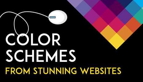
Color is such a fundamental part of the way we perceive the world that we often take it for granted. Think about it: From the youthful and vivid orange on someone’s attire to the gray and gloomy sky above us, colors have the power to mold our perceptions of others and even the circumstances we find ourselves in. This is why one of the most powerful tools in a designer’s arsenal is color. It can either make or break a design; it can be the determining factor in engaging viewers or sending them promptly on their way. As a non-designer, I often find it difficult to find just the right colors for my amateur projects. Whether I’m creating a simple image to support my content or more elaborate projects such as a slide deck or infographic, I frequently spend a good amount of time looking for the perfect color scheme. I ask myself questions like: Do I want my design to be inviting? Provocative and bold? Or intelligent and elegant? Unless you’re a seasoned designer, it takes time and effort to find a color combination that works, which is why the design team at Visme decided to provide our users with a handy list of beautiful color schemes from websites that have been recognized by Awwwards, the most prestigious award for Web designers and developers....
‘Crowded’ websites are difficult to read. Complexity often makes users uncomfortable. If we’ve overwhelmed them with lots of different information, all fighting for their attention, they will leave or not take the action we’d wanted them to do. It may be purchasing something on e-commerce website or reading the article on a blog. There is, however, a concept that helps graphic designers to create great web experiences, making the content appealing and easy to follow. It’s white space – the way of giving your layouts extra room, simply by avoiding unnecessary clutter and using the space between elements for their advantage....
Twibfy is an inspirational platform and marketplace for creative professionals. Discover and purchase high quality digital visual content curated by creatives for creatives and organize it in the Twibfy cloud. The marketplace offers an environment for talented people to showcase their work and instantly sell it through the platform.
This year, like a number of UX experts, I’m betting on AI-powered chatbots, VR, and immersive storytelling trends to leave a permanent mark on the industry. Undoubtedly, we will also see a lot of last year’s trends continue to shape and influence the web design space. Without further ado, let’s explore what design innovations can give your website a serious facelift in 2017....
As it turns out, posters aren't as old-school as we might think. In fact, they're still quite effective devices for promoting events. Making yours stand out, however, is the tricky part.Like so many other things in marketing, it requires a combination of creativity and formula. But what are the success factors? And what makes a poster look its best? You're in luck. Our friends at Venngage, who know a thing or two about creating compelling visuals, put together this infographic to guide you along your poster-making journey. It'll help you figure out what information is essential to include on your poster, and how to make it aesthetically appealing -- without overwhelming the viewer....
While clients often ask you to cram in as much information into a page as possible, seasoned web designers know this can lead to a usability nightmare. Confident and careful use of whitespace, in contrast, is all about giving content room to breathe. The examples listed here work because everything the visitor needs is still there on the page; all that’s absent would just be clutter. In place of that clutter, whitespace helps create a balanced, easy to navigate interface where you can find what you need without being overwhelmed....
It’s never too early to try and take a peek at the future. After all, web design will play a HUGE role in the way people connect with each other and receive information. A lot has changed since the days of crowded homepages and colorful fonts. Minimalistic design seems to be passé as well. Which makes us wonder: what’s in store for the future of web design? What elements will users favor more or expect to see? Below are the top three trends that could dominate web design by 2017. Take a look and see if you can implement them before the year is over....
Unlike any aspect of the aesthetically appealing website design seen today, brutalism is new, fresh, promising, and what not. It is far from minimalism and represents some sort of an ultra-basic design, thus called ugly sometimes. Brutalist is a design trend highly unlikely to make a place in today’s world where the most modern and effective designs are prevailing. Yet, designers in a large count are keeping it in mind, despite the fact that it reminds of a brutish design which was workable in post-World War II Europe since such a design helped revamp in an inexpensive way, thus resulting in cold, stark buildings. A lot of people have lately shifted to brutalism in design trend. It clearly indicates how certain design circles have been overshadowing the modern web, which chooses to focus majorly on alignment of colors, shapes, design elements and lines....
|


 Your new post is loading...

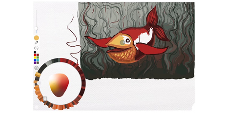





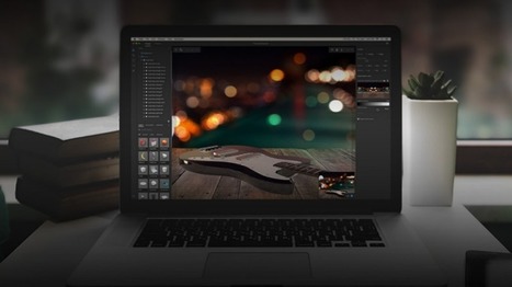









Adobe Research and University of Toronto have reimagined the color picker as a skeuomorphic palette that's designed to be more natural and intuitive.