 Your new post is loading...
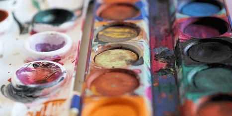
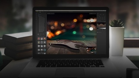
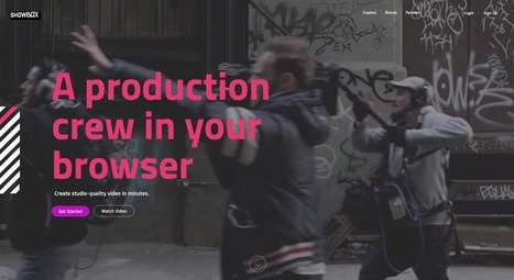
Images are a vital component of any website, and using the right ones can enhance both your content and design. The problem lies in finding the right graphics without resorting to the same free stock images everyone else uses. If you really want to set your site apart, there’s an alternative to stock images – you can create your own. The best part is, you don’t need to be a designer to get it done. Nowadays, there are plenty of tools that can help you create stylish graphics with only a little practice, and they’re a great option if you don’t have the budget to hire a designer. In this article, we’ll talk about why images are so important for any website, then we’ll introduce you to three tools that can help you create your own custom graphics. Let’s get started!...
Just like previous years, we've undertaken great efforts to look for, categorize, and create font previews of 100 typefaces that you can use to do almost anything. Regarding their licenses, you should pay attention to each one individually as, while the majority are completely free, some are for personal use only and others are not full families – this means that you’ll only be able to download regular or medium weights or condensed styles for free. Font Selection As you know, the selection has been made keeping the typical type classifications in mind to help you browse more efficiently: Serif, Sans Serif, Slab Serif, Rounded, Geometric, Decorative, Display, etc. Many of these fonts can also be downloaded as a web font kit so that you can use them in your online projects....
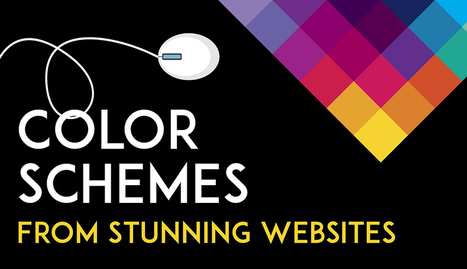
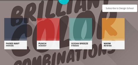
Color is such a fundamental part of the way we perceive the world that we often take it for granted. Think about it: From the youthful and vivid orange on someone’s attire to the gray and gloomy sky above us, colors have the power to mold our perceptions of others and even the circumstances we find ourselves in. This is why one of the most powerful tools in a designer’s arsenal is color. It can either make or break a design; it can be the determining factor in engaging viewers or sending them promptly on their way. As a non-designer, I often find it difficult to find just the right colors for my amateur projects. Whether I’m creating a simple image to support my content or more elaborate projects such as a slide deck or infographic, I frequently spend a good amount of time looking for the perfect color scheme. I ask myself questions like: Do I want my design to be inviting? Provocative and bold? Or intelligent and elegant? Unless you’re a seasoned designer, it takes time and effort to find a color combination that works, which is why the design team at Visme decided to provide our users with a handy list of beautiful color schemes from websites that have been recognized by Awwwards, the most prestigious award for Web designers and developers....
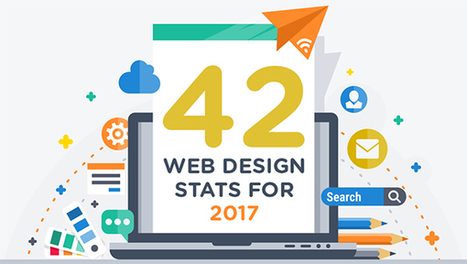
Are you considering a new website or even a redesign in 2017? Need some facts and figures to help you form and execute your web strategy? We share 42 stats you need to know in this infographic....
When I worked as a web designer, I was fascinated by how design trends changed each year. Since hanging up my design boots and focusing on being CEO of Envato, my focus has shifted from visual trends, to industry and technology ones. As I did in 2014 and 2015, here’s my take on where the world is moving!...
It’s never too early to try and take a peek at the future. After all, web design will play a HUGE role in the way people connect with each other and receive information. A lot has changed since the days of crowded homepages and colorful fonts. Minimalistic design seems to be passé as well. Which makes us wonder: what’s in store for the future of web design? What elements will users favor more or expect to see? Below are the top three trends that could dominate web design by 2017. Take a look and see if you can implement them before the year is over....
If you look at how product pages take shape across different companies, it's clear that they run the gamut. Some go for the direct approach, displaying an image of a product and explaining why someone should buy it. Other companies create elaborate pages with moving parts and fancy coded elements. Of course, some companies fare better than others at creating delightful product pages. But since we prefer to focus on the positive, we scouted out 14 examples that we find truly admirable. From messaging, to value propositions, to general product promotions, these brands nail these features in a persona-friendly way....
The layout of a responsive website is designed in such a way so that it becomes sensitive to the screen size of the device, which is used for accessing it. In the present time most of the websites are not responsive. But the pace at which the number of mobile users is increasing, it is high time for the entrepreneurs or the webmaster to upgrade their site and make it responsive. This is especially applicable for the owners of the ecommerce sites as it will definitely impact the conversion rate of their site. There are many ways with the application of which a website can be made responsive. A skilled and knowledgeable web designer can accomplish the task with ease and efficacy if he or she is aware of the technique. We have collected 30+ responsive websites from the internet which is going to be of great help for the designers. These examples will help the designers to draw valuable inspiration as far as the style and layout of the website is concerned....
Color makes a design come alive.It can attract attention, set a mood, and even influence our emotions and perceptions. But sometimes it can be hard to know where to start when choosing a color palette for your design project. So we’ve done the hard work for you— giving you 100 color combinations inspired by nature, food & drink, travel, and everyday items. Want to use these color combinations in Canva? Click here to sign up for free if you haven’t already (if you haven’t — are you kidding me?!). Canva lets you change the colors of your design by entering the hex code in the color menu. Check out the video below for a quick tutorial on how...
Think about the iconic brand names you know: Apple, Target, McDonald’s, Gap. What images come to mind? For many of us, probably their logos. That’s because whether it’s an apple or big golden arches, a logo is crucial to a company’s identity. Now, new research says that logos are even more important than businesses and consumers realize. A recent study in the Journal of Consumer Research found that even just a basic element of logos—their shape—affects how people perceive a company and its products.
There’s already a good amount of research on how logos influence customers. For example, a 2011 study found that when a company has an incomplete logo (think IBM), people perceive the business as more innovative but less trustworthy. Another weird logo effect that researchers have found: when consumers see a complex-looking logo over and over again, they start to like the brand more. Given these past findings, Amitava Chattopadhyay and his team at INSEAD thought something as simple as a logo’s overall shape—circular or angular—might also impact people’s opinions in a significant way....
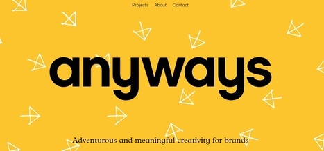
When thinking about web design, you must consider the full spectrum of possibilities that the internet presents. Done boldly, designers can push the limits of human interaction and imagination on a global scale – as is often seen with edgier industries, such as creative agency websites.
In this article, we’ll boil down some of the most prominent web design trends emerging in 2015. It is here that we can find true innovation and new opportunities – a few of which may completely change our understanding of a “modern website”....
There’s no reason for your designs to look drab – especially when it comes to color. A quick glance online and you’ll find a stockpile of color scheme apps ready to help you learn, play and perfect your next palette.From clever Hex code games to comprehensive color wheels, here are 15 of our favorite free color scheme apps to take your designs to the next level....
Undoubtedly, Adobe Creative Cloud is still the best choice for working with visuals and doing advanced design work. But creating great visuals no longer requires you to be a graphic design professional. Even if you don’t have the skills, you can use a variety of free web-based visual tools for designing eye-popping graphics directly in your browser. In this blog post, you’ll find six of the top free visual tools that you can use for your online project.Which visual tools do you use?...
|
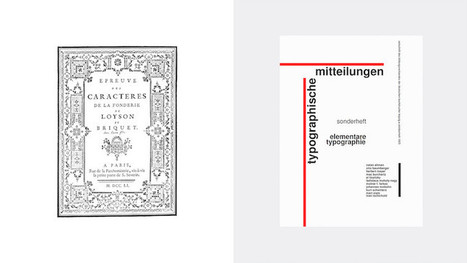
I launched Typewolf as a side project in June of 2013. Working as a designer, I was always frustrated by the lack of good resources for choosing fonts for design projects. Seeing type samples set in “the quick brown fox jumps over the lazy dog” isn’t very useful when it comes to web design—seeing how real type performs on actual websites is much more helpful. I’ve also noticed that other typography sites tend to be written from a type designer’s perspective rather than from the perspective of someone who actually uses type in their day-to-day work. I’ve been a designer for 15 years, so everything on Typewolf is approached from a designer’s perspective....
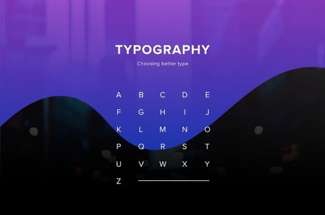
One of the most important skills you can learn as a designer is how to choose type. This is because text is one of the primary ways designers can communicate with users. Typography can make or break a design. There’s a beauty and complexity to typography. Some people devote their entire careers to type. Thankfully, their work is well documented, so we have tons of online resources for typography. This article is designed to serve as a starting point for helping you learn how to choose type for your designs. It will encourage you to explore fonts and font combinations beyond those you’re familiar with....
‘Crowded’ websites are difficult to read. Complexity often makes users uncomfortable. If we’ve overwhelmed them with lots of different information, all fighting for their attention, they will leave or not take the action we’d wanted them to do. It may be purchasing something on e-commerce website or reading the article on a blog. There is, however, a concept that helps graphic designers to create great web experiences, making the content appealing and easy to follow. It’s white space – the way of giving your layouts extra room, simply by avoiding unnecessary clutter and using the space between elements for their advantage....
As it turns out, posters aren't as old-school as we might think. In fact, they're still quite effective devices for promoting events. Making yours stand out, however, is the tricky part.Like so many other things in marketing, it requires a combination of creativity and formula. But what are the success factors? And what makes a poster look its best? You're in luck. Our friends at Venngage, who know a thing or two about creating compelling visuals, put together this infographic to guide you along your poster-making journey. It'll help you figure out what information is essential to include on your poster, and how to make it aesthetically appealing -- without overwhelming the viewer....
While clients often ask you to cram in as much information into a page as possible, seasoned web designers know this can lead to a usability nightmare. Confident and careful use of whitespace, in contrast, is all about giving content room to breathe. The examples listed here work because everything the visitor needs is still there on the page; all that’s absent would just be clutter. In place of that clutter, whitespace helps create a balanced, easy to navigate interface where you can find what you need without being overwhelmed....
For the early part of this century we saw a lot of colorful artwork in the shape of icons and vibrant mascots. Heavily shaded, three-dimensional characters, and richly rendered forms were all the rage. Now, illustration is heading for a more authentic and organic experience. Low-color, hand-drawn looks that are specifically created for a single-site use are becoming more common and are expected to stick around. Custom designs will more often take on a unique, loose and even childish feel. Websites will feel more personable compared to the copy and paste looks we have been seeing thanks to the prevailing flat design/minimalism bandwagon....
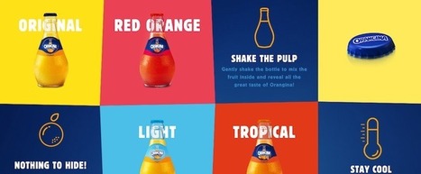
So what is product packaging? It’s a practical tool, yes. (I mean, how else are you going to effectively get beer into your mouth?) But it’s also more than that. Like any good design, packaging tells a story. It’s also a sensual experience, literally engaging us through sight, touch and sound (and possibly smell and taste, depending on the product/package). All of these details help us understand what the enclosed product is for, how it should be used, who should use it and, maybe most importantly, if we should buy a product or not. In the Ultimate Guide to Product Packaging Design we look at how to get your packaging to tell the story you want....
A lot of these lists just cram everything and anything into the lineup. So, we decided to pick our designers’ brains to bring you the best resources that we are using on a daily basis.
In order to arrange your design, you need a place to start. Backgrounds are the foundation of your graphics — it helps pave the path to forming a successful composition. Textures and colors help create depth and contrast, allowing your graphics to stand out and get noticed. Well composed images can help create space for you to overlay text, while visually communicating your message at the same time. Using a background can help give your designs more context and provide a visual element to help support your content. Bonus: We’ve designed most of the images in this article as templates for you to personalize! To use them for your own stuff, just click them and they’ll be ready to edit in your Canva account (No Canva? It’s free!).
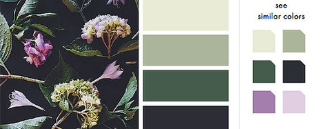
As Buffer writes, over 90% of our assessment of a product is made on color alone, so it makes sense that color should be considered with care for every design decision, particularly on websites. Chances are, if we don’t like the color palette, we’re not going to stay on the site for very long.
To get you started on your own palette, we’ve gathered 50 beautiful websites with versatile color schemes you can take inspiration from. So without further ado, let’s get knee-deep in some beautiful colors.
Landing pages are often the most effective means of getting customers to a product. Rather than a traditional website (with multiple tabs and in-depth content), the landing page is usually a stripped-down, single page that’s specifically made for potential customers to “land on” and convert.
To achieve this, these pages utilize a CTA, or “call to action”, that encourages visitors to complete an immediate action – such as downloading an app, submitting an email or purchasing a subscription. Done correctly these pages can revolutionize online marketing efforts. Check out some of these awesome examples from our site and get ready to come in for a landing!...
These are the prettiest free minimalist fonts you will ever want to use in order to create super-clean, gorgeous designs!
Whether you want to use them for prints or logos, or want to add them to a website, these minimalist fonts are very versatile and can be used in pretty much any kind of design.
The trend of minimal design is here to stay, which is why minimalist fonts are so popular among designers. With the overwhelming use of mobile devices, and the increasing emphasis of search engines on website speed and usable, users are now looking for designs that are easy to use, without any over the top effects or graphics.
The 25 free minimalist fonts showcased here in this list include both free serif fonts and free sans serif fonts. They have clean shapes, unique details and will make your designs pop out if you decide to use them!...
|


![Design School's Ultimate Guide to Designing With Backgrounds [With Ready-to-Use Templates] | Public Relations & Social Marketing Insight | Scoop.it](https://img.scoop.it/eUy0foC9bWwH53Mpp35bKjl72eJkfbmt4t8yenImKBVvK0kTmF0xjctABnaLJIm9)


Some people think they're stuck using stock images for their designs, but you can always learn how to create custom graphics for your website. Three tools reviewed are Canva, Pixlr and PicMonkey -- I recommend each highly.