 Your new post is loading...
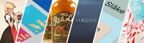
While big businesses often have multiple decision makers with very specific ideas and guidelines to keep their existing brands consistent, smaller companies are usually more open to exploring new creative directions, and can move faster to implement them. If you need some more convincing that working with small businesses can result in some stunning creative work, we've put together a list of 15 small business branding examples to get you inspired for your next project...
Fresh, innovative, creative, minimalist award winning web design agencies websites for inspiration. Today we've selected 26 best web design agencies' websites. Beautiful examples of Web Design Agencies websites for inspiration. These agencies are are using the latest technologies “HTML5, CSS3 and JavaScript” for their websites to create perfect and eye catching design. Let’s take a quick look at some amazing new web trends to keep in mind when designing your next website project.
For the early part of this century we saw a lot of colorful artwork in the shape of icons and vibrant mascots. Heavily shaded, three-dimensional characters, and richly rendered forms were all the rage. Now, illustration is heading for a more authentic and organic experience. Low-color, hand-drawn looks that are specifically created for a single-site use are becoming more common and are expected to stick around. Custom designs will more often take on a unique, loose and even childish feel. Websites will feel more personable compared to the copy and paste looks we have been seeing thanks to the prevailing flat design/minimalism bandwagon....
If you follow the right people, that's what Instagram can do for you. There are a lot of really talented artists and designers out there who use Instagram as a sort of mini art gallery -- a social portfolio, if you will. And it's a jackpot for people who love browsing gorgeous design work. To help you narrow your search, I've carefully curated some of the best Instagrams to follow for design inspiration. I did my best to place them in categories -- illustration, graphic design, pop art and installation, color palettes, street art, photography, typography, and calligraphy -- although you'll notice some of their work could fall into a number of different lists. Whether you're a designer looking for inspiration, or you simply harbor an appreciation for art and design, you'll want to check out (and follow) these accounts. ...
In a sea of similar items, how do you make your product packaging stand out? One of our favorite ways is by complicating it a little with 2016’s coolest packaging trend. Designers are imbuing their designs with texture, giving packaging a tactile quality that drives shoppers to grab them off the shelf.
A great way to accomplish this tactility is by adding a pattern to your package. A play off of color and shape that gives a little hint as to what’s inside, or tells a story without using words. Designers have been doing this for ages, but if you pay close attention, you’ll notice that the kinds of aesthetic stories they tell change from year to year.
Here are five different ways for you to work with the hottest 2016 packaging trend – using patterns to create textural design and to stand out from the crowd:...
See what the design world will look like this year with Shutterstock’s latest infographic.Global TrendsThe top four trends making an impact around the world.
What better time to kick off a fun community contest than right before the Academy Awards?! This time around, we turned to our designer community to reimagine the 2016 Oscars movie posters for the 8 “Best Picture” nominees, drawing inspiration from the minimal movie poster trend.
The results were great – and Mad Max and The Martian were definite favorites. Check out the winners and some of the highlights below!...
As we prepare for another exciting year of design, let’s take a look back at some of the best 2015 content from The Creative Edge…
Presenting the recipients of Best In Class, a special award to commend the most impressive sites in each of the WOTY 2015 award categories.
There’s no right choice here (unless your deadline is tomorrow), but if you’re the kind of designer who likes to plough on and get work done, this article is the resource for you.
You’re about to find 70 inspiring Pinterest design boards that are guaranteed to inspire your creative genius, for free, and get you on the road to your next great design....
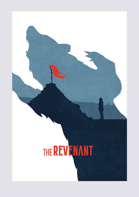
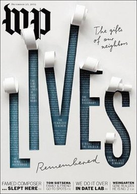
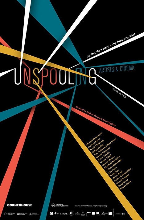
How will your magazine cover attract the potential buyer’s attention? By being striking. Study the competition and do something different. Create a cover design that attracts attention for being unusual, extreme or prominent; a cover that stands out like a sore thumb on a crowded magazine rack. And as these striking magazine covers demonstrate, create a design concept that is closely tied to the theme of the magazine issue.
So, let’s get on with the show – or the showdown. In the great magazine cover battle, here are 50 striking magazines that have delivered winning blows....
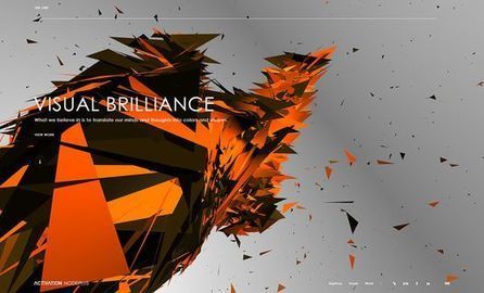
While they don’t save the day or wear flashy capes, hero images are a very important and very effective tool in the world of web design. Basically, the term ‘hero image’ refers to a specific type of website banner, usually quite large and at the very top of a website.
For sites that use hero images, it is often the first thing users see when they click through to a site. So, it’s probably wise to think of hero images like an introduction – they give users a sense of what to expect from the rest of the site.
If you have a sophisticated hero image, they’ll expect class and culture, or if you had a colourful and fun hero image, and they may expect some comedy and playfulness.
Whatever your choice of tone, let’s have a look at 35 striking examples of hero images to get you inspired and on your way to crafting your own heroic image today....
Your portfolio website is one of the first things your clients will see, so it’s important to get its design just right. Are you designing your very first portfolio website? Or do you need motivation to redesign an existing one? Check out these excellent portfolio websites for ideas and inspiration.
|
Twibfy is an inspirational platform and marketplace for creative professionals. Discover and purchase high quality digital visual content curated by creatives for creatives and organize it in the Twibfy cloud. The marketplace offers an environment for talented people to showcase their work and instantly sell it through the platform.
A new book, Let's Play, tasks 100 Swiss designers to play with toy blocks, then photographs the results, looking for trends. In the new book Let's Play, artistic director Christiane Nill and photographer Lionel Henriod task 100 Swiss creatives who work in three-dimensional fields like architecture, sculpture, and industrial design to play with blocks for the camera then document what they make. The parameters of Let's Play are simple. Designers are given 270 simple wooden blocks which have been custom created for the project. All blocks are visible at the beginning of each play section, and they're organized into groups of 34 different shapes. Each player has 30 minutes to construct something using any of the blocks they want, plus three picked by the previous player—those must be incorporated into thee structure. (The first player used blocks selected by the carpenter who made them.) Beyond that, anything goes....
This might be the coolest thing you'll see today -- a church ceiling in Paris being used for a crazy interactive art project. For the yearly art night Nuit Blanche in Paris on October 1, Mexican artist Miguel Chevalier covered the entire upper part of the Eglise Saint-Eustache for his installation Voûtes Célestes, which roughly translates to Heavenly Vaults. He used several projectors to overlay visuals onto the church’s ceiling, or in his own words: These digital constellations of pixels immerse visitors in an atmosphere bathed in light while opening unto infinity. A new era of tech events has begun Among the animations were abstract star constellations, colorful geometric shapes and lines following the shapes of the church. The impressive visuals were accompanied by an organ player and a choir, which made the performance even more intense....
Designers of any creative art borrow design inspiration from several sources online. Open source community provides most of the designs we find all over. They also contribute to the open source platforms where other designers can access their creative designs. Borrowing from different people and sources prevents monotony. This keeps the followers hooked and excited. The internet provides endless solutions to our existing problems. Solutions are just a click away. This article discusses such life-changing design inspiration resources to help you solve all your design needs, regardless of what kind of a designer you are, so:
Here are 20 great sources for your design inspiration...
Think about the iconic brand names you know: Apple, Target, McDonald’s, Gap. What images come to mind? For many of us, probably their logos. That’s because whether it’s an apple or big golden arches, a logo is crucial to a company’s identity. Now, new research says that logos are even more important than businesses and consumers realize. A recent study in the Journal of Consumer Research found that even just a basic element of logos—their shape—affects how people perceive a company and its products.
There’s already a good amount of research on how logos influence customers. For example, a 2011 study found that when a company has an incomplete logo (think IBM), people perceive the business as more innovative but less trustworthy. Another weird logo effect that researchers have found: when consumers see a complex-looking logo over and over again, they start to like the brand more. Given these past findings, Amitava Chattopadhyay and his team at INSEAD thought something as simple as a logo’s overall shape—circular or angular—might also impact people’s opinions in a significant way....
The really eye-catching execution advertises Purdy's XL brushes, which can paint on practically any surface. To communicate this, the agency used XLs to paint over a billboard-size section of an ordinary New York City street—covering materials including brick, glass, wood, metal and plastic.
Among the objects that got a coating of bright yellow: a trash can, a newspaper stand, a bicycle, delicate flowers and even a pigeon. (Yes, it's fake. Don't go torturing actual NYC pigeons with your Purdy brushes.) And while this execution is visually reminiscent of OBI's famous German work from 2014, the message is different....
It is natural to look at brilliant designs by Paul Rand, Saul Bass or David Carson and to want to create designs like that – or even to want to be as great as them. This inspiration is what has reeled many of us into the field of graphic design. For some, it leads nowhere. For others, it unearths a true passion for design and occasionally it brings a brilliant designer into the limelight.
Inevitably, greatness is a status that occasionally churns in the back of a graphic designer’s subconscious. This article brings the concept of greatness to the forefront and breaks it down by looking at commonalities between the all time great graphic designers; both in talent and fame. This list is a good starting point for anyone questioning their status in graphic design....
We’re so excited to have finished 2015 off with a bang! Last December, we ran the third certification contest for Logo & Web. See below for the contest’s top 20 entries and find out why Jimdo’s multi-talento Brent Gummow thinks they out-shined their competition.Let’s start with the winner:...
So, it’s safe to say that composition is pretty important. So, what exactly is a composition? Well, in very simple terms, it’s the part where all the separate elements come together to form a whole. When all of your type, your images, your graphics and colors, come together to form one cohesive design.
A successful composition means that you have arranged, distributed, aligned and compiled your design in a way that not only looks good but is also highly functional and effective. So, let’s run over a few tips, tricks and techniques that will have you mastering composition in no time....
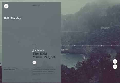
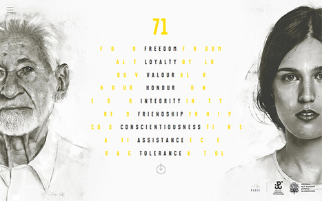
One of the more interesting design trends is the split-screen layout, in which some kind of vertical break divides portions of the page into two or more parts. A split-screen websites will showcase messages which are equal in terms of importance. If you offer goods, as well as services, you may feature your products on one side of a split screen and then highlight your services on the other side. So here, we take a look at some of examples of split-screen layout in Web design.
Inspiring Sites of the Week is the weekly series where we feature the latest and hottest websites targeting the design world from around the globe.
On a hot day, instead of cranking up the air conditioning, this house transforms: A screen and shell move out to wrap around the entire home, shading everything so it cools down."
It provides this flexible control over heat gain from sunlight," says architect Todd Fix, who compares the screen and shell to extra layers of clothes you can put on or take off. "So if it's a cold day, the sensor will sense that, and it will close both to keep the heat inside. If you want more light in the space, you can open up the screen or open up the shell.
"It's a way to create a passive, zero-energy home without the typical passive house design. "The living area is all glass, from the walls and ceiling to the floors," Fix says. "This opens up a house. Instead of having really thick, insulated walls that are opaque, so you can't see out or see in, it kind of opens you up to the environment."....
|


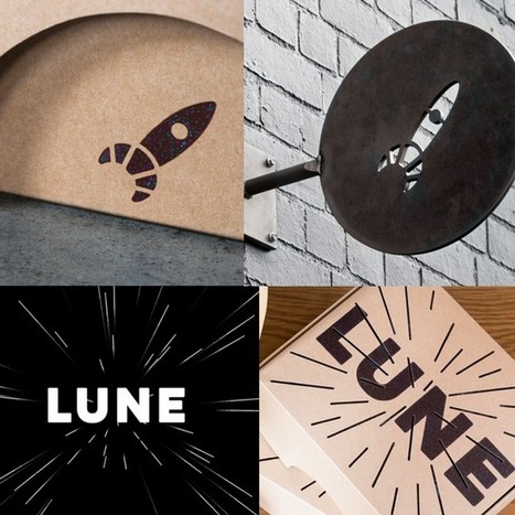


Check out these stunning and unique examples of small business branding from HubSpot.