 Your new post is loading...
If you follow the right people, that's what Instagram can do for you. There are a lot of really talented artists and designers out there who use Instagram as a sort of mini art gallery -- a social portfolio, if you will. And it's a jackpot for people who love browsing gorgeous design work. To help you narrow your search, I've carefully curated some of the best Instagrams to follow for design inspiration. I did my best to place them in categories -- illustration, graphic design, pop art and installation, color palettes, street art, photography, typography, and calligraphy -- although you'll notice some of their work could fall into a number of different lists. Whether you're a designer looking for inspiration, or you simply harbor an appreciation for art and design, you'll want to check out (and follow) these accounts. ...
Graphic design is an industry that has been growing and changing for centuries at the hand of countless designers.
So, to celebrate this rich and exciting history, we’ve compiled a list of 40 famous designers that have done their part in shaping graphic design in some way.
From those who specialize in typography or magazine design, through to album covers and political posters, each of these people have made their mark on the industry and shaped it in some way through hard work and some great designs. With that, let’s have a look at 40 people who changed graphic design for good....
If you are looking for inspiration to make your sign up and login forms a breeze to fill in, in this post, i’d like to present a couple of new ideas that might be useful for your next designs.
The use of geometrics provides graphic designers with a fantastic opportunity to add to the flat design trend. Combined with flat design the use of geometric shapes enables a designer to stay true to the fundamentals of flat design – creating clean and clear designs, while also providing them with a clever use for negative space, and fun ways to explore colours.
So in this post i collected 20 WordPress Themes utilizing geometric concepts and shapes to produce simplistic, fun, modern and innovative designs with content at the forefront.
A website with a design one major color or shades of one color is called a monochromatic website. In this post, we have the beautiful examples of Monochromatic Website Designs that you can check out below. Scroll down and maybe get some fresh ideas and inspirations for your own work. Take a peek, and enjoy the designs!...
Looking for inspiration?
Here are 51 striking poster designs that beautifully illustrate minimalism by incorporating simple shapes, typography and colors to convey the message....
Featuring an awesome line-up of designers, illustrators and typographers who are sharing their fantastic portfolios on the image-sharing site, this article is a must-read if you are looking to turn up the beauty, style and creativity on your daily feed.
From colorful hand-made typography to surreal 3D illustrations, head over here to learn more about these Instagram-savvy graphic designers....
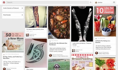
You notice well designed food packaging while wandering grocery store aisles. You try to identify the fonts used on advertisements or store signs. You’re tempted to buy greeting cards just because they have a really great design or illustration.If you’re like me, maybe you’re constantly bookmarking designs you find online or you compile boards of inspiring work on Pinterest....
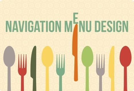
Navigation menu design is not a simple bar on top of the screen. New solutions and design tricks are widely used for this key site element.
Via Mark Strozier
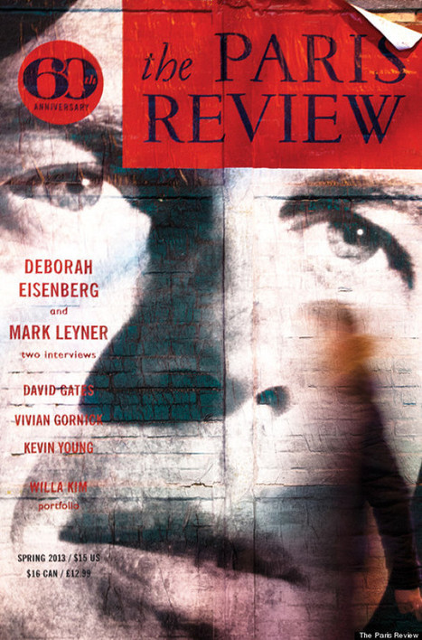
In 1953, writers George Plimpton, Harold L. Humes, and Peter Matthiessen banded together to found The Paris Review, the famed magazine that gave voice to literary giants like Ernest Hemingway and Jack Kerouac. Today the formidable institution is celebrating an impressive 60 years in operation....
|
How many times you have struggled with the ideas. How to do that or that, how to finish this design or illustration? For me, it happens a lot and I think is normal. Time to time designers face this “black” interim. I’m not saying that you need steal other ideas or designs, but you need to check how the professionals are doing things, it will let you step out of your zone and make something better.
I have collected 15 websites which are covering everything you need, from web design and illustration to furniture design and app design. I hope all these websites will inspire you and will help you to finish your ideas faster and better....
So, it’s safe to say that composition is pretty important. So, what exactly is a composition? Well, in very simple terms, it’s the part where all the separate elements come together to form a whole. When all of your type, your images, your graphics and colors, come together to form one cohesive design.
A successful composition means that you have arranged, distributed, aligned and compiled your design in a way that not only looks good but is also highly functional and effective. So, let’s run over a few tips, tricks and techniques that will have you mastering composition in no time....
As most of you guys probably know, the footer is the last significant part of a website. It tends to be used for placing important information, such as the RSS feedback button, slide galleries, contact information, latest posts, the site map, among others. But the footer its not just a large space to fill the bottom of the page. It's a whole design area, in which the designer can place some pretty cool ideas that will not fit inside the main space of the site. In this countdown, we will be showing you some of the coolest footer ideas on the web, so lets get it started.
Whether by conscious decision or force of habit every designer has a formula for creating new work.
Over time they develop a set of rules which guide the creative process to what they believe to be a successful outcome. While these unwritten rules are unique to each individual they are likely to focus on 6 key areas. We’ve illustrated these below for you....
10 web designers who have amassed an excellent body of work and done something truly outstanding over the past year, as voted for by you!It's that time again!
Voting is now open in the 16th annual net awards and the leading lights of the web world are waiting to see whether they win one of the most sought-after prizes in the web design world.
There are 20 categories this year, including Designer of the Year. Below is the shortlist based on nominations from the public and in no particular order. We invite you to check them out and then vote for your favourites....
Choosing harmonious font combinations is a key part of typography. Good font pairings will lead to beautiful designs that are also easy to read.For font-pairing ideas and inspiration, check out the following resources....
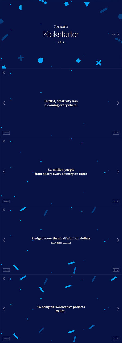
I kinda wish I’d thought of this topic earlier this year, but I recently came across some really cool 2014 Year in Review features that I’d missed at the turn of the year. I thought there was probably some others that I’d missed too, so I took some time to round up all the best microsites that documented various stats from 2014. There’s some inspirational layouts and clever use of web effects that make them definitely worth checking out!...
Creating your own images is also an excellent tactic for re-purposing text-only content into enticing images. Here are some examples: Turn quotes into an interesting slideshow, post an event announcement on a pretty picture, place stats onto eye-catching graphs, give a blog post title some pizzaz, create an infographic about the history of your biz, create a catchy, custom featured image for a video, etc. The possibilities are endless.
To help you create images that get BuzzFeed-worthy engagement, here are 13 of our favorite and easy-to-use visual content creation tools....
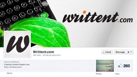
If you’re trying to harness the power of Facebook to market your business, great content and lots of engagement are only 2 pieces of the puzzle. To really make the most of your presence on this popular social network, you need your business page to be attractive. Why is an attractive Facebook page important? - attractiveness = likeability, meaning more fans - a visually pleasing page is easier for fans to engage with - fans consume your content more easily - attractive content is more likely to be shared Plus, an attractive, branded page looks more professional, amplifying the benefits of being on Facebook. Use these 5 ideas to get started with this social media and make your business Facebook pages more attractive....
The color scheme of a site creates its atmosphere. It should be fitting, good looking, and attractive. At the same time, it should not impede visitors to use the website and easily find all necessary information. No matter what kind of business you have, don’t be afraid to use bold color schemes for your website. Here I have showcased 50 fantastic websites with extremely bright color palette for inspiration. All of them are great examples of beauty and creativity in web design....
|


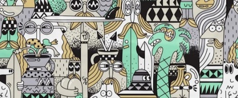


Check out Lindsay Kolowich's carefully curated list of the best Instagram accounts for beautiful illustration, graphic design, photography, typography, street art, and more. Recommended reading. 9.5/10