Public Relations & Social Marketing Insight
443.6K views | +1 today
Follow
Public Relations & Social Marketing Insight
Social marketing, PR insight & thought leadership - from The PR Coach
Curated by Jeff Domansky
Your new post is loading...
Scooped by Jeff Domansky
Scoop.it!

24 Minimalist Print Ads to Inspire Your Creativity

24 Minimalist Print Ads to Inspire Your Creativity | Public Relations & Social Marketing Insight | Scoop.it

Simplicity never feels big enough. We want big, impressive, inspiring, creative ideas, right?


So we add, and add, and add. Paring back -- removing extra words, images, slogans, and the innumerable things a brand wants to communicate to a consumer in one ad -- isn't easy. But when a brand conveys a message using only the most essential images and text, we take notice. We recognize how difficult it was to tell a story or highlight a benefit using only a few elements.


If you're looking for inspiration on how to make simple attention-grabbing, check out these minimalist print ads....

Jeff Domansky's insight:

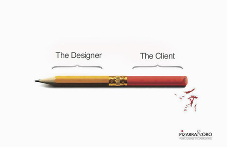
Be inspired by these minimalist print advertisements.

No comment yet.
Scooped by Jeff Domansky
Scoop.it!

27 Funny Posters & Charts Graphic Designers Will Relate to

27 Funny Posters & Charts Graphic Designers Will Relate to | Public Relations & Social Marketing Insight | Scoop.it
We at DS come across a lot of memes, comics and artworks that offer a hilarious look into the life and mind of a graphic designer. So we thought, why not collate a few good ones into one cool post? Who knows, it might even drive some sense into an unreasonable client and make him/her change his/her attitude? Wishful thinking, we guess. Enough talk, check them out below....
Jeff Domansky's insight:
What an awesome, fun look at client relations. If you are a graphic designer, web expert, marketing pro, PR consultant or anyone else with a client, you'll be able to identify with these visuals. This is a must -read and highly recommended 10/10
Kim S Martin's curator insight, January 18, 2015 7:53 AM

We can relate: 

Marta Ciesielska's curator insight, January 19, 2015 3:15 AM

A little bit of information about designer-consumer relations. Something funny for Monday - I especially liked 17, 10 & 7 (to 7 I would add language mistakes in restaurant's menu).

Bartek Daniel's curator insight, January 20, 2015 12:00 PM

Humorystyczne obrazki dotyczÄ…ce grafików komputerowych.

Scooped by Jeff Domansky
Scoop.it!

Redesigning The Bible With Readability In Mind | Fast Company

Redesigning The Bible With Readability In Mind | Fast Company | Public Relations & Social Marketing Insight | Scoop.it

The goal of the Bibliotheca project is to print a Bible that you'll want to read cover to cover.The Bible is sometimes called the greatest story ever told. Its typography, on the other hand, leaves much to be desired. Unlike the layout of novels, the layout of the Old and New Testament discourages reading the book from front to back.


Normally printed as a single, 2,000-odd page volume with microscopic, two-columned text, the Bible's typography is designed with reference, not readability, in mind. No wonder that while 73% of Americans say they are Christian, only one in five Americans will cop to actually reading the Bible on a regular basis.


IT'S A BIBLE THAT WANTS TO BE READ LIKE A SHORT STORY COLLECTION.


A new Kickstarter project by Santa Cruz typographer Adam Lewis Greene is hoping to improve Biblical literacy. Called the Bibliotheca, the project is a new printing of the Old and New Testaments that is designed to be read from cover to cover....

Jeff Domansky's insight:

Let there be creativity and content marketing ;-)

No comment yet.
Scooped by Jeff Domansky
Scoop.it!

Infographic: Why marketers choose certain colors

Infographic: Why marketers choose certain colors | Public Relations & Social Marketing Insight | Scoop.it
This infographic explores the psychology of color and suggests why brands like McDonald’s and Pizza Hut prefer red whereas Lowe’s opts for blue.
Jeff Domansky's insight:

All about the colors of marketing.

Zeebric's curator insight, May 22, 2013 3:52 AM

Wow...never really considered colours! This infographic makes perfect sense, though

WEDCBiz's curator insight, May 22, 2013 10:21 AM

Not that all of us agree with painting our daughters' rooms pink, but still, color is something we should consider when branding our small businesses.

Ali Anani's curator insight, May 23, 2013 12:16 AM

A must reading to know your feelings and feelings of others

Scooped by Jeff Domansky
Scoop.it!

15 Corporate Logos That Contain Subliminal Messaging

15 Corporate Logos That Contain Subliminal Messaging | Public Relations & Social Marketing Insight | Scoop.it

Subliminal logo messages: Have you spotted them before?

Jeff Domansky's insight:

Lots of fun and you may find a few subliminal elements to logos that you haven't noticed before.

Marcel Magem Rico's curator insight, April 21, 2015 5:10 AM

Recull de logos amb possibles missatges darrere.

Scooped by Jeff Domansky
Scoop.it!

Adventures in Marketing: Polaroid Will Make an ‘Instagram Camera’ | PRNewser

Adventures in Marketing: Polaroid Will Make an ‘Instagram Camera’ | PRNewser | Public Relations & Social Marketing Insight | Scoop.it

As if Instagram weren’t easy enough already, last week we learned that the Socialmatic, aka the “Instagram Camera”, is really going to happenthanks to a deal between an Italian inventor and the folks responsible for the Polaroid name. We find the concept behind this product amusing, but it also represents the latest step in an interesting rebranding experiment.


The old-school camera company went bankrupt more than a decade ago, and the folks who bought the name quickly began making money by licensing it to other brands. C&A Licensing, which owns the rights to all things “Polaroid”, already attempted to tie it to the smartphone craze earlier this year by planning a series of “FotoBar” locations that aim to put the brand back in business by aping the Apple Genius Bar retail model....

Jeff Domansky's insight:

With your Google Glass, Instagram Camera and iPhone, your mobile PR office is set. Isn't marketing wonderful?

No comment yet.
Scooped by Jeff Domansky
Scoop.it!

Brochure Design: 25 Tips to Create Marketing Materials That Sell – Design School

Brochure Design: 25 Tips to Create Marketing Materials That Sell – Design School | Public Relations & Social Marketing Insight | Scoop.it

We’ve all received brochures from various businesses and most of the time they all have one thing in common — they’re boring.


Whether they’re packed with so much information you feel like you’re about to read a full length novel, or so plain you feel like you’re sitting in the dentist’s office, brochures tend to get a bad rap. They may be chock full of important stuff, but unless you can get someone to pick it up and read it, it doesn’t matter how great the content inside is.


Here are 25 ways to step up your brochure design game and ensure your information will be shared....

Jeff Domansky's insight:

Don't settle for a boring brochure. Try these 25 creative techniques to create marketing materials people will want to read.

No comment yet.
Scooped by Jeff Domansky
Scoop.it!

Big List of 52 Sites That Inspire: No Excuse for a Creative Slump Ever Again

Big List of 52 Sites That Inspire: No Excuse for a Creative Slump Ever Again | Public Relations & Social Marketing Insight | Scoop.it

We all know it can be tough to perform when the creative juices are not flowing. This is especially true when you are doing the same thing over and over and over again and having to come up with creative eye-popping solutions every single time.


That’s why I curated this list. I pulled from various websites & forums and just .. put it all together. Hope you enjoy, and most of all never have an excuse to be in a creative slump.. ever again....

Jeff Domansky's insight:

Awesome list of creative resources. Recommended reading 9/10

Suvi Salo's curator insight, August 24, 2014 11:00 AM

For some situations...

Scooped by Jeff Domansky
Scoop.it!

Colour trends in web design for 2013 | Web design | Creative Bloq

Colour trends in web design for 2013 | Web design | Creative Bloq | Public Relations & Social Marketing Insight | Scoop.it

Pantone Color Institute kicked things off by naming emerald green as its official 2013 colour. Fashion, interior design, graphic design and other industries followed suit by using the basic colour wheel as inspiration for 2013 colour trends. Here I'll look at five of the biggest colour trends in web design. You don't have to follow them, but it's important to know what they are...

Jeff Domansky's insight:

Brandon Hill picks five big colour trends for websites in 2013. Marketing, product and web designers take note.

No comment yet.
Scooped by Jeff Domansky
Scoop.it!

These Huge Brands' Early Websites From The 1990s Looked Terrible

These Huge Brands' Early Websites From The 1990s Looked Terrible | Public Relations & Social Marketing Insight | Scoop.it
Whoa! A very cool trip down the Internet memory lane... The internet's embarrassing middle school yearbook.
No comment yet.
Scooped by Jeff Domansky
Scoop.it!

7 B2B Companies to Admire for Exceptional Visual Content | HubSpot

7 B2B Companies to Admire for Exceptional Visual Content | HubSpot | Public Relations & Social Marketing Insight | Scoop.it
Get inspired by these 7 B2B companies we admire for awesome visual marketing content.


...Lucky for you, there a ton of ways you can get visual without taking screenshot after screenshot of your "boring" product. In fact, you already have the resources and know-how you need to create visual content right on your computer (or how to hire someone to help you out). Now all you need is a little dose of inspiration and creativity. So to help you get out of that non-visual rut and feel inspired to create awesome visual content of your own, we’ve compiled several noteworthy visual content examples from some B2B companies that have it right.


Just keep in mind that effective visual content may not always make you gasp, “Wow!” Remember that intricacy of design and professional photography skills aren’t always necessary in order to create outstanding visual content that brings in new visitors, leads, and customers to your business....

Jeff Domansky's insight:

HubSpot shares seven tasty visual content examples for your inspiration.

No comment yet.
Rescooped by Jeff Domansky from WebsiteDesign
Scoop.it!

Creative Techniques for Single-Page Websites | Tips

Creative Techniques for Single-Page Websites | Tips | Public Relations & Social Marketing Insight | Scoop.it

Over the past few years there has been an emergence of new custom trends in website design. A very popular idea is placing all your major content onto a single page and using dynamic scrolling animations to locate bits of content. These single-page layouts are popular among landing pages and mobile apps which only need to display a small section of related information.


In this article I would like to go over some interesting techniques you’ll find in single page websites. Hopefully these ideas may provide inspiration for younger designers who are looking to move into this area. Generally the frontend will require some type of scripting effects through a library such as jQuery. Overall the techniques can be practiced and learned very quickly, and it’s a wonderful style for basic webpages....


Via Brian Yanish - MarketingHits.com
Jeff Domansky's insight:

Great examples of one-page website and portfolio designs that translate well to mobile too. Perfect for resumes or added social media profile as well.

Gerlando Piccionello's comment, January 25, 2013 6:01 PM
Good
Jeff Domansky's comment, January 25, 2013 6:27 PM
glad it was useful Gerlando