 Your new post is loading...
In terms of design, the minimalist aesthetic is the visual representation of this concept. Even if in the early days of this style it was very difficult for the designers to achieve its simplicity and clean lines, they have learned to “declutter” the visual to the point of it being the second nature. However, some of the designers take it a step further and cut out almost everything from the design.
Indeed, even if the latest web designs with loud color, trendy headers, and stunning imagery are really attractive, sometimes, it’s nice to see and admire the everlasting minimalist style. The ultra-minimalist websites in this list focus on composition and typography to create clean and simple visuals, and the naked designs are as beautiful as those full of glamour.
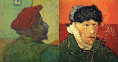
"Between two such beings as he and I, the one a perfect volcano, the other boiling too, inwardly, a sort of struggle was preparing." In February of 1888, a decade after Van Gogh found his purpose, he moved to the town of Arles in the South of France. There, he exploded into a period of immense creative fertility, completing more than two hundred paintings, one hundred watercolors and sketches, and his famous Sunflowers series. But he also lived in extreme poverty and endured incessant inner turmoil, much of which related to his preoccupation with enticing Gauguin — whom he admired with unparalleled ardor (“I find my artistic ideas extremely commonplace in comparison with yours,” Van Gogh wrote) and who at the time was living and working in Brittany — to come live and paint with him. This coveted cohabitation, Van Gogh hoped, would be the beginning of a larger art colony that would serve as “a shelter and a refuge” for Post-Impressionist painters as they pioneered an entirely novel, and therefore subject to spirited criticism, aesthetic of art. Van Gogh wrote to Gauguin in early October of 1888:I’d like to see you taking a very large share in this belief that we’ll be relatively successful in founding something lasting. Despite his destitution, Van Gogh spent whatever money he had on two beds, which he set up in the same small bedroom. Seeking to make his modest sleeping quarters “as nice as possible, like a woman’s boudoir, really artistic,” he resolved to paint a set of giant yellow sunflowers onto its white walls. He wrote beseeching letters to Gauguin, and when the French artist sent him a self-portrait as part of their exchange of canvases, Van Gogh excitedly showed it around town as the likeness of a beloved friend who was about to come visit.Gauguin finally agreed and arrived in Arles in mid-October, where he was to spend about two months, culminating with the dramatic ear incident....
The idea pops into my mind almost immediately. For weeks, amid my dad’s barrage of doctor’s appointments, medical tests, and treatments, I keep the notion to myself.
I dream of creating a Dadbot—a chatbot that emulates not a children’s toy but the very real man who is my father. And I have already begun gathering the raw material: those 91,970 words that are destined for my bookshelf....
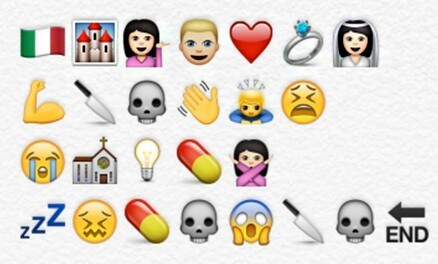
Many stories are told via emojis, but Twitter and London’s Royal Opera House are taking it to the next level on Monday, July 17, in honor of World Emoji Day, using them to tell the story of an entire opera. This isn’t the first collaboration between these unlikely partners: They first joined forces to tweet an opera in August 2009. On Monday, the Royal Opera House will be tweeting all day long using emojis—and only emojis—to share the story of famous operas and ballets. There will be a new tweet every 30 minutes....
Less is a bore, as Robert Venturi once said. Minimalism has held a tight grip on the modern design industry for the past decade. We embraced the Apple aesthetic, extolled the logic of Helvetica, and worshiped at the church of Dieter Rams. It served its purpose, most recently, as a correctional to the excesses of the 1990s. But lately, as dispatches from Milan Design Week have shown, asceticism has given way to audacity. Every April, hundreds of thousands of people trek to Milan for its trendsetting design week, which ultimately influences the furniture, accessories, and textiles that make their way into homes, offices, hotels, restaurants, and virtually every other interior. This year the artistic influences ranged from ’30s art deco to ’70s eclecticism. Designers and manufacturers experimented with digital fabrication–like 3D knitting–and rediscovered artisanal craft techniques, like lacquering, metal casting, and jacquard weaving. But one thing was consistent: They’re embracing luxurious materials and textures, testing ambitious silhouettes, and piling on the details to yield products and furnishings that are visually enticing and emotionally evocative.In other words, minimalism is dead; maximalism has arrived....
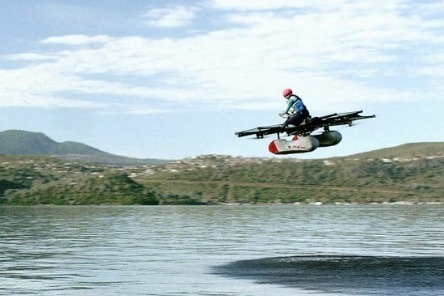
For those of us who commute, we’ll spend over a year of our lives stuck in traffic.” So said engineer Todd Reichert as he introduced an alternative at TED 2017: a 100% electric flying vehicle under development now. A recreational version of the vehicle, called the Kitty Hawk Flyer, is expected to launch in late 2017.
Using electronic sensors similar to those found in cell phones, the device controls and stabilizes eight electric rotors. “With this kind of control, we can make flying as simple as playing a video game, using a very similar set of joysticks,” Reichert says. The vehicle, with room for one person, is designed to make it possible for anyone to learn to fly in minutes.
Rapidly advancing battery technology makes it possible to run the vehicle on electricity. “We’re just crossing this threshold now where [batteries] start to make sense for flight,” he says. “This is incredibly exciting for us–it opens up an entirely new set of design possibilities. We can design with multiple, small, lightweight electric motors in a variety of different configurations.”
The first version of the vehicle, classified as an “ultralight” aircraft, somehow doesn’t require a pilot’s license and can avoid complex regulations. With current battery technology, it can fly about 15 miles before it needs to be recharged, though that range will increase as batteries continue to evolve. For now, it’s designed to be flown only above water, at a low height, to keep it as safe as possible. But the team plans to rapidly iterate other models that they want to be used more widely–and over city streets....
25 of the most rare photos in history you never seen before and won't believe this really happen around the world
Editor’s Note: In the world of web design, we tend to become preoccupied with the here and now. In “Resilient Web Design“, Jeremy Keith emphasizes the importance of learning from the past in order to better prepare ourselves for the future. So, perhaps we should stop and think more beyond our present moment? The following is an excerpt from Jeremy’s web book. Design adds clarity. Using colour, typography, hierarchy, contrast, and all the other tools at their disposal, designers can take an unordered jumble of information and turn it into something that’s easy to use and pleasurable to behold. Like life itself, design can win a small victory against the entropy of the universe, creating pockets of order from the raw materials of chaos....
Intuition, argues Gerd Gigerenzer, a director at the Max Planck Institute for Human Development, is less about suddenly "knowing" the right answer and more about instinctively understanding what information is unimportant and can thus be discarded. Gigerenzer, author of the book Gut Feelings: The Intelligence of the Unconscious, says that he is both intuitive and rational. "In my scientific work, I have hunches. I can’t explain always why I think a certain path is the right way, but I need to trust it and go ahead. I also have the ability to check these hunches and find out what they are about. That’s the science part. Now, in private life, I rely on instinct. For instance, when I first met my wife, I didn’t do computations. Nor did she."I'm telling you this because recently one of my readers, Joy Boleda, posed a question that stopped me in my tracks:What about intuition? It has never been titled as a form of intelligence, but would you think that someone who has great intuition in things, has more intelligence?
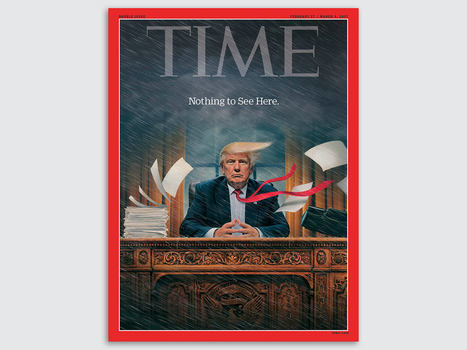
The 2016 election and new administration come accompanied by a renaissance of political image-making: The release of new cover art by magazines like Der Spiegel and Time are met with thousands of shares and retweets. Each photograph and illustration is analyzed and picked apart by commentators. And fomenting all of this is a protest movement with a flair for signage that remixes, reappropriates, and borrows the work of these artists.
Not since George Lois's iconic work for Esquire in the '60s has cover art enjoyed so much popular and critical success. It’s a fascinating time to be an illustrator, designer, or painter working on political subjects. Co.Design asked some of the voices and pens behind today’s iconic cover art about their work—and what’s changed in the past three months....
Twibfy is an inspirational platform and marketplace for creative professionals. Discover and purchase high quality digital visual content curated by creatives for creatives and organize it in the Twibfy cloud. The marketplace offers an environment for talented people to showcase their work and instantly sell it through the platform.
Curated directory of the best Product Pages
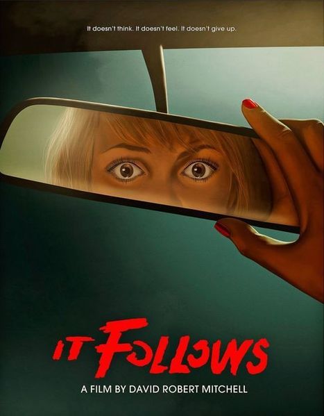
Posters offer a diverse canvas for graphic designers, and some of the very best are not only beautifully designed but also inspiring and thought-provoking. There are hundreds of stunning poster designs that are instantly eye-catching, but we’ve narrowed this list down to a few of the most intriguing examples from the current decade. Whether you prefer to be bold or understated, you’re certain to find something here that will get your creative juices flowing.
|
...But to help you narrow your search, we've done a bit of our own curation of the best Instagram accounts to follow for design inspiration. We've broken the list down by category: illustration, graphic design, pop art and installation, color palettes, street art, photography, typography, and calligraphy -- although, you might notice that some of the work below could fall onto more than one list. Check out how these artists are sharing their work with the world -- we're sure you'll find them as inspiring as we do....
ON FRIDAY EVENING, inside an old-movie-house-cum-art-gallery at the heart of San Francisco's Mission district, Google graphics guru Blaise Agüera y Arcas delivered a speech to an audience of about eight hundred geek hipsters. He spoke alongside a series of images projected onto the wall that once held a movie screen, and at one point, he showed off a nearly 500-year-old double portrait by German Renaissance painter Hans Holbein. The portrait includes a strangely distorted image of a human skull, and as Agüera y Arcas explained, it's unlikely that Holbein painted this by hand. He almost certainly used mirrors or lenses to project the image of a skull onto a canvas before tracing its outline. "He was using state-of-the-art technologies," Agüera y Arcas told his audience. Neural networks are not only driving the Google search engine but spitting out art for which some people will pay serious money.His point was that we've been using technology to create art for centuries—that the present isn't all that different from the past. It was his way of introducing the gallery's latest exhibit, in which every work is the product of artificial neural networks—networks of computer hardware and software that approximate the web of neurons in the human brain. Last year, researchers at Google created a new kind of art using neural nets, and this weekend, the tech giant put this machine-generated imagery on display in a two-day exhibit that raised roughly $84,000 for the Gray Area Foundation for the Arts, a San Francisco nonprofit devoted to the confluence of art and tech....
If a 150-million-year-old Brachiosaurus could talk, what would it say?You can find out at Chicago’s Field Museum of Natural History, where many of the exhibits will soon tell their own stories using local voices, thanks to an initiative from local museum advertising specialist Leo Burnett. The agency wrote more than 100 short scripts, each a paragraph or two long, designed to capture the “voice” of various plants, animals and minerals in the museum’s permanent collection. The write-ups combine history and humor. For example, the Brachiosaurus bemoans its girth while also discussing the contributions of paleontologist Elmer Riggs. Everyday Chicagoans are invited to record the first-person monologues in a special pop-up audio booth that is traveling around the city this summer. (It visited Chinatown this weekend.) Ultimately, the best voiceovers will be accessible via smartphone for Field visitors to enjoy on audio tours....
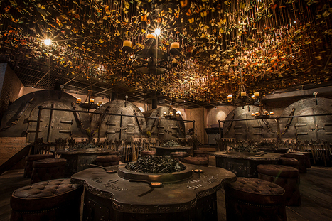
Named ‘the iron fairies’, the mysterious interiors of this bar conjures up scenes from a fairytale book or Lord of the Rings. With three locations: Bangkok, Hong Kong and Tokyo, the underground den is reminiscent of a blacksmith’s workshop; reflected in the iron, timber and leather materiality and the curious decorations all across the eclectic interior. Created by designer Ashley Sutton, a distinctive element of the iron fairies is the ceiling enveloped with 10,000 preserved butterflies that suspend over the main ‘workshop’ room furnished with low seating and circular tables. Rooms branch out to form individually designed ‘furnaces’ and ‘casting rooms’, offering private spaces for smaller groups. The element of enchantment is distilled into every detail of the bar interior, with the concept itself deriving from sutton’s days working in the underground iron-ore mines in Western Australia. With this, the décor follows a fantasy imagined by the designer where ore miners stumble upon little winged spirits, mixing roughly hewn wood, massive rusty cogs, rickety piping, and walls lined with vials of fairy dust....
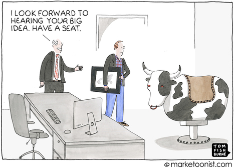
Bringing ideas to life in an organization can be a bumpy ride. We’re all familiar with the myth of Isaac Newton sitting under the apple tree, waiting for inspiration to fall on his head. Newton’s apple is one of the more common symbols of innovation, right up there with Archimedes shouting Eureka from his bathtub. Metaphorically, that’s what we do when go to a brainstorming meeting to come up with new ideas. If the conditions are right, and the coffee strong enough, the next great idea just might fall on our heads. What is often overlooked is what happens next, after the apple falls, when we have to actually bring that idea to life. If we’re not careful, Newton’s apple can turn into Newton’s applesauce, a watered down imitation of the idea. One of my first cartoons (back in 2002) was about this phenomenon.j...
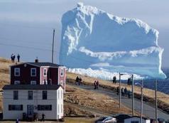
Residents view the first iceberg of the season as it passes the South Shore, also known as "Iceberg Alley", near Ferryland Newfoundland, Canada April 16, 2017. REUTERS/Jody Martin
Humans are obsessed with happiness—how to find it, how to keep it, and how to define it. Here's a look at why.
EMany of us bemoan the fact that creativity seems to be in decline in America.Research by KH Kim finds that the ability to think creatively is down among children and adults, which suggests they may be less able to come up with creative solutions to problems. This trend worries those in the business sector and beyond, who fear it could spell disaster for the future of innovation. But what if the biggest block to creativity isn’t the inability to come up with new ideas and solutions to problems, but our inability to accept and recognize them? This idea is at the heart of Jennifer Mueller’s new book, Creative Change: Why We Resist It . . . How We Can Embrace It. Mueller, a former Wharton School management professor, uncovers the way our minds react to uncertainty and how that can get in the way of embracing creativity. Her book aims to give us the tools we need to be more open to creative ideas and to communicate them to others....
An artist in California is replacing garish billboard ads with nature photos that blend almost perfectly into the surrounding landscapes—because they show the landscapes themselves. Jennifer Bolande’s “Visible Distance/Second Sight” is gracing roadside scenes along Gene Autry Trail and Vista Chino in Palm Springs, California. When a viewer sees the outdoor posters from the right perspective, the large-scale images of the mountains in the distance align with the actual ranges, creating a striking juxtaposition of the virtual image and the real one. Part of a broader “Desert X” exhibition in the area, it’s meant to redirect attention from the advertisement to the natural world depicted in it. It’s been done before, to a degree. As we pointed out in 2015, artist Brian Kane’s work in Massachusetts used trees and stars to similar effect....
While big businesses often have multiple decision makers with very specific ideas and guidelines to keep their existing brands consistent, smaller companies are usually more open to exploring new creative directions, and can move faster to implement them. If you need some more convincing that working with small businesses can result in some stunning creative work, we've put together a list of 15 small business branding examples to get you inspired for your next project...
The colors you choose while designing a website, poster or any other type of image will have a huge impact on whether or not the overall design is successful. After all, there is a lot of psychology behind the colors that people are attracted to, and designers need to incorporate this into everything they do.
Color contrast plays a very valuable role, but it is often overlooked, undervalued and misunderstood. To avoid this problem, you must learn more about color contrast, including how and why you should use it. Once you go beyond the basics of knowing that red and orange aren’t good colors to create contrast but black and white are, you can begin to develop an enhanced aesthetic that will please clients and viewers.
Why is Color Contrast So Useful?
Color contrast, in a nutshell, provides visual intrigue and keeps viewers interested. Consider for a moment how boring it would be if an entire poster was made from one color or only included shades from the same color family. Although there are some instances when this does work from an artistic perspective, it’s not an approach that is likely to grab someone’s attention when they’re perusing store shelves, looking at movie posters or surfing the web. Therefore, it’s wise to use contrasting colors whenever appropriate....
An architect by day and a master of illusion in his offtime, Ukranian Oleg Shuplyak, aka MrOlik, uses his technical skills as a trained architect to paint surreal optical illusions that contain portraits of other artists, authors and historical figures.
|


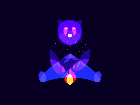


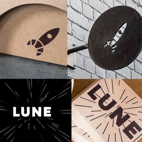


Beautiful minimalist designs to admire.