


Sandra St. Victor -Dizzy- @ Adinkra House 12.28.13
Research and publish the best content.
Get Started for FREE
Sign up with Facebook Sign up with X
I don't have a Facebook or a X account
Already have an account: Login

Public Relations & Social Marketing Insight
443.6K views |
+0 today
Social marketing, PR insight & thought leadership - from The PR Coach
Curated by
Jeff Domansky
 Your new post is loading...
 Your new post is loading...
Your new post is loading...

Quotes from beloved books, each thematically matched with a song. A side project by Maria Popova.
Jeff Domansky's insight:
Maria Popova offers some much-needed inspiration. 

Photographer Denis Cherim began taking photos for his “Solo Para Locos” project when he was living in various countries for a year.
Jeff Domansky's insight:
Very creative photography.
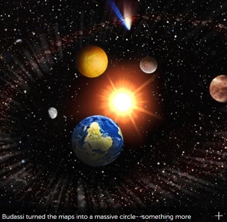
What does the entire observable universe look like? Not exactly like this—but it's a pretty (and fascinating) picture. The illustration, based on logarithmic maps from Princeton researchers and images from NASA, shows the universe from a human perspective: The sun is at the center, ringed by planets, galaxies, the cosmic web (the void between solar systems), and invisible plasma from the Big Bang.
Jeff Domansky's insight:
Sometimes science is wonderful.
Typically, a logo’s design is for immediate recognition. The logo is one aspect of a company’s commercial brand, or economic or academic entity, and its shapes, colors, fonts, and images usually are different from others in a similar market. Logos are also used to identify organizations and other non-commercial entities. These types of corporate identities are often developed by large firms who specialize in this type of work. However, if you want to save some bucks and want to design your logo then there are many sources to get logo design inspiration. Infact, we might able to help you by presenting this showcase of Highly beautiful, original and creative logo designs for your design inspiration. All of these logos are very creative and following different trends like PhotoFill, Concealed, VariDots, Candy Stripe, Flip Flop, Sequential, but most importantly Texting which is a common element among all of them. Also, try to catch how they created using specific colors combination, typography adjustments and font selection....
Jeff Domansky's insight:
What an exceptional collection of logo designs. Creativity with your coffee. Highly recommended viewing! 9.5/10
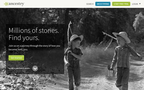
Web design has a big influence on internet presence, affecting things like how traffic interacts with a website (bounce- and conversion-rates) to how effective the site is in the context of SEO and branding. While content is obviously crucial to any site, the aesthetic presentation of that content is equally important. To get a feel for good web design and visually arresting content, here are 20 of the most beautiful websites in 2015.
Jeff Domansky's insight:
Creativity with your coffee and a great collection of website design inspiration. Recommended viewing. 9/10

PARKJH's curator insight,
December 10, 2015 4:33 AM
Inspiration of websites's good online for the enterprice planning 
Cheryl Chng's curator insight,
January 8, 2016 3:44 AM
Creativity with your coffee and a great collection of website design inspiration. Recommended viewing. 9/10

Designing newspapers, magazines and books has become particularly challenging as digital takes over most of our communications. While we must learn to adapt our concepts to various screen sizes, paper will always be an essential medium for creative expression. Throughout this article, I’ll introduce 50 incredible newspaper designs (and the design lessons they bestow) to inspire your work....
Jeff Domansky's insight:
Creativity with your coffee. Recommended viewing for creatives, bloggers, marketers and PR.
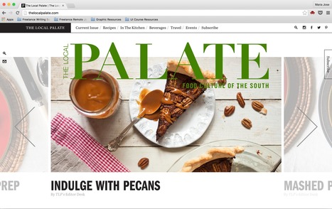
As a society, we love food. That's really all there is to it.
Jeff Domansky's insight:
Here's a little creativity and food for thought. Recommended viewing. 9/10
So, it’s safe to say that composition is pretty important. So, what exactly is a composition? Well, in very simple terms, it’s the part where all the separate elements come together to form a whole. When all of your type, your images, your graphics and colors, come together to form one cohesive design. A successful composition means that you have arranged, distributed, aligned and compiled your design in a way that not only looks good but is also highly functional and effective. So, let’s run over a few tips, tricks and techniques that will have you mastering composition in no time....
Jeff Domansky's insight:
Foolproof composition techniques that will hold all your design elements in all the right places.

As most of you guys probably know, the footer is the last significant part of a website. It tends to be used for placing important information, such as the RSS feedback button, slide galleries, contact information, latest posts, the site map, among others. But the footer its not just a large space to fill the bottom of the page. It's a whole design area, in which the designer can place some pretty cool ideas that will not fit inside the main space of the site. In this countdown, we will be showing you some of the coolest footer ideas on the web, so lets get it started.
Jeff Domansky's insight:
More creativity with your coffee and 200 inspiring footer designs you can learn from.Recommended viewing! 10/10
The use of geometrics provides graphic designers with a fantastic opportunity to add to the flat design trend. Combined with flat design the use of geometric shapes enables a designer to stay true to the fundamentals of flat design – creating clean and clear designs, while also providing them with a clever use for negative space, and fun ways to explore colours. So in this post i collected 20 WordPress Themes utilizing geometric concepts and shapes to produce simplistic, fun, modern and innovative designs with content at the forefront.
Jeff Domansky's insight:
Creativity with your coffee and 20 geometric WordPress designs to inspire you.
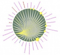
Metaphor is not the sole preserve of Shakespearean scholarship or high literary endeavour but has governed how we think about and describe our daily lives for centuries, according to researchers at Glasgow University. Experts have now created the world’s first online Metaphor Map, which contains more than 14,000 metaphorical connections sourced from 4m pieces of lexical data, some of which date back to 700AD. While it is impossible to pinpoint the oldest use of metaphor in English, because some may have been adopted from earlier languages such as Germanic, the map reveals that the still popular link between sheep and timidity dates back to Old English. Likewise, we do not always recognise modern use of metaphor: for example, the word “comprehend” comes from Latin, where it meant to physically grasp an object. The three-year-long project to map the use of metaphor across the entire history of the English language, undertaken by researchers at the School of Critical Studies, was based on data contained in the Historical Thesaurus of English, which spans 13 centuries....
Jeff Domansky's insight:
Huge project by Glasgow University researchers plots thirteen centuries of startling cognitive connections. Purely random but fascinating. Recommended reading. 9/10

rodrick rajive lal's curator insight,
July 9, 2015 2:56 AM
We work with metaphors all the time, and for teachers of English literature, having a good grasp of metaphors is even more important. But then metaphors are symbols and like symbols, metaphors can cover a large number of ideas and concepts. No wonder therefore that using metaphors can help communicate complex ideas and concepts more effectivley than verbal descriptions or written descriptions that go on and on and yet are not able to communicate the intended information. I somehow connect metaphors with the heading in a mind map.

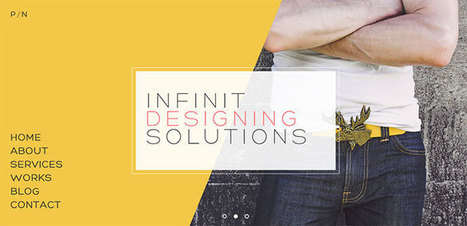
A website with a design one major color or shades of one color is called a monochromatic website. In this post, we have the beautiful examples of Monochromatic Website Designs that you can check out below. Scroll down and maybe get some fresh ideas and inspirations for your own work. Take a peek, and enjoy the designs!...
Jeff Domansky's insight:
Terrific web design inspiration.
|
Jeff Domansky's insight:
Useful source for the best product page designs and inspiration.
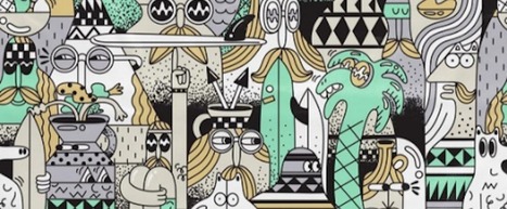
If you follow the right people, that's what Instagram can do for you. There are a lot of really talented artists and designers out there who use Instagram as a sort of mini art gallery -- a social portfolio, if you will. And it's a jackpot for people who love browsing gorgeous design work. To help you narrow your search, I've carefully curated some of the best Instagrams to follow for design inspiration. I did my best to place them in categories -- illustration, graphic design, pop art and installation, color palettes, street art, photography, typography, and calligraphy -- although you'll notice some of their work could fall into a number of different lists. Whether you're a designer looking for inspiration, or you simply harbor an appreciation for art and design, you'll want to check out (and follow) these accounts. ...
Jeff Domansky's insight:
Check out Lindsay Kolowich's carefully curated list of the best Instagram accounts for beautiful illustration, graphic design, photography, typography, street art, and more. Recommended reading. 9.5/10
Any description I write for this collection will pale in comparison to the excellent copywriting examples contained herein.
Jeff Domansky's insight:
A Crayon collection of web designs and awesome copywriting examples by Jonah Lopin. Recommended reading for inspiration. 9/10

Mike Allen's curator insight,
March 26, 2016 4:53 AM
A Crayon collection of web designs and awesome copywriting examples by Jonah Lopin. Recommended reading for inspiration. 9/10
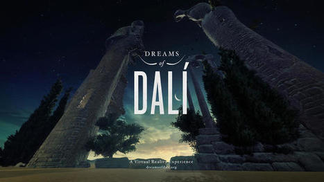
Salvador Dali once said, "Surrealism is destructive, but it destroys only what it considers to be shackles limiting our vision." Perhaps the artist would've said something similar about virtual reality, which The Dalí Museum is now using to bring his 1935 painting Archeological Reminiscence of Millet's "Angelus" to life. To help celebrate the opening of its new exhibition "Disney and Dalí: Architects of the Imagination" on January 23rd, which looks at the relationship between the artist and Walt Disney, the museum enlisted agency Goodby Silverstein & Partners to create "Dreams of Dalí" to give viewers a new way to experience his work....
Jeff Domansky's insight:
Creativity with your coffee: An early painting comes to life for The Dalí Museum's new "Disney and Dalí: Architects of the Imagination" exhibit.
It has been said that designing a blog is easy, a-no brainer. Pick a template from the myriads out there all readily available on any platform and you’ll be good to go, right?
Jeff Domansky's insight:
Creativity with your coffee and some design inspiration to go with it.
We all need a little inspiration sometimes. So, when you're feeling a bit lackluster, here is a list of 25 modern sites from a range of industries that will spark a little bit of inspiration in you. All of these sites are mobile friendly and responsive and feature a host of great features. This list is split into multiple sections based on industry so, you can find the most relevant and useful inspiration. Go forth, my friends!...
Jeff Domansky's insight:
Check out some of Hubspot's favorite responsive websites for inspiration across a variety of industries including eCommerce, B2B, Nonprofits, Media and more!
How many times you have struggled with the ideas. How to do that or that, how to finish this design or illustration? For me, it happens a lot and I think is normal. Time to time designers face this “black” interim. I’m not saying that you need steal other ideas or designs, but you need to check how the professionals are doing things, it will let you step out of your zone and make something better. I have collected 15 websites which are covering everything you need, from web design and illustration to furniture design and app design. I hope all these websites will inspire you and will help you to finish your ideas faster and better....
Jeff Domansky's insight:
Creativity with your coffee.

Graphic design is an industry that has been growing and changing for centuries at the hand of countless designers. So, to celebrate this rich and exciting history, we’ve compiled a list of 40 famous designers that have done their part in shaping graphic design in some way. From those who specialize in typography or magazine design, through to album covers and political posters, each of these people have made their mark on the industry and shaped it in some way through hard work and some great designs. With that, let’s have a look at 40 people who changed graphic design for good....
Jeff Domansky's insight:
Meet the pioneers of graphic design. Creativity with your coffee. Recommended reading. 9.5 / 10

If you are looking for inspiration to make your sign up and login forms a breeze to fill in, in this post, i’d like to present a couple of new ideas that might be useful for your next designs.
Jeff Domansky's insight:
Creativity with your coffee and a whole lot of design inspiration.

i-webdesigner's curator insight,
October 21, 2015 5:55 AM
Great to look at what others suggest and recommend for your own inspiration

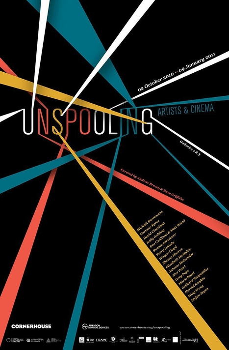
Black and white can seem like a very inflexible palette, but believe me when I say, it’s actually quite the opposite. In fact, black and white is incredible versatile, easy to use, and effective as anything!In this list we’ll look at 50 stunning monochromatic designs and hopefully you’ll quickly begin to notice how flexible this small palette really is, and just how easy it is for you to kickstart your own black and white designs. So, let’s get started....
Jeff Domansky's insight:
Creativity with your coffee. Black and white is a classic and timeless design combination. How ingenious and creative is this poster design? Awesome!
If you want to make something that people really care about, that they actually give a hot shit about, you have to care about it yourself. Because if you don’t, then try as you might, it’ll come out in the final product.
Jeff Domansky's insight:
An inspirational post by Jon Westenberg who writes about passion and why you deeply need to care about what you do and what you create. Highly recommended. 10/10

Whether by conscious decision or force of habit every designer has a formula for creating new work. Over time they develop a set of rules which guide the creative process to what they believe to be a successful outcome. While these unwritten rules are unique to each individual they are likely to focus on 6 key areas. We’ve illustrated these below for you....
Jeff Domansky's insight:
Design: Every successful designer follows some type of formula. Here are six principles of good design. Creativity with your coffee. Recommended reading. 9/10
|


Just for a change, I'm going to share an exceptional, soulful performance by a favorite singer Sandra St. Victor. If you want Inspiration, watch this clip. I curate other jazz music on one of my other pages here. Enjoy!