Public Relations & Social Marketing Insight
443.4K views | +0 today
Follow
Public Relations & Social Marketing Insight
Social marketing, PR insight & thought leadership - from The PR Coach
Curated by Jeff Domansky
Your new post is loading...
Scooped by Jeff Domansky
Scoop.it!

50 of the Greatest Data Visualization Examples

50 of the Greatest Data Visualization Examples | Public Relations & Social Marketing Insight | Scoop.it

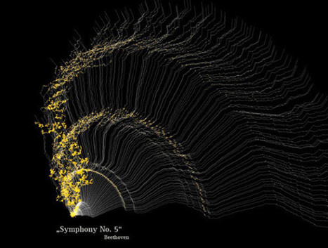
Data presentation should be elegant, detailed and beautiful. There are different ways to show the data that can be a pie charts, tables, histograms, and bar graph. However, to send a clear and effective message to your readers, you just need more than just a simple table or histogram, etc.


There are some data visualization techniques that present your data much better than expected, intelligent, beautiful, original and in an excellent way. We have gathered some of the most attractive and unique ideas of data visualization examples....

Jeff Domansky's insight:

These data visualizations are really worth viewing. Recommended. 9/10

No comment yet.
Scooped by Jeff Domansky
Scoop.it!

7 Amazing Data Journalism Blogs you Should Read | Infogr.am

7 Amazing Data Journalism Blogs you Should Read | Infogr.am | Public Relations & Social Marketing Insight | Scoop.it
Blogging is one of the oldest tricks journalists have utilized on the Web to express their opinions and ideas. Even though social networks have been strong competitors, blogs have managed to survive. Are there any good data journalism blogs on the internet? The answer is yes. Here, we give you a list of the blogs you should keep up with in the data realm.
Jeff Domansky's insight:
Terrific resources for tips on data storytelling and marketing.
No comment yet.