 Your new post is loading...
It’s expected that only 6% of all data (read: information) comes from books and printed materials – the other 94% is digital. 90% of all data has been created and stored digitally within just the past 3 years, which is striking considering human recordkeeping dates back thousands of years! To top that off, we’re generating about 2.5 quintillion bytes of data daily, which just adds to the amount of data we have available to us. But the question is – what do we do with the data we collect? Many people (entrepreneurs, business owners, and data scientists) are beginning to visualize it....
Data presentation should be elegant, detailed and beautiful. There are different ways to show the data that can be a pie charts, tables, histograms, and bar graph. However, to send a clear and effective message to your readers, you just need more than just a simple table or histogram, etc.
There are some data visualization techniques that present your data much better than expected, intelligent, beautiful, original and in an excellent way. We have gathered some of the most attractive and unique ideas of data visualization examples....
We’re literally drowning in data. Everyday, 2.5 quintillion bytes of data are created. This is the equivalent of 90% of the world’s information–created in the last two years alone. Now this is what we call “big data.”
But where does it come from? Everywhere, from sensors and social media sites to digital images and videos. We have more data than we know what to do with, so it’s time now to organize and make sense of it all.
This is where data visualization comes into the picture. In the seismic shift awaiting us, referred by some as the Industrial Revolution of Data, we have to get better and more efficient at creating innovative data visualization that make the complex easy to understand.
In the hopes of inspiring your own work, we’ve compiled 15 data visualizations that will not only blow your mind, they will also give you a clearer understanding of what makes a good visualization–and what makes a bad one....
Tired of showcasing the same old boring tables to your management? A spice of colors and layout brings life to data representation. If you need to understand million rows of data and you are short on time. The data might be coming from different sources and you may need to compile it to get a holistic view to make a decision on it. In order to make the meaning of the information effectively,
Data Visualization is an important answer.Data Visualization is an art for visual communication which enhances the expression of data in to one collective graphic for anyone to digest and action upon....
We live in an age of Big: Big Computers, Big Data, and Big Lies.
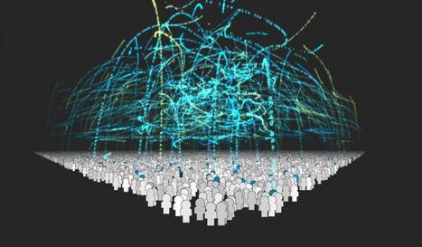
Faced with an unprecedented torrent of information, data scientists have turned to the visual arts to make sense of big data. The result of this unlikely marriage—often called "data visualizations" or "infographics"—has repeatedly provided us with new and insightful perspectives on the world around us.
However, time and time again we have seen that data visualizations can easily be manipulated to lie. By misrepresenting, altering, or faking the data they visualize, data scientists can twist public opinion to their benefit and even profit at our expense.
We have a natural tendency to trust images more than text. As a result, we’re easily fooled by data visualizations. But fortunately, there are three easy steps we can follow to save ourselves from getting duped in the data deluge....
Months back we came up with the superb collection of nice, visually appealing infographics (Creative Infographics for Designers and Developers) witnessing which designers and developers would easily relate as each one of them was visual graphics talking about designers and developers.Here is our latest compilation 40 creative infographics for designers and developers. Hit a jump to take the glimpse of each....
Welcome to Introduction to Data Science. In this first post, I want to go through some examples of data science activities and projects from the recent past that I found interesting. And use them to whet your appetites for the concepts that we are going to learn in the following posts....
Data visualization is a powerful tool to communicate complex information in an engaging way. By visualizing information, our brains can synthesize and retain content more effectively, increasing its impact. But if data isn’t properly visualized, it can do more damage than good. The wrong presentation can diminish the data’s message or, worse, misrepresent it entirely.
That’s why good data visualization relies on good design. And it’s about more than just choosing the right chart type. It’s about presenting information in a way that is easy to understand and intuitive to navigate, making the viewer do as little legwork as possible. Of course, not all designers are data visualization experts, which is why much of the visual content we see is, well, less than stellar. Here are 10 data visualization mistakes you’re probably making and the quick fixes to remedy them....
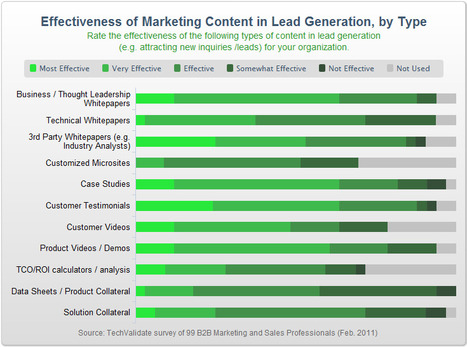
In today’s “content-age,” the creation of data is as simple as hitting “submit” on a blog entry or uploading a video to YouTube – anyone can do it, and practically everyone is doing it, causing content growth to increase at astonishing rates. In fact, just last year, there was enough digital data created to fill a stack of DVDs that would stretch all the way to the moon and back! In light of this, companies are realizing the importance of creating increasingly strong and engaging content that will rise above the waffle and hopefully have some kind of tangible impact. But what kind of content are companies finding most impactful?...
|
Data can be very powerful. If you can actually understand what it's telling you, that is.
It's not easy to get clear takeaways by looking at a slew of numbers and stats. You've got to have the data presented in a logical, easy-to-understand way.
Enter data visualization. The human brain processes visual information better than it processes text -- so using charts, graphs, and design elements, data visualization can help you explain trends and stats much more easily.
But not all data visualization is created equal. (Just check out “Why Most People’s Charts and Graphs Look Like Crap” to see what I mean.)
So, how do organize data in a way that's both compelling and easy to digest? Get inspired by the following 16 examples of data visualization that communicate interesting information with both style and substance....
The success of infographics has evolved since that time. Just a few years ago, infographics became extremely popular with the eruption of digital marketing and search engine optimization.
With their popularity came several changes in the way they were presented. Only the best of the best were shared on social media, resulting in higher brand awareness and consumer engagement.
As the traditional infographic evolved to keep up with consumers’ changing tastes, it brought the world the interactive infographic, which is becoming the most sought after form of data representation to date, even rendering some static infographics as outdated and irrelevant.
To help you stay ahead of the game with your graphic design and create an infographic with the potential to go viral, take a look at this list of awesome interactive infographics....
Not a web designer or developer? You may prefer free tools for creating infographics.
As author, data journalist and information designer David McCandless said in his TED talk: “By visualizing information, we turn it into a landscape that you can explore with your eyes, a sort of information map. And when you’re lost in information, an information map is kind of useful.”
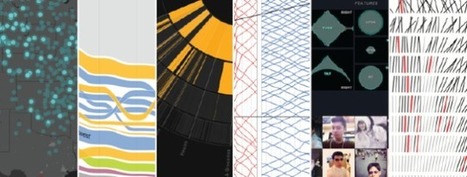
There are many different ways of telling a story, but everything starts with an idea. So to help you get started we’ve rounded up some of the most awesome data visualization tools available on the web....
It's always tough to pick my favorite visualization projects. I mean, it's a challenge to pick and rank your favorite anything really. So much depends on what you feel like at the time, and there's a lot of good work out there. Nevertheless, I gave it a go.
These are my favorites for the year, roughly in order of favorite on down and based on use of data, design, and being useful. Mostly though, my picks are based on gut.
One unintentional theme: All of my picks are interactive or animated or both. Telling for where we're headed, I guess....
You could sift through piles of dense data sets in an attempt to understand the trends and discoveries that emerged in history, psychology, current events, and even fictional dragons in 2014. Or you could look at these infographics, which visualize otherwise overwhelming data as beautiful charts, graphs, and maps.
Co.Design's Infographic of the Day series regularly showcases the best in data visualization, and this past year saw many stellar examples of the power of the well-designed visualization to illuminate information about nearly any subject, from the serious (the daily activities of Congress) to the frivolous (a visual compendium of the world's best dogs).
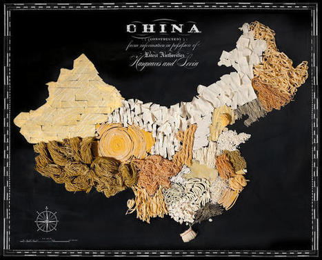
We couldn't resist promoting Co.Design's own in-house data visualizations: the Great Wheel of Food Mashups and a map of each U.S. state's weirdest eating patterns (we're a bit food-fixated, apparently). Here, our favorite infographics from the past year.
This is the 2nd post in Data Science introduction, Please go to my 1st post to get started. So, let’s go through a few more examples on Data science.
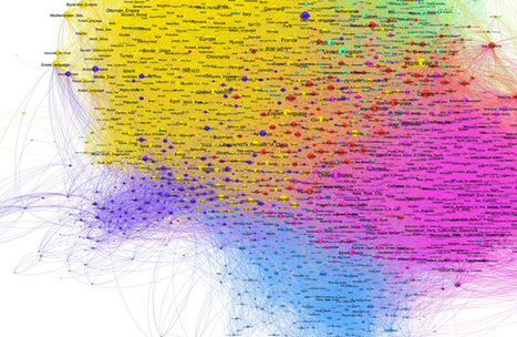
Clustering Algorithm If you were asked to decide how important a particular scientific paper was relative to other papers, how might you go about doing that?One way to decide between the two papers here, one in light blue and the other in dark blue, is to wait until other papers start to site these, and count up the number of citations...
The growth of data visualization says a mix of data and narrative is now s better way for businesses to tell their story.
Which tools ae best to tell your story? While price and software sophistication play a role, the more important criteria are:
- How you define success?
- What measures are most important to manage?
Once you’ve answered these questions, here are 14 of the best data visualization tools. They are grouped by categories to help you be a better storyteller with data,...
In my previous article I discussed the importance of ensuring that your data is clean and processed before attempting any form of data visualisation. Here I will share some really awesome tools that (once your data is clean and ready to use) you can have at your disposal to create mind-blowing representations of the facts and figures. Here is a list of tools, some more open and adjustable than others, that add value to your raw data and can be used as a source of inspiration and design when approaching the visualisation process....
|


We are generating more data than ever. But what can you do with that data? Data visualization can help engage your audience and increase conversions.