Public Relations & Social Marketing Insight
443.6K views | +0 today
Follow
Public Relations & Social Marketing Insight
Social marketing, PR insight & thought leadership - from The PR Coach
Curated by Jeff Domansky
Your new post is loading...
Scooped by Jeff Domansky
Scoop.it!

7 Amazing Data Journalism Blogs you Should Read | Infogr.am

7 Amazing Data Journalism Blogs you Should Read | Infogr.am | Public Relations & Social Marketing Insight | Scoop.it
Blogging is one of the oldest tricks journalists have utilized on the Web to express their opinions and ideas. Even though social networks have been strong competitors, blogs have managed to survive. Are there any good data journalism blogs on the internet? The answer is yes. Here, we give you a list of the blogs you should keep up with in the data realm.
Jeff Domansky's insight:
Terrific resources for tips on data storytelling and marketing.
No comment yet.
Scooped by Jeff Domansky
Scoop.it!

Meet Dadaviz: Curated, YouTube-Style Distribution Platform for Data Visualizations

Meet Dadaviz: Curated, YouTube-Style Distribution Platform for Data Visualizations | Public Relations & Social Marketing Insight | Scoop.it

“If I read news without dataviz I get a bit nauseous, I don’t have patience for words alone anymore. Nor infographics”. This helps explain why marketing expert and consultant León Markovitz co-founded Dadaviz, nicknamed by some as “the YouTube of data visualizations“. Online since June 11th, it’s a collection of the best dataviz selected from different sources by an invite-only community.


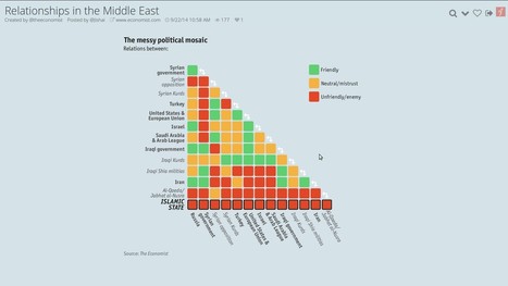
Want to learn the Who’s Who of political relationships in the Middle East, what’s the average commute time in the U.S. or where do the visitors of the Oktoberfest come from? This is the place to go.


Most of the published material is “curated” from external sources (the Middle East dataviz was taken from the Economist), but there’s also a certain amount of original work. Every visualization shared on Dadaviz links to the author, original link and data source, when available, so people can find out more and get more context if they wish. If someone wants to use a dataviz, they can reach directly the creators, or type “/embed” at the end of any Dadaviz link -which gives them an embed of the image with all the attribution already in place. Or they can simply share it on social media....

Jeff Domansky's insight:

Dadaviz is an awesome resource for anyone looking to add visuals to their content, marketing or communications. Highly recommended.   9.5/10

No comment yet.
Scooped by Jeff Domansky
Scoop.it!

The 37 best tools for data visualization

The 37 best tools for data visualization | Public Relations & Social Marketing Insight | Scoop.it

Not a web designer or developer? You may prefer free tools for creating infographics.


As author, data journalist and information designer David McCandless said in his TED talk: “By visualizing information, we turn it into a landscape that you can explore with your eyes, a sort of information map. And when you’re lost in information, an information map is kind of useful.”


There are many different ways of telling a story, but everything starts with an idea. So to help you get started we’ve rounded up some of the most awesome data visualization tools available on the web....

Jeff Domansky's insight:

This great list of valuable data visualization tools is recommended reading. 9/10

Winners Education's curator insight, March 26, 2015 12:24 PM

Adressing the visula part of the learning brain with easy-to-use, web-dased tools 

Vinicius Vinny Araujo's curator insight, April 17, 2015 12:55 AM

#data

Nora Morton's curator insight, April 22, 2015 6:23 PM

Colorful charts/graphs/maps are my type of eye candy!  This site illustrates the vast ways you can visually present data.  Among the many: iChart, Polymaps, Google Charts, Many Eyes, Leaflet, Exhibit, and Zing Chart.