


 Your new post is loading...

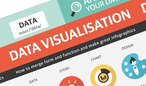

The following infographic, created by Zhenia Vasiliev, breaks down the basics of data visualization. It shows how beginners can merge form and function, and design meaningful infographics.
Key highlights:
- Analyse your data: Analysis is the key. Before we can visualize the data we need to understand it.
- Come up with a story: Story is finding a single strand of meaning in an endless sea of information. It has a beginning, middle and end.
- Make it visible: Visualization is a creative act of making. Making the data visually elegant evident and engaging.
- Entertain to educate: Good data design need to illuminate and inform the viewer, elucidate and illustrate the facts and stats....

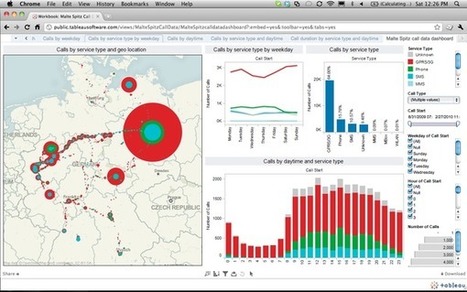


Useful tips on how to turn data into compelling content.