


 Your new post is loading...

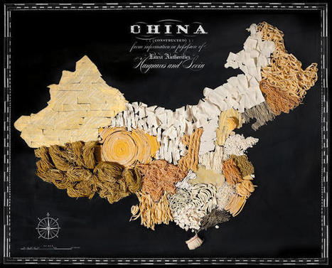

You could sift through piles of dense data sets in an attempt to understand the trends and discoveries that emerged in history, psychology, current events, and even fictional dragons in 2014. Or you could look at these infographics, which visualize otherwise overwhelming data as beautiful charts, graphs, and maps.
Co.Design's Infographic of the Day series regularly showcases the best in data visualization, and this past year saw many stellar examples of the power of the well-designed visualization to illuminate information about nearly any subject, from the serious (the daily activities of Congress) to the frivolous (a visual compendium of the world's best dogs).
We couldn't resist promoting Co.Design's own in-house data visualizations: the Great Wheel of Food Mashups and a map of each U.S. state's weirdest eating patterns (we're a bit food-fixated, apparently). Here, our favorite infographics from the past year.


Co.Design 2014 saw stellar examples of the power of data visualization to shed light on nearly any subject, from politics to dogs. Good reading for fans of infographics and data visualization..