


 Your new post is loading...

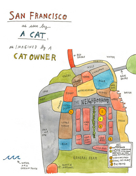

"More isn't always better: no more in information design than in poetry..."
Nate Silver, the author of The Signal and the Noise, considers the two factors that make an infographic compelling — providing a window into its creator’s mind and telling a story that “couldn’t be told in any other way.”
He writes:
Design has traditionally been seen as a field for “right-brained” types: those who think visually and spatially rather than with symbols like words and numbers. But modern information design is equal parts art and science, form and function, architecture and engineering. It combines the best of at least three fields of achievement: aesthetics, technology, and journalism.
By aesthetics, I mean all the usual things, but especially proportionality. For information designers, this quality is not so abstract as it might be in other mediums. Their goal is tangible: to convey as much information as possible given some set of constraints....


Great exploration of infographics by Maria Popova at BrainPickings. Highly recommended 9.5/10