Public Relations & Social Marketing Insight
443.6K views | +10 today
Follow
Public Relations & Social Marketing Insight
Social marketing, PR insight & thought leadership - from The PR Coach
Curated by Jeff Domansky
Your new post is loading...
Scooped by Jeff Domansky
Scoop.it!

The Golden Ratio – What Is It And How To Use It

The Golden Ratio – What Is It And How To Use It | Public Relations & Social Marketing Insight | Scoop.it

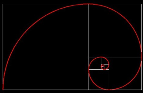
The golden ratio (or the divine proportion) is a mathematical constant that can be often seen in the natural world, as well as in the artwork throughout the history. In mathematical terms, when a is larger than b, and the two are added and then divided by a, the sum represents the golden ratio (1.618). That number is represented by the Greek character “phi”.


It is still not clear why this ratio is so appealing to the human eye. Anything following this ratio tends to be perceived as attractive and even the slightest change in an image that gets closer to the ratio is automatically considered to be more beautiful to the human brain.


It is not a matter of magic; it is just a yet unexplained fact that our minds react very positively to anything formed on the basis of the golden ratio. As many artists have been using this fact, so could you when it comes to web designing....

Jeff Domansky's insight:

These golden ratio design tips will help improve your design effectiveness.

No comment yet.
Scooped by Jeff Domansky
Scoop.it!

The Essential Cheat Sheet of Cover Photo Dimensions for Facebook, Twitter & More [Templates]

The Essential Cheat Sheet of Cover Photo Dimensions for Facebook, Twitter & More [Templates] | Public Relations & Social Marketing Insight | Scoop.it

And considering social media cover photos are likely something you'll want to update regularly to align with new campaigns, cover photo design can be an ongoing process -- not to mention how frequently social networks redesign their layouts, inevitably affecting cover photo sizes by cropping, warping, and mucking up your existing design. 

This is definitely not ideal for brands looking to put their best foot forward in social media. So what's a poor marketer to do when the only scalable option is to take graphic design into their own hands?

To make things easier on social media managers and non-designers doing design, we created an essential cheat sheet containing the most up-to-date social media cover photo dimensions -- something you can bookmark and reference when you're ready to create or re-create a cover photo for Facebook, Twitter, LinkedIn, YouTube, or Google+.

We also created free, downloadable PowerPoint templates that are already pre-sized for each channel's specific cover photo dimensions so you can easily customize them for your own business. Just add your creative, save it as an image file, and upload it to your social media business page....

Jeff Domansky's insight:

Really useful graphic dimensions cheat sheets for your blog and social marketing.

No comment yet.
Scooped by Jeff Domansky
Scoop.it!

15 vibrant color scheme apps that make design simple - The Creative Edge

15 vibrant color scheme apps that make design simple - The Creative Edge | Public Relations & Social Marketing Insight | Scoop.it

There’s no reason for your designs to look drab – especially when it comes to color. A quick glance online and you’ll find a stockpile of color scheme apps ready to help you learn, play and perfect your next palette.From clever Hex code games to comprehensive color wheels, here are 15 of our favorite free color scheme apps to take your designs to the next level....

Jeff Domansky's insight:

Excellent color resources for design, blogging and marketing. Recommended viewing!  10/10

Jeff Domansky's curator insight, January 10, 2016 10:18 AM

Excellent color resources for design, blogging and marketing. Recommended viewing!  10/10

Scooped by Jeff Domansky
Scoop.it!

What Is The Golden Ratio? What You Need to Know and How To Use It – Design School

What Is The Golden Ratio? What You Need to Know and How To Use It – Design School | Public Relations & Social Marketing Insight | Scoop.it

As an owner of a blog, you need to have engaging, relevant and updated content that satisfy the needs of your readers. There are several ways through which a blog owner can make sure that there is enough and more content on his or her blog at any given time.


The most invincible pillar and pinnacle in any online business are therefore the creation and writing of content which is engaging to the readers that visit your blog. There are several ways in which you can create more content for your blog to make sure that you achieve your desired goals of online business.

Jeff Domansky's insight:

Use mathematics to create flawless designs. Sort of. Design tips from Canva's Design School.

No comment yet.
Scooped by Jeff Domansky
Scoop.it!

How to Marry Text and Images – Design School

How to Marry Text and Images – Design School | Public Relations & Social Marketing Insight | Scoop.it

It’s time to take your designs to the next level! Combine your text and images to create powerful compositions.From making use of copy space in your images, to adding shapes to your designs to help your text stand out – the value of this creative technique is not to be overlooked.


Try these five simple tips to create effective compositions that not only look beautiful, but read effectively....

Jeff Domansky's insight:

Increase the quality of your designs by learning how to marry text and images like a professional designer.

Marco Favero's curator insight, December 24, 2014 6:17 AM

aggiungi la tua intuizione ...

Marta Ciesielska's curator insight, January 20, 2015 6:12 AM

This  is very popular nowdays to make text and image work fine together on the web page, in your presentation etc. So it's good to know how to make it look nice and clean!

Scooped by Jeff Domansky
Scoop.it!

How to create more fun and playful typography - 99designs

How to create more fun and playful typography - 99designs | Public Relations & Social Marketing Insight | Scoop.it

Good typography may be hard work, but designers shouldn’t forget to have some fun with it! While crafting fonts and typographic characters can sometimes feel stiff and overly mathematical, we want you to help you find the joy in creating more expressive and playful typography.

Of course, this approach is great for children-oriented design projects—but let’s not limit ourselves. After all… not every coffee shop, ice cream store and logo needs to look posh. Let’s find the more creative side of typography and get goofy!

In this article, we’ll spotlight some examples of playful typography and show you how to join in the fun with your own work....

Jeff Domansky's insight:

Lots of creative inspiration here  and tips on how to use fun and playful typography in your design..

No comment yet.
Scooped by Jeff Domansky
Scoop.it!

50 Free Resources for Web Designers | Speckyboy

50 Free Resources for Web Designers | Speckyboy | Public Relations & Social Marketing Insight | Scoop.it
The tremendous thing about the design community is that we all love to share. We really do. Whether we share our thoughts and ideas via an in-depth article or by giving advice/feedback on a forum, or even by freely offering high-quality resources. The sharing is what makes our community truly great!


Here are last month’s 50 best free resources for designers…

Jeff Domansky's insight:

If you're a designer, you'll find some great resources here from typefaces and icons to UX, UI and design tools.

No comment yet.
Scooped by Jeff Domansky
Scoop.it!

50 Blog Headers Guaranteed To Draw Readers Into Any Post – Design School

50 Blog Headers Guaranteed To Draw Readers Into Any Post – Design School | Public Relations & Social Marketing Insight | Scoop.it

It has been said that designing a blog is easy, a-no brainer. Pick a template from the myriads out there all readily available on any platform and you’ll be good to go, right?

But popping images and text into an existing template will likely translate into another generic looking blog. And in today’s growing blogging industry, being just another sheep in the herd won’t do much for your traffic. Differentiating your blog from others in the same niche by creating a blog designed with a bit more character will turn you into the sheep they’ll remember.

Creating a stunning blog does not necessarily mean building your own layout from scratch. You can take advantage of a template, let it do most of the heavy lifting, and pair it with a thoughtfully designed header to start engaging your target audience. Use them to set the mood and visually communicate what your blog is all about. They don’t have to be terribly complex, just tailored to fit your blog beautifully. Below, we showcase 50 awesome blogs with headers that make great first impressions and feature great content....

Jeff Domansky's insight:

Creativity with your coffee and some design inspiration to go with it. 

No comment yet.
Scooped by Jeff Domansky
Scoop.it!

20 Best Color Palette Tools for Web and Graphic Design

20 Best Color Palette Tools for Web and Graphic Design | Public Relations & Social Marketing Insight | Scoop.it

As a web or graphic designer you must have a keen sense of color combinations and feel which colors look good together and which don’t. Anyway, even with this great skill in color combining, you may find yourself in situations when you just feel less inspired. That’s when these best color palette tools come in handy!


These 20 best color palette tools will help you choose and create the best color palettes for your graphic or web designs. Choose the one that is perfect for you and start using it! Enjoy

Jeff Domansky's insight:

Bloggers, marketing and PR pros will also appreciate these excellent color palette tools.