


Beautiful newsletters in minutes? You bet.
Looking for a fast and easy way to communicate with your customers?
Get stylish, effective results in 5 minutes or less....
Get Started for FREE
Sign up with Facebook Sign up with X
I don't have a Facebook or a X account


 Your new post is loading...
 Your new post is loading...
Your new post is loading...
Beautiful newsletters in minutes? You bet.
Looking for a fast and easy way to communicate with your customers?
Get stylish, effective results in 5 minutes or less....
Jeff Domansky's insight:
Newsletters in 5 minutes or less. 
Do you want to make your infographics iconic? Okay, so we don’t mean “iconic” in the usual sense. We mean using icons in your infographic design. Icons are those little illustrative graphic images/clip art that represent an object, action or idea. They are often stylized and simplified designs. N Using icons can make your infographic design more cohesive and more professional. With Venngage you can choose from over 10,000 icons in our icon library and stylize them to your preference by editing their colors, sizes and positions. Here are some tips for how to use icons in your infographics....
Jeff Domansky's insight:
6 ways to use icons in your infographic design. Quick infographic tips from Venngage.

Jeff Domansky's curator insight,
October 21, 2015 10:57 AM
6 ways to use icons in your infographic design. Quick infographic tips from Venngage.
There’s a big problem in the design community. We don’t know how to sell our services. In fact, we fail miserably at it. It's the part of the biz we didn't realize we had to do, and by the time we figured it out, the rent was already due and we had to put food on the table.I hope to help you overcome that in this blog post....
Jeff Domansky's insight:
David Tendrich says if your portfolio isn't making you sales, then it sucks. He also tells you how to fix the problem right. his post is a must-read for creatives who need to get sales from portfolio websites. 9/10
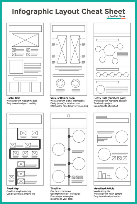
Infographic layouts refer to the arrangement of your visual elements and your content. When you begin working on a piece of infographic, you should have a story to tell hence, you will need to select a layout that best suits your story. Using the right layout will ensure good readability and convey your message well. We have put together a cheat sheet for your quick reference to the right arrangement to use, here are six common ones you can quickly work with....
Jeff Domansky's insight:
Very helpful blueprint for creating interesting and effective infographics.

Tony Guzman's curator insight,
March 2, 2015 3:29 PM
This article helps you determine the best layout for the type of infographic you may be creating. 
David Baker's curator insight,
March 13, 2015 1:21 AM
This is a great tool to share with my seminar teachers whose final project for the year is an infographic. 
Monica S Mcfeeters's curator insight,
March 20, 2015 11:51 PM
HERE ARE SOME HELPFUL LAYOUTS TO SPEED UP YOUR DESIGNS.

It’s time to take your designs to the next level! Combine your text and images to create powerful compositions.From making use of copy space in your images, to adding shapes to your designs to help your text stand out – the value of this creative technique is not to be overlooked. Try these five simple tips to create effective compositions that not only look beautiful, but read effectively....
Jeff Domansky's insight:
Increase the quality of your designs by learning how to marry text and images like a professional designer.

Marta Ciesielska's curator insight,
January 20, 2015 6:12 AM
This is very popular nowdays to make text and image work fine together on the web page, in your presentation etc. So it's good to know how to make it look nice and clean!

When you think of your favourite book, movie or artwork, it’s the title that springs to mind. To the same effect, titles act like a hook in graphic design. They’re a feature element – so make sure they stand out!
Jeff Domansky's insight:
Here's how to create terrific titles for your blog or content.
|

Content is one of the most effective ways for a brand to market itself. It’s the mode through which you can convince your audience to take action and guide them towards a specific goal. However, content marketing can be a complicated and time-consuming process. There are a number of things that could go wrong. In this article, I’ll outline 21 content marketing mistakes and how you can avoid them.
Jeff Domansky's insight:
Nice 'n easy tips.
A look at the psychology and research behind shareable social media images, and how to create your own.But, how much do you know about actually creating scientifically shareable images? Turns out, there’s tons of actionable, research-backed advice on how to create social media images that get shared—the ideal colors, fonts, text, and more, all leveraging what we know about design, psychology and the Internet to get more shares and engagement. By the end of this article you’re going to be fully aware of how to make images that your readers can’t help but share. All backed by science....
Jeff Domansky's insight:
Epic tips from James Johnson at Buffer. Highly recommended. 10/10

Well, I’m here to tell you that it’s definitely possible to create some awesome infographics in any category that you choose, EVEN if you’re not a designer. In this blog post, I’m going to introduce you to three awesome tools to create the best infographics, tell you how to use them AND how you can share your infographics in different channels all over the web. So, let’s get started!..
Jeff Domansky's insight:
Basic infographics tips from Lillian Sue.

Well Connected Mom's curator insight,
April 10, 2015 4:11 PM
Infographics makes statistics visually interesting and more palatable. 
Daniel de Lisle's curator insight,
April 23, 2015 5:05 PM
New to infographics and want to get a handle on how to make complex data speak to your clients then read on.
Accelerate positive outcomes with premium WordPress themes. As long as you work with the right ones, these themes can help you create E-commerce, business, portfolio, blog and event pages. It’s a lot better and a lot faster than designing websites from ground up. So, join me in unveiling a dozen or so accomplished themes that really make the grade in 2015....
Jeff Domansky's insight:
Useful collection of top WordPress themes.
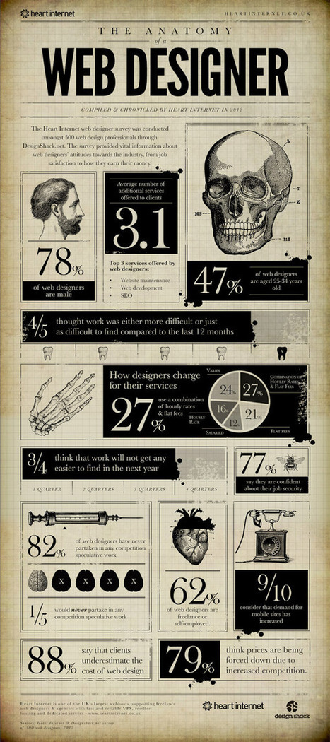
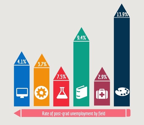
The bold visual design of Infographics makes it easy to digest facts and figures about a given subject. There’s some great infographics based on interesting topics related to web design, from articles explaining the benefits of responsive design to interesting statistics about the industry. Today I showcase 15 interesting Infographics that every web designer will enjoy. Give your scrolling finger some exercise as you browse through this lengthy post!...
Jeff Domansky's insight:
Very creative!

Paul Leslie's curator insight,
October 21, 2014 4:17 AM
Some great ideas for our year 4 students on how to represent their data.

Drawing by Numbers is a resource on data visualization for activists, created by Tactical Tech. It features visualization tools, infographic ideas, as well as advice on working with data and information in campaigning and independent journalism.
...The possibilities outlined above open up a wide range of ways to represent ideas, designs and information about an issue. To simplify this, the most useful starting point in deciding how to use visualisation is to think about what it is you are trying to help audiences do. You can help audiences to:
Using a wide variety of different examples we'll walk through these three approaches and give helpful hints about the key challenges and creative tactics involved in their successful use....
[Great tips to help you tell better stories by using better visuals - JD]
|


Newsletters in 5 minutes or less.