Public Relations & Social Marketing Insight
443.6K views | +8 today
Follow
Public Relations & Social Marketing Insight
Social marketing, PR insight & thought leadership - from The PR Coach
Curated by Jeff Domansky
Your new post is loading...
Scooped by Jeff Domansky
Scoop.it!

It's A Golden Age For Magazine Covers

It's A Golden Age For Magazine Covers | Public Relations & Social Marketing Insight | Scoop.it

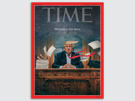
The 2016 election and new administration come accompanied by a renaissance of political image-making: The release of new cover art by magazines like Der Spiegel and Time are met with thousands of shares and retweets. Each photograph and illustration is analyzed and picked apart by commentators. And fomenting all of this is a protest movement with a flair for signage that remixes, reappropriates, and borrows the work of these artists.

Not since George Lois's iconic work for Esquire in the '60s has cover art enjoyed so much popular and critical success. It’s a fascinating time to be an illustrator, designer, or painter working on political subjects. Co.Design asked some of the voices and pens behind today’s iconic cover art about their work—and what’s changed in the past three months....

Jeff Domansky's insight:

The new administration has provided the mother lode of ideas for magazine covers, political cartoons and cable TV news programming.

No comment yet.
Scooped by Jeff Domansky
Scoop.it!

Disenfranchised by Bad Design

Disenfranchised by Bad Design | Public Relations & Social Marketing Insight | Scoop.it

This Nov. 8, even if you manage to be registered in time and have the right identification, there is something else that could stop you from exercising your right to vote.

The ballot. Specifically, the ballot’s design.

Bad ballot design gained national attention almost 16 years ago when Americans became unwilling experts in butterflies and chads. The now-infamous Palm Beach County butterfly ballot, which interlaced candidate names along a central column of punch holes, was so confusing that many voters accidentally voted for Patrick Buchanan instead of Al Gore....

Jeff Domansky's insight:

Here's a look at why bad design of ballots could impact some votes in the election. I hope Donald Trump isn't reading because he might use it as an excuse for a lawsuit about the "rigged election." ;-)

No comment yet.
Scooped by Jeff Domansky
Scoop.it!

Trump’s Libertarian Rival Just Admitted To Stealing Designers' Work

Trump’s Libertarian Rival Just Admitted To Stealing Designers' Work | Public Relations & Social Marketing Insight | Scoop.it

He might not have much chance of winning, and he may not command the same attention in the news cycle, but there's another hopeful in the 2016 presidential election besides Hilary Clinton and Donald Trump: libertarian Gary Johnson, a socially liberal, fiscal conservative whose campaign rests on the idea that he can bridge the divide between the left and the right. Unfortunately, the branding of the Johnson campaign wasn't getting that idea across, so as a fun exercise, the Florida-based branding agency Spark decided to mock up an identity for him.

Then things got weird. Without crediting Spark or paying for the work, a contractor for the Johnson campaign stole Spark's brand identity wholesale. To add insult to injury, the contractor didn't even steal the work correctly. The execution was so bad, Spark felt obliged to publicly release a style guide to its own pilfered work, in the hopes that the Johnson campaign would start using it right.

In a statement to Co.Design, the Johnson campaign acknowledged the screw-up. "At the senior level of the campaign, we were completely unaware until receiving a media inquiry Saturday evening that our website contractor had seen and clearly used the concept and design ideas posted on the web by Spark," said Joe Hunter, communications director for the Johnson campaign. "Upon seeing the obvious connection, we immediately contacted Spark and have since had a very constructive conversation with them—hopefully with no hard feelings. It was never our intent to use anyone's creative work, spec or otherwise, without giving appropriate credit, and we regret that our contractor apparently failed to communicate our desire to use Spark's work. It won't happen again, and we look forward to continued conversations with Spark about putting their excellent work to good use in the campaign."...

Jeff Domansky's insight:

Gary Johnson's Libertarian campaign finally fesses up to stealing another designers work for their own use. Classic reputation management although a little slow.

No comment yet.
Scooped by Jeff Domansky
Scoop.it!

We Asked 3 Designers to Sum Up This Election With a Single Image

We Asked 3 Designers to Sum Up This Election With a Single Image | Public Relations & Social Marketing Insight | Scoop.it

It's been quite the year. From the FBI's Clinton email bombshell to Trump's bragging about sexual assault, this election has been unlike any other in memory. It's also been full of visual emblems, from red Make America Great Again hats to the near-constant stream of memes both campaigns churn out. Yet there hasn't been a single image that truly encapsulate the mania of 2016: Where is this election's Hope poster?


There are several reasons for that, as I wrote back in August. One, the candidates are some of the most well-known—and the least liked—in electoral history, and haven't necessarily inspired artists the way Obama did. Meanwhile, the way we consume images has significantly changed over the past eight years. Today, we are constantly inundated not only with images, but with video and other forms of media.


In response to this question, Co.Design asked three graphic designers—Natasha Jen of Pentagram, Carly Ayres of HAWRAF, and Bobby C. Martin of Original Champions of Design—to create an image that they believe gets at the heart of this election cycle. Today at Fast Company's Innovation Festival, all three discussed the images they created in response to our brief....

Jeff Domansky's insight:

Three designers came up with political poster designs that touch on the media frenzy, police brutality, and the loss of basic civility.

No comment yet.
Scooped by Jeff Domansky
Scoop.it!

What Pantone Color Is Donald Trump?

What Pantone Color Is Donald Trump? | Public Relations & Social Marketing Insight | Scoop.it

No, Donald Trump didn't descend from Loompaland, but one look at his unmistakably orange complexion, and you'd be forgiven for thinking so.


Puzzled citizens have questioned the origins of the Republican presidential candidate's orange skin tone: Is it a Jersey Shore spray tan? The work of a cancer-causing tanning bed? The after-effects of chemical peels? A beta-carotene addiction? (Perhaps if he squeezed a few carrots between taco bowls.) Some have speculated what he would look like without the rumored fake tan.


We may never know the cause of Trump's sui generis skin tone—just as we may never know his firm policy stances—but we can deduce the nearest color, and what it means, thanks to the expert eye of the color company Pantone and its standards manuals. It's difficult to boil him down to just one color, but if you blended together all his hues, you would probably get Pantone 16-1449: the aptly named Gold Flame....

Jeff Domansky's insight:

Political fun: The color gurus at Pantone solve one of this election season's greatest quandaries: What shade of orange is Donald Trump?

No comment yet.