 Your new post is loading...
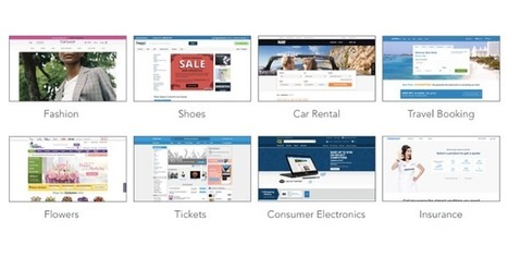
As reported by Fast Company and Inc. Magazine, a new EyeQuant study has shown that there's a surprisingly strong relationship between the "visual clarity" of a website (as rated by an algorithm) and its bounce rate. In fact, the results suggest that up to one-third of a user's decision to stay or bounce comes down to a snap judgment of whether or not the page is too cluttered. In this post, we'll take a closer look at the data and the methodology behind the study.
Why study the impact of visual clarity?
Within the design community, there's been a definite trend towards simpler, more stripped-back design. At EyeQuant, we've seen many of our customers "de-clutter" their way to higher conversion rates, and even observed that amongst a collection of online retailers, the ones with "cleaner" design were growing the fastest.
What we wanted to understand is this: does "clean" design have a positive impact on user engagement across the board, or is it limited to specific cases like overly cluttered-sites or retail?
In terms of design, the minimalist aesthetic is the visual representation of this concept. Even if in the early days of this style it was very difficult for the designers to achieve its simplicity and clean lines, they have learned to “declutter” the visual to the point of it being the second nature. However, some of the designers take it a step further and cut out almost everything from the design.
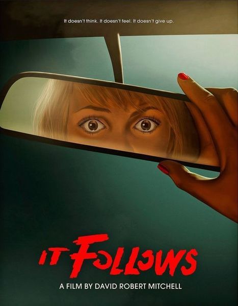
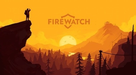
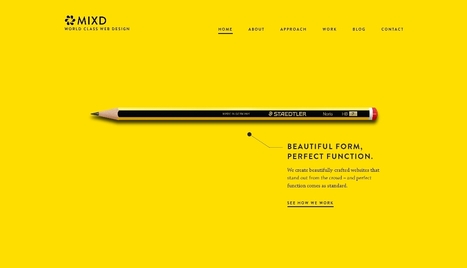
Indeed, even if the latest web designs with loud color, trendy headers, and stunning imagery are really attractive, sometimes, it’s nice to see and admire the everlasting minimalist style. The ultra-minimalist websites in this list focus on composition and typography to create clean and simple visuals, and the naked designs are as beautiful as those full of glamour.
I launched Typewolf as a side project in June of 2013. Working as a designer, I was always frustrated by the lack of good resources for choosing fonts for design projects. Seeing type samples set in “the quick brown fox jumps over the lazy dog” isn’t very useful when it comes to web design—seeing how real type performs on actual websites is much more helpful. I’ve also noticed that other typography sites tend to be written from a type designer’s perspective rather than from the perspective of someone who actually uses type in their day-to-day work. I’ve been a designer for 15 years, so everything on Typewolf is approached from a designer’s perspective....
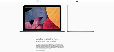
Have you noticed that most websites are, more or less, made up of rectangular boxes? From the rectangular shape of a browser window to the rectangular shape of buttons, websites are mostly rectangular. This is not only practical, it just makes sense. However, that doesn’t mean there is not room for other shapes like circles, triangles, or made up miscellaneous curvatures. I’ve gathered 30 different websites that use different shapes for different purposes. Some of them use random assortments of shape for decorations – like Roadmap – others completely redefine the structure of a web page – like Timetable Records....
While clients often ask you to cram in as much information into a page as possible, seasoned web designers know this can lead to a usability nightmare. Confident and careful use of whitespace, in contrast, is all about giving content room to breathe. The examples listed here work because everything the visitor needs is still there on the page; all that’s absent would just be clutter. In place of that clutter, whitespace helps create a balanced, easy to navigate interface where you can find what you need without being overwhelmed....
Trump's "Make America Great Again" hat was pervasive, potent, and deeply misunderstood.mp's ubiquitous bright red trucker hat, festooned with "Make America Great Again," is now seared into our collective memory. It was the most hated and most loved symbol of the election, the most comical and the most serious. It was a poorly designed product that turned out to be very strong branding. It was the most misunderstood design of the election—for designers and non-designers alike. But most of all, it's a lesson about the limitations of "good" design. "No one wants to give [Trump] credit, understandably, because it’s not something that was designed," says Lindsay Ballant, a designer, art director, and adjunct professor at the Maryland College of Art. "It should be something that designers think about. Good design doesn't necessarily mean effective design." As we move on from the 2016 election and contemplate the role of design in subsequent political campaigns, understanding the difference between good and effective design is imperative....
As we look forward to 2017 — a year that hopefully won’t be plagued by the passing of so many of the world’s greatest artists and performers — the big question on every designer’s mind has to be: what will define design in 2017? So with that in mind, I decided to ask Webflow’s own designers what trends they think will dominate the world of digital design in 2017. (And wrote up a little commentary on their thoughts.)...
The art and psychology of color is a deeply intimate thing. Color affects us daily, from the moment we wake, throughout our day, and well into our evening. This connection to color, and the emotions it evokes plays a big part in how we design as educators, marketers, and brand storytellers. What Is The Psychology Of Color? Color psychology is the science of how color can affect human behavior. This field is a broach branch within psychology and can be very complicated. Humans interpret color based on their personal color preferences, but there are also stereotypical ideas and color associations that affect consumer preference. The combination of the two leads to color and color choice playing a large role in brand marketing and strategy....
What if I told you you could visit an art gallery ... from the comfort of your own home? Or from a bus seat on your commute to work? Or while you're taking a break for lunch? If you follow the right people, that's what Instagram can do for you. There are a lot of really talented artists and designers out there who use Instagram as a sort of mini art gallery -- a social portfolio, if you will. And it's a jackpot for people who love browsing gorgeous design work. To help you narrow your search, I've carefully curated some of the best Instagrams to follow for design inspiration. I did my best to place them in categories -- illustration, graphic design, pop art and installation, color palettes, street art, photography, typography, and calligraphy -- although you'll notice some of their work could fall into a number of different lists. ...
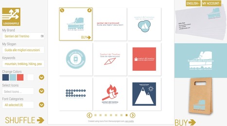
Logoshuffle is a powerful automated logo builder which allows anyone to generate infinite alternative logo designs customized to your preferred brand name, tagline, font and color scheme. Once you have input your brand name, tagline and preferred color scheme Logoshuffle displays nine alternative designs. You can request additional sets by simply clicking on the Shuffle button. Designs that suit you can be saved and kept until you decide which one to buy.Icons are outsourced and licensed from the NounProjec. Pricing: free to use for generating new logo designs. You pay only to download the final high quality version. A 400x400 .PNG version of the final logo you have created costs $29....
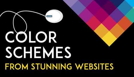
One of the keys to making your design come alive is choosing just the right color combination. Whether you’re attempting to evoke the feelings associated with a breathtaking landscape, a romantic sunset or a dynamic scene bursting with color, it takes a trained eye to bring together the perfect hues to drive your message home. To save you some time and effort in your search for the ideal color combination, we’ve created a list of beautiful color schemes you can use in any of your projects. These color presets are already available for you within Visme, so you can easily apply them to any of your own designs by simply clicking on the color combination of your choice, as seen below....
Minimalism is one of the most dominating styles of today- right from architecture, to design, to literature. It is a style used in almost every other form of art. People often confuse minimalism with absence of detail. Minimalism is certainly not a grand style, but it is also not an absence of detail or design either. Minimalists just focus on how much of useless content can be stripped away from an item without losing its key purpose and identity. Minimalism is simple in form and function, devoid of pointless decorations, yet lavish. What exactly do we understand from Minimalist design? The simplicity of minimalist web design may seem too simple, but it is under the surface that the real content lies. Don’t think minimalism is easier just because it is simple. It gets even more difficult because with fewer elements you still need to provide the same usage with less interface. The less-is-more attitude was first applied in architecture and then slowly moved on to other industries like- interior design, industrial design, and now web design. The basic idea was to eradicate any element that didn’t really contribute to the main purpose or function. 6 Elements to Consider in Minimalist Web Design...
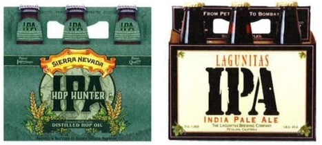
So what is product packaging? It’s a practical tool, yes. (I mean, how else are you going to effectively get beer into your mouth?) But it’s also more than that. Like any good design, packaging tells a story. It’s also a sensual experience, literally engaging us through sight, touch and sound (and possibly smell and taste, depending on the product/package). All of these details help us understand what the enclosed product is for, how it should be used, who should use it and, maybe most importantly, if we should buy a product or not. In the Ultimate Guide to Product Packaging Design we look at how to get your packaging to tell the story you want....
|
Ten years ago, a lot of breweries found they could get away with soliciting a friend to design their beer packaging. Not anymore.
With so many beers competing for attention on the shelves, standout beer labels have become a critical part of any brewery's marketing strategy.
So which breweries have come up with those really standout designs?
Images are a vital component of any website, and using the right ones can enhance both your content and design. The problem lies in finding the right graphics without resorting to the same free stock images everyone else uses. If you really want to set your site apart, there’s an alternative to stock images – you can create your own. The best part is, you don’t need to be a designer to get it done. Nowadays, there are plenty of tools that can help you create stylish graphics with only a little practice, and they’re a great option if you don’t have the budget to hire a designer. In this article, we’ll talk about why images are so important for any website, then we’ll introduce you to three tools that can help you create your own custom graphics. Let’s get started!...
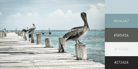
Color is such a fundamental part of the way we perceive the world that we often take it for granted. Think about it: From the youthful and vivid orange on someone’s attire to the gray and gloomy sky above us, colors have the power to mold our perceptions of others and even the circumstances we find ourselves in. This is why one of the most powerful tools in a designer’s arsenal is color. It can either make or break a design; it can be the determining factor in engaging viewers or sending them promptly on their way. As a non-designer, I often find it difficult to find just the right colors for my amateur projects. Whether I’m creating a simple image to support my content or more elaborate projects such as a slide deck or infographic, I frequently spend a good amount of time looking for the perfect color scheme. I ask myself questions like: Do I want my design to be inviting? Provocative and bold? Or intelligent and elegant? Unless you’re a seasoned designer, it takes time and effort to find a color combination that works, which is why the design team at Visme decided to provide our users with a handy list of beautiful color schemes from websites that have been recognized by Awwwards, the most prestigious award for Web designers and developers....
Posters offer a diverse canvas for graphic designers, and some of the very best are not only beautifully designed but also inspiring and thought-provoking. There are hundreds of stunning poster designs that are instantly eye-catching, but we’ve narrowed this list down to a few of the most intriguing examples from the current decade. Whether you prefer to be bold or understated, you’re certain to find something here that will get your creative juices flowing.
Why have I used the adjective 'sensible' in my headline, instead of something more click-worthy like 'crucial'? The answer is that web design trends in 2017 should be all about meeting the user's needs. Gone is the temptation to show off what the browser can do, in its place is a passion for proper design; form follows function. Ignore all the web design trends pieces that tip their hats to virtual reality or to eye-catching animation; 2017 is about utilitarianism. Here are the 10 trends I think will be most noticeable....
As 2016 comes to a near close, our creative team here at Dock9 reflected on what we consider the rising web design trends of 2017. Like any trend, these go in and out of fashion and may not necessarily suit all our users. However, we like to think of each trend as an “additional tool” to our designer tool box, where we pick the right ones for the job at hand. This week we’ve compiled a list of 9 key trends we believe have been prominent in Web design this year, and we predict, likely to continue into 2017.
These technologies have combined to create a huge shift in the web design paradigm, creating, most notably, a responsive (or increasingly mobile-first) design philosophy. On the aesthetic side, 3 years ago flat design reigned supreme. And then Google introduced Material design, which brought us slightly out of abstraction. 2017 marks the year design takes one more step back into reality. Whether it’s through form, color choice or functionality, 2017 is a year of hybrids, where reality and technology collide to create a seamless browsing experience. Here are the 9 web design trends we think are going to bridge that gap...
Empty space is not always wasted space.In fact, when it comes to web design, it's a best practice to give your content a little breathing room. Today's website visitors are content-scanners. They scroll quickly, skim posts, and get distracted by busy layouts trying to accomplish too much. The key to getting your visitors' undivided attention is simplicity -- and that starts with an effective use of whitespace. In this article, we'll take a brief look at why whitespace matters, what it means for conversion-driven web design, and how eight websites are using whitespace to lead their visitors towards a desired action....
It’s design vocabulary time! We know you’ve heard these two terms floating around: skeuomorphism and flat design. What do they mean? They’re two contemporary designs trends that each have their own unique style and set of traits. Skeuomorphism creates a sense of familiarity by emulating materials, while flat design stays true to its medium, often feeling minimal and utilitarian. These opposing styles create a major fork in the road for designers (especially those in UI design), and many projects begin with the question of which world to jump into. Luckily, we’re here to help answer that question with an in-depth look at each design style. We’ll also explore Google’s all-new design language, Material Design, which combines the aesthetic of both skeuomorphism and flat design....
For the early part of this century we saw a lot of colorful artwork in the shape of icons and vibrant mascots. Heavily shaded, three-dimensional characters, and richly rendered forms were all the rage. Now, illustration is heading for a more authentic and organic experience. Low-color, hand-drawn looks that are specifically created for a single-site use are becoming more common and are expected to stick around. Custom designs will more often take on a unique, loose and even childish feel. Websites will feel more personable compared to the copy and paste looks we have been seeing thanks to the prevailing flat design/minimalism bandwagon....
If you look at how product pages take shape across different companies, it's clear that they run the gamut. Some go for the direct approach, displaying an image of a product and explaining why someone should buy it. Other companies create elaborate pages with moving parts and fancy coded elements. Of course, some companies fare better than others at creating delightful product pages. But since we prefer to focus on the positive, we scouted out 14 examples that we find truly admirable. From messaging, to value propositions, to general product promotions, these brands nail these features in a persona-friendly way....
Some trends last for ages while others are cyclical, but whether classic or fleeting, design trends are both inspiring and incredibly useful when it comes to your graphics work. So what’s been hot in 2016? The five styles that have dominated the year so far are outlined here to help you develop eye-catching and relevant concepts, while still staying true your unique creative vision.
We rounded up visual examples of each design trend using royalty-free stock graphics, which you can easily incorporate into your own projects. Here’s the breakdown....
|


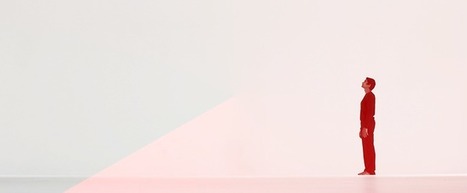


O-e third of the websiite visitors decision to stay more bounce is based on page clutter.
O-e third of the websiite visitors decision to stay more bounce is based on page clutter.