 Your new post is loading...
Ten years ago, a lot of breweries found they could get away with soliciting a friend to design their beer packaging. Not anymore.
With so many beers competing for attention on the shelves, standout beer labels have become a critical part of any brewery's marketing strategy.
So which breweries have come up with those really standout designs?
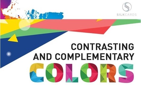
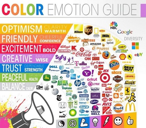
Color theory is the art and science of colors, our understanding of how colors mix, how people perceive colors, and the message the colors communicate. Are you aware that colors impact how one thinks and behaves? In fact, color ads attract 42 percent more attention than those in black and white. This holds true even outside the realm of social media and into print marketing. Prospects hold on to colored business cards 10 times longer than standard white cards.
Why Is Color Theory Important to Content and Social Media Campaigns?
When a prospect’s eyes meet a particular color, they immediately send a message to the brain. After a nanosecond of processing the information, the individual makes a judgment about what they see. They may be interested, bored, or repulsed.
Great marketers wind up testing multiple visuals to find the best option. However, this can’t begin without an understanding of the benefits of color theory in marketing.
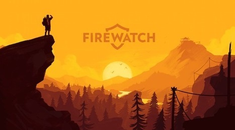
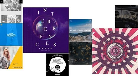
Posters offer a diverse canvas for graphic designers, and some of the very best are not only beautifully designed but also inspiring and thought-provoking. There are hundreds of stunning poster designs that are instantly eye-catching, but we’ve narrowed this list down to a few of the most intriguing examples from the current decade. Whether you prefer to be bold or understated, you’re certain to find something here that will get your creative juices flowing.
When you're new to marketing, especially on a small team, you might have to do a lot of things at a moment's notice. And when it comes to things like blogging and social media, sure, you've got this. But soon enough, you're being pulled onto design projects. One day you're mocking up an infographic; the next, you're designing an ebook. You feel woefully unprepared -- and that design vocabulary? It can feel like a foreign language. Sound familiar? We've been there -- and we know we're not the only marketers who have, at some point, needed to become fluent in this vocabulary. So we decided to share a larger glossary, to help us all step up our game a bit. By no means is this the be-all-end-all of design terminology, so feel free to add your definitions in the comments as well. Here's what we have, organized alphabetically....
Why have I used the adjective 'sensible' in my headline, instead of something more click-worthy like 'crucial'? The answer is that web design trends in 2017 should be all about meeting the user's needs. Gone is the temptation to show off what the browser can do, in its place is a passion for proper design; form follows function. Ignore all the web design trends pieces that tip their hats to virtual reality or to eye-catching animation; 2017 is about utilitarianism. Here are the 10 trends I think will be most noticeable....
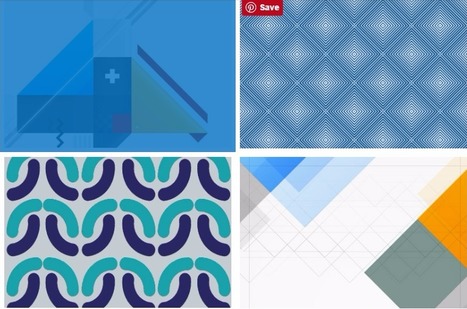
One of the keys to making your design come alive is choosing just the right color combination. Whether you’re attempting to evoke the feelings associated with a breathtaking landscape, a romantic sunset or a dynamic scene bursting with color, it takes a trained eye to bring together the perfect hues to drive your message home. To save you some time and effort in your search for the ideal color combination, we’ve created a list of beautiful color schemes you can use in any of your projects. These color presets are already available for you within Visme, so you can easily apply them to any of your own designs by simply clicking on the color combination of your choice, as seen below....
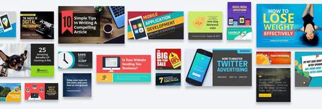
Snappa makes it easy to create any type of online graphic. Create & publish images for social media, content marketing, and more! Hundreds of ready made templates Don't want to design from scratch? No problem! Just choose from our growing collection of beautiful templates to get started in seconds. Everything you need to create stunning graphics Snappa combines the best visual assets with a fully-featured graphic editor....
Some trends last for ages while others are cyclical, but whether classic or fleeting, design trends are both inspiring and incredibly useful when it comes to your graphics work. So what’s been hot in 2016? The five styles that have dominated the year so far are outlined here to help you develop eye-catching and relevant concepts, while still staying true your unique creative vision.
We rounded up visual examples of each design trend using royalty-free stock graphics, which you can easily incorporate into your own projects. Here’s the breakdown....
A lot of these lists just cram everything and anything into the lineup. So, we decided to pick our designers’ brains to bring you the best resources that we are using on a daily basis.
The psychology of color as it relates to persuasion is one of the most interesting — and most controversial — aspects of marketing. At Help Scout we believe the problem has always been depth of analysis. Color theory is a topic of complexity and nuance, but splashy infographics rarely go beyond See ‘n Say levels of coverage. Green Lantern can’t turn lemons into lemonade and I’m left equally unequipped to make smart decisions about the spectrum which shades our world. But why is such a potentially colorful conversation so unwaveringly shallow?...
Why typography? Turns out that while the importance of typography is often overlooked, it plays a critical role in strengthening your brand, creating interest in your product, and highlighting your central message. Knowing that, I decided to sign up for a typography course at the Massachusetts College of Art and Design. Couldn't hurt to learn how to identify a good font from a bad one, right? I learned a lot more than that. I realized that paying attention to even the littlest details of type can make all the difference in the world when you're laying out an email, ebook, or image for social media. This is why I wanted to write this post: to share the most important learnings and resources with my fellow marketers. ...
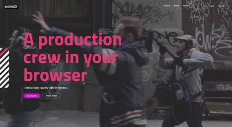
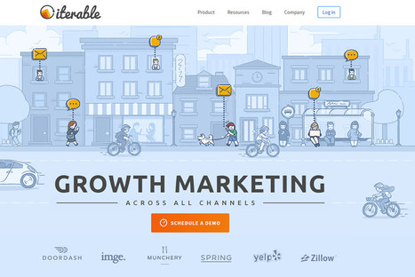
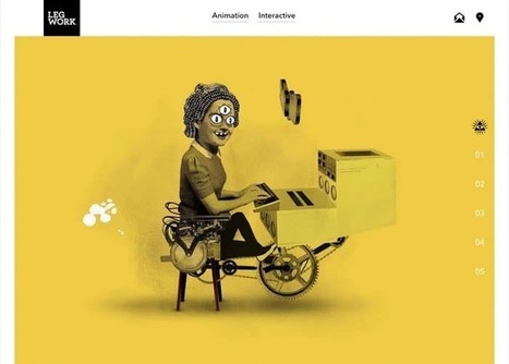
Enter the rise of microsites. Unlike regular websites, microsites tend to be rather simplistic and easier to navigate. This isn't to say they won't make you want to poke around for a while, though. In fact, the really great ones do just that. Ready to see a few use cases? Check out the list below for some great examples of microsites in action....
As Buffer writes, over 90% of our assessment of a product is made on color alone, so it makes sense that color should be considered with care for every design decision, particularly on websites. Chances are, if we don’t like the color palette, we’re not going to stay on the site for very long.
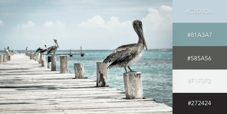
To get you started on your own palette, we’ve gathered 50 beautiful websites with versatile color schemes you can take inspiration from. So without further ado, let’s get knee-deep in some beautiful colors.
|
In 2009, I started a stock media company with a single vision: to provide premium creative content that everyone could afford. This idea grew into VideoBlocks, followed by the launch of GraphicStock and AudioBlocks. Now, we’re adding millions of photos to our new image Marketplace and it’s time to bring our expanding libraries together as Storyblocks.
Whether it’s a brand promotion, video, news update or even a meme, visual content rules the social media landscape. What has become so important is effectively conveying your brand on social media through images and video.
In this quick-scroll world of social media, the visual face of your brand is often times the first thing your audience sees and possibly the one thing they remember. It’s hard to cut and paste an image and reuse it across all of your social networks unless you have a tool like Landscape.
Sprout Social’s very own tool is free to use to resize, crop and scale social media image sizes. And along with our resizing tool, we’ve provided all the specific dimensions and a few quick tips to help you decide which image best fits each position....
Another year has passed and designers are looking ahead towards the future. Many promising design trends are bound to erupt in 2017. Last year I covered the top 2016 design trends and we’ve seen a lot of changes since then. So, for this post I’ve picked the top 20 trends that I’ve noticed gaining traction in 2017. These design trends can apply to any website, so keep your eyes out for these techniques as we move through 2017 and beyond....
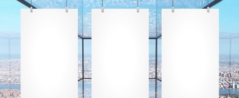
As it turns out, posters aren't as old-school as we might think. In fact, they're still quite effective devices for promoting events. Making yours stand out, however, is the tricky part.Like so many other things in marketing, it requires a combination of creativity and formula. But what are the success factors? And what makes a poster look its best? You're in luck. Our friends at Venngage, who know a thing or two about creating compelling visuals, put together this infographic to guide you along your poster-making journey. It'll help you figure out what information is essential to include on your poster, and how to make it aesthetically appealing -- without overwhelming the viewer....
These technologies have combined to create a huge shift in the web design paradigm, creating, most notably, a responsive (or increasingly mobile-first) design philosophy. On the aesthetic side, 3 years ago flat design reigned supreme. And then Google introduced Material design, which brought us slightly out of abstraction. 2017 marks the year design takes one more step back into reality. Whether it’s through form, color choice or functionality, 2017 is a year of hybrids, where reality and technology collide to create a seamless browsing experience. Here are the 9 web design trends we think are going to bridge that gap...
Why do you want to create a site? Is it to deliver good looking visuals to your visitors? No! The objective is to drive conversions, generate sales, improve brand visibility and ensure your business reaches a wider audience. Unfortunately, an unnecessary focus on visuals might see you creating a site that is low on ROI. Your target website visitors are interested in getting more information about your business and its products and services from your site. If great visuals help drive brand and business messaging forward, well and good and that should be their primary objective. If they haven’t been picked keeping the website’s goal in mind, they will just serve to distract visitors. Here are two sites that have made great use of visuals, and they serve to illustrate the purpose of the site. The visuals are arresting but do not distract visitors from what the website is all about and the products/services it is bringing to them....
Minimalism is one of the most dominating styles of today- right from architecture, to design, to literature. It is a style used in almost every other form of art. People often confuse minimalism with absence of detail. Minimalism is certainly not a grand style, but it is also not an absence of detail or design either. Minimalists just focus on how much of useless content can be stripped away from an item without losing its key purpose and identity. Minimalism is simple in form and function, devoid of pointless decorations, yet lavish. What exactly do we understand from Minimalist design? The simplicity of minimalist web design may seem too simple, but it is under the surface that the real content lies. Don’t think minimalism is easier just because it is simple. It gets even more difficult because with fewer elements you still need to provide the same usage with less interface. The less-is-more attitude was first applied in architecture and then slowly moved on to other industries like- interior design, industrial design, and now web design. The basic idea was to eradicate any element that didn’t really contribute to the main purpose or function. 6 Elements to Consider in Minimalist Web Design...
So what is product packaging? It’s a practical tool, yes. (I mean, how else are you going to effectively get beer into your mouth?) But it’s also more than that. Like any good design, packaging tells a story. It’s also a sensual experience, literally engaging us through sight, touch and sound (and possibly smell and taste, depending on the product/package). All of these details help us understand what the enclosed product is for, how it should be used, who should use it and, maybe most importantly, if we should buy a product or not. In the Ultimate Guide to Product Packaging Design we look at how to get your packaging to tell the story you want....
Are you including images in your social media content? Looking for easy-to-use tools to help you create images for your content strategy? If the idea of using Photoshop makes your head spin or hiring a graphic designer isn’t an option, there are many easy-to-use, low-cost alternatives available to you to create social media graphics. In this article, I’ll show you 6 easy tools that will help you create compelling graphics for social media.
PngImg.com is a large collection of high-quality images of object cutouts on transparent backgrounds ready to be downloaded and used in your next project. You can easily search for the subject you are looking for and select from the image results your favorite ones for immediate download. No registration or login is required. 100% free. N.B.: From the notes in the about page of the site it appears as if some of the images contained in this catalog may have been simply copied from other sources without securing permissions for re-use. Be warned. My comment: Very useful resource for finding image cutouts of objects that can be integrated in existing layouts or photographs thanks to their having a trasparent background. Try it out: http://pngimg.com...
Design trends change every year, and it seems like most of them get hyped up to the point that all the chatter actually hinders the acceptance on some of the trends. There comes a point where, as a web designer, you start to settle into your own personal preferences, and the idea of expanding outside your comfort zone seems costly and maybe even detrimental to your job security. The Awwwards Website Trends and Design recognition program is proof that the outliers are the ones that typically get recognition. Awards and big paychecks go to those who stretch the boundaries and try out new, brave and often even re-emerging designs concepts. You hear about new design trends just about every single year, but this time we wanted to cover some of the re-emerging trends, which have some use, but maybe not the adaptation that they deserve. Let’s have a look....
It’s not every year that we experience big changes. With such rapid growth in technology over the past few years, we’re sure that the big 2016 web design trends will focus on maturing and expanding on those developments.
Flat design will get more texture, “cinematic experiences” will become more common, and the use of JavaScript libraries will enable more experimentation. Growing popularity in WebGL and virtual reality are sure to transform websites as we know them, giving way to new and exciting interactive possibilities.
In this article, we’ll break down 11 of the biggest web design trends we’re expecting to see this year. So get comfortable and start reading – we have a lot to cover!...
|


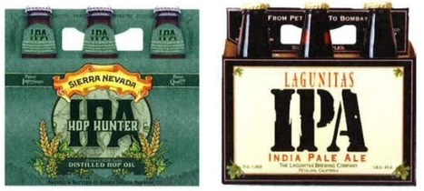


Nothing like the tasty design of beer labels.