 Your new post is loading...
In terms of design, the minimalist aesthetic is the visual representation of this concept. Even if in the early days of this style it was very difficult for the designers to achieve its simplicity and clean lines, they have learned to “declutter” the visual to the point of it being the second nature. However, some of the designers take it a step further and cut out almost everything from the design.
Indeed, even if the latest web designs with loud color, trendy headers, and stunning imagery are really attractive, sometimes, it’s nice to see and admire the everlasting minimalist style. The ultra-minimalist websites in this list focus on composition and typography to create clean and simple visuals, and the naked designs are as beautiful as those full of glamour.
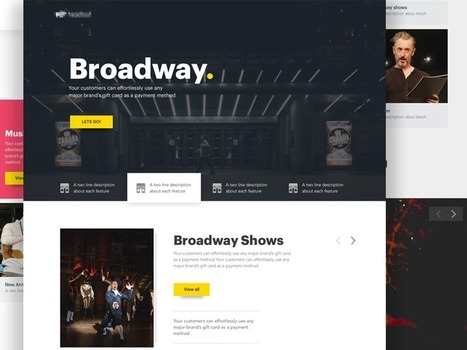
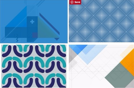
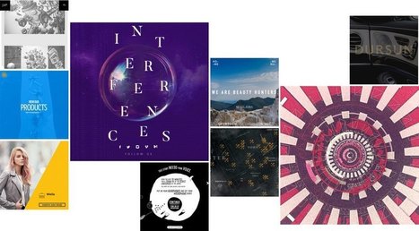
Landing Page Inspiration — December 2016.
What if I told you you could visit an art gallery ... from the comfort of your own home? Or from a bus seat on your commute to work? Or while you're taking a break for lunch? If you follow the right people, that's what Instagram can do for you. There are a lot of really talented artists and designers out there who use Instagram as a sort of mini art gallery -- a social portfolio, if you will. And it's a jackpot for people who love browsing gorgeous design work. To help you narrow your search, I've carefully curated some of the best Instagrams to follow for design inspiration. I did my best to place them in categories -- illustration, graphic design, pop art and installation, color palettes, street art, photography, typography, and calligraphy -- although you'll notice some of their work could fall into a number of different lists. ...
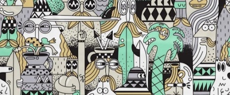
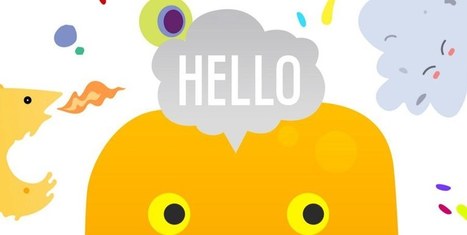
For the early part of this century we saw a lot of colorful artwork in the shape of icons and vibrant mascots. Heavily shaded, three-dimensional characters, and richly rendered forms were all the rage. Now, illustration is heading for a more authentic and organic experience. Low-color, hand-drawn looks that are specifically created for a single-site use are becoming more common and are expected to stick around. Custom designs will more often take on a unique, loose and even childish feel. Websites will feel more personable compared to the copy and paste looks we have been seeing thanks to the prevailing flat design/minimalism bandwagon....
Some trends last for ages while others are cyclical, but whether classic or fleeting, design trends are both inspiring and incredibly useful when it comes to your graphics work. So what’s been hot in 2016? The five styles that have dominated the year so far are outlined here to help you develop eye-catching and relevant concepts, while still staying true your unique creative vision.
We rounded up visual examples of each design trend using royalty-free stock graphics, which you can easily incorporate into your own projects. Here’s the breakdown....
Enter the rise of microsites. Unlike regular websites, microsites tend to be rather simplistic and easier to navigate. This isn't to say they won't make you want to poke around for a while, though. In fact, the really great ones do just that. Ready to see a few use cases? Check out the list below for some great examples of microsites in action....
So, it’s safe to say that composition is pretty important. So, what exactly is a composition? Well, in very simple terms, it’s the part where all the separate elements come together to form a whole. When all of your type, your images, your graphics and colors, come together to form one cohesive design.
A successful composition means that you have arranged, distributed, aligned and compiled your design in a way that not only looks good but is also highly functional and effective. So, let’s run over a few tips, tricks and techniques that will have you mastering composition in no time....
One of the more interesting design trends is the split-screen layout, in which some kind of vertical break divides portions of the page into two or more parts. A split-screen websites will showcase messages which are equal in terms of importance. If you offer goods, as well as services, you may feature your products on one side of a split screen and then highlight your services on the other side. So here, we take a look at some of examples of split-screen layout in Web design.
|
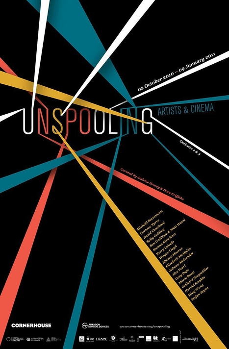
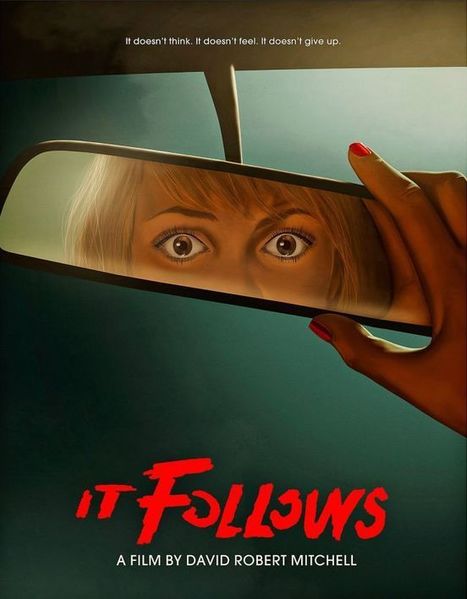
Posters offer a diverse canvas for graphic designers, and some of the very best are not only beautifully designed but also inspiring and thought-provoking. There are hundreds of stunning poster designs that are instantly eye-catching, but we’ve narrowed this list down to a few of the most intriguing examples from the current decade. Whether you prefer to be bold or understated, you’re certain to find something here that will get your creative juices flowing.
These technologies have combined to create a huge shift in the web design paradigm, creating, most notably, a responsive (or increasingly mobile-first) design philosophy. On the aesthetic side, 3 years ago flat design reigned supreme. And then Google introduced Material design, which brought us slightly out of abstraction. 2017 marks the year design takes one more step back into reality. Whether it’s through form, color choice or functionality, 2017 is a year of hybrids, where reality and technology collide to create a seamless browsing experience. Here are the 9 web design trends we think are going to bridge that gap...
It’s design vocabulary time! We know you’ve heard these two terms floating around: skeuomorphism and flat design. What do they mean? They’re two contemporary designs trends that each have their own unique style and set of traits. Skeuomorphism creates a sense of familiarity by emulating materials, while flat design stays true to its medium, often feeling minimal and utilitarian. These opposing styles create a major fork in the road for designers (especially those in UI design), and many projects begin with the question of which world to jump into. Luckily, we’re here to help answer that question with an in-depth look at each design style. We’ll also explore Google’s all-new design language, Material Design, which combines the aesthetic of both skeuomorphism and flat design....
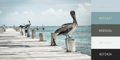
One of the keys to making your design come alive is choosing just the right color combination. Whether you’re attempting to evoke the feelings associated with a breathtaking landscape, a romantic sunset or a dynamic scene bursting with color, it takes a trained eye to bring together the perfect hues to drive your message home. To save you some time and effort in your search for the ideal color combination, we’ve created a list of beautiful color schemes you can use in any of your projects. These color presets are already available for you within Visme, so you can easily apply them to any of your own designs by simply clicking on the color combination of your choice, as seen below....
Color wields enormous sway over our attitudes and emotions. When our eyes take in a color, they communicate with a region of the brain known as the hypothalamus, which in turn sends a cascade of signals to the pituitary gland, on to the endocrine system, and then to the thyroid glands. The thyroid glands signal the release of hormones, which cause fluctuation in mood, emotion, and resulting behavior. Research from QuickSprout indicates that 90% of all product assessments have to do with color. “Color,” writes Neil Patel, is “85% of the reason you purchased a specific product.” It’s a no-brainer fact of any website that color affects conversions. Big time. So, the bottom line is: use the right colors, and you win....
Think about the iconic brand names you know: Apple, Target, McDonald’s, Gap. What images come to mind? For many of us, probably their logos. That’s because whether it’s an apple or big golden arches, a logo is crucial to a company’s identity. Now, new research says that logos are even more important than businesses and consumers realize. A recent study in the Journal of Consumer Research found that even just a basic element of logos—their shape—affects how people perceive a company and its products.
There’s already a good amount of research on how logos influence customers. For example, a 2011 study found that when a company has an incomplete logo (think IBM), people perceive the business as more innovative but less trustworthy. Another weird logo effect that researchers have found: when consumers see a complex-looking logo over and over again, they start to like the brand more. Given these past findings, Amitava Chattopadhyay and his team at INSEAD thought something as simple as a logo’s overall shape—circular or angular—might also impact people’s opinions in a significant way....
So what’s the secret to designing with contrast in a way that will enhance your project? Unfortunately, there’s no magic formula. The process often starts to happen subconsciously as you build your design skills. If you’re thinking that this sounds like some mysterious skill that designers are keeping to themselves, don’t give up yet. Contrast is a design tool that anyone can use to organize and add visual interest to their design projects, so keep reading to find out how....
Recently, we started asking businesses how much they valued design in their workplace.
And this is one of the most common answers we heard: For the challenge of perfecting a steady design flow – is it really worth it?
Firstly, we’re strong believers in the notion that design in the workplace should be easy. And secondly – a thousand times yes.
To outline exactly why, we created this list of proven reasons design is a good business decision....
|


![20 Reasons Good Design [Really] Matters To Your Business – Design School | Public Relations & Social Marketing Insight | Scoop.it](https://img.scoop.it/cN32AQDL_D2O0Bkb259EjDl72eJkfbmt4t8yenImKBVvK0kTmF0xjctABnaLJIm9)


Beautiful minimalist designs to admire.