 Your new post is loading...
Websites that are considered as modern and fresh today, will not be treated in the same manner tomorrow because Web design trends are changing constantly with time. Professionals associated with the industry are aware of the fact that every year brings new challenges and opportunities in the field of web design and development. Therefore, it is important to know how to make them flexible and adaptive towards the rapidly changing trends of website design. Here, we have put together a list of web design trends that will have a bigger impact in 2018....
While clients often ask you to cram in as much information into a page as possible, seasoned web designers know this can lead to a usability nightmare. Confident and careful use of whitespace, in contrast, is all about giving content room to breathe. The examples listed here work because everything the visitor needs is still there on the page; all that’s absent would just be clutter. In place of that clutter, whitespace helps create a balanced, easy to navigate interface where you can find what you need without being overwhelmed....
As 2016 comes to a near close, our creative team here at Dock9 reflected on what we consider the rising web design trends of 2017. Like any trend, these go in and out of fashion and may not necessarily suit all our users. However, we like to think of each trend as an “additional tool” to our designer tool box, where we pick the right ones for the job at hand. This week we’ve compiled a list of 9 key trends we believe have been prominent in Web design this year, and we predict, likely to continue into 2017.
These technologies have combined to create a huge shift in the web design paradigm, creating, most notably, a responsive (or increasingly mobile-first) design philosophy. On the aesthetic side, 3 years ago flat design reigned supreme. And then Google introduced Material design, which brought us slightly out of abstraction. 2017 marks the year design takes one more step back into reality. Whether it’s through form, color choice or functionality, 2017 is a year of hybrids, where reality and technology collide to create a seamless browsing experience. Here are the 9 web design trends we think are going to bridge that gap...
Trends are mysterious things. Some stay for years and others are just a swift shimmer that leave as fast as they enter the scene. Still others shift and evolve with the times. Design is both the driving force and the result of this cycle of trends—with packaging design creating personal experiences (like the unboxing experience) that connect consumers to brands on a deeper level. With that in mind, here are the 9 packaging trends that we are predicting for 2017....
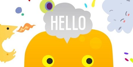
For the early part of this century we saw a lot of colorful artwork in the shape of icons and vibrant mascots. Heavily shaded, three-dimensional characters, and richly rendered forms were all the rage. Now, illustration is heading for a more authentic and organic experience. Low-color, hand-drawn looks that are specifically created for a single-site use are becoming more common and are expected to stick around. Custom designs will more often take on a unique, loose and even childish feel. Websites will feel more personable compared to the copy and paste looks we have been seeing thanks to the prevailing flat design/minimalism bandwagon....
Color wields enormous sway over our attitudes and emotions. When our eyes take in a color, they communicate with a region of the brain known as the hypothalamus, which in turn sends a cascade of signals to the pituitary gland, on to the endocrine system, and then to the thyroid glands. The thyroid glands signal the release of hormones, which cause fluctuation in mood, emotion, and resulting behavior. Research from QuickSprout indicates that 90% of all product assessments have to do with color. “Color,” writes Neil Patel, is “85% of the reason you purchased a specific product.” It’s a no-brainer fact of any website that color affects conversions. Big time. So, the bottom line is: use the right colors, and you win....
Design trends change every year, and it seems like most of them get hyped up to the point that all the chatter actually hinders the acceptance on some of the trends. There comes a point where, as a web designer, you start to settle into your own personal preferences, and the idea of expanding outside your comfort zone seems costly and maybe even detrimental to your job security. The Awwwards Website Trends and Design recognition program is proof that the outliers are the ones that typically get recognition. Awards and big paychecks go to those who stretch the boundaries and try out new, brave and often even re-emerging designs concepts. You hear about new design trends just about every single year, but this time we wanted to cover some of the re-emerging trends, which have some use, but maybe not the adaptation that they deserve. Let’s have a look....
|
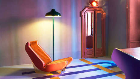
Less is a bore, as Robert Venturi once said. Minimalism has held a tight grip on the modern design industry for the past decade. We embraced the Apple aesthetic, extolled the logic of Helvetica, and worshiped at the church of Dieter Rams. It served its purpose, most recently, as a correctional to the excesses of the 1990s. But lately, as dispatches from Milan Design Week have shown, asceticism has given way to audacity. Every April, hundreds of thousands of people trek to Milan for its trendsetting design week, which ultimately influences the furniture, accessories, and textiles that make their way into homes, offices, hotels, restaurants, and virtually every other interior. This year the artistic influences ranged from ’30s art deco to ’70s eclecticism. Designers and manufacturers experimented with digital fabrication–like 3D knitting–and rediscovered artisanal craft techniques, like lacquering, metal casting, and jacquard weaving. But one thing was consistent: They’re embracing luxurious materials and textures, testing ambitious silhouettes, and piling on the details to yield products and furnishings that are visually enticing and emotionally evocative.In other words, minimalism is dead; maximalism has arrived....
It’s that time of year where we look at the year that was and the year that will be. We’ve seen a lot of amazing website designs this year, and I’m eager to see what 2017 has in store for website and website design. 2017 is sure to bring some amazing website designs, but if we look hard enough, we can already start seeing some trends that are sure to dominate websites in 2017. Let’s take a look at the 10 website design trends we can expect to see in 2017....
As we look forward to 2017 — a year that hopefully won’t be plagued by the passing of so many of the world’s greatest artists and performers — the big question on every designer’s mind has to be: what will define design in 2017? So with that in mind, I decided to ask Webflow’s own designers what trends they think will dominate the world of digital design in 2017. (And wrote up a little commentary on their thoughts.)...
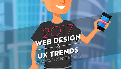
Are you considering creating a new website for your business? Want to know the trends that are expected to take charge in 2017?
The Deep End take a look at the 10 web design trends they expect to see more of in this infographic....
It’s design vocabulary time! We know you’ve heard these two terms floating around: skeuomorphism and flat design. What do they mean? They’re two contemporary designs trends that each have their own unique style and set of traits. Skeuomorphism creates a sense of familiarity by emulating materials, while flat design stays true to its medium, often feeling minimal and utilitarian. These opposing styles create a major fork in the road for designers (especially those in UI design), and many projects begin with the question of which world to jump into. Luckily, we’re here to help answer that question with an in-depth look at each design style. We’ll also explore Google’s all-new design language, Material Design, which combines the aesthetic of both skeuomorphism and flat design....
If you look at how product pages take shape across different companies, it's clear that they run the gamut. Some go for the direct approach, displaying an image of a product and explaining why someone should buy it. Other companies create elaborate pages with moving parts and fancy coded elements. Of course, some companies fare better than others at creating delightful product pages. But since we prefer to focus on the positive, we scouted out 14 examples that we find truly admirable. From messaging, to value propositions, to general product promotions, these brands nail these features in a persona-friendly way....
When the weather warms up, the arctic length of the supermarket beer aisle starts to beckon. And every year, when we venture over, we are amazed by the amount of design talent on display. Moreover, it is clear that the trends in beer label design are always changing. The growth of the craft beer (a.k.a. artisanal, a.k.a. micro-brewed, a.k.a. small batch, whatever) industry appears to be unstoppable. In fact, there are so many bottles to choose from now, almost all of them thoughtfully designed, that it has become rather difficult for any one to stand out. Is it still possible to do so on the basis of a particularly good beer label design alone? We think so.Here is our trend observation: the best examples of beer label design today do not take the middle road. They are either distinctly maximal (colorful, visually loud, eclectic and full of attitude) or minimal (confidently spare, geometric, typography-oriented, exuding elegance). Below we’ve rounded up our favorite recent examples of each type...
We’ve all received brochures from various businesses and most of the time they all have one thing in common — they’re boring.
Whether they’re packed with so much information you feel like you’re about to read a full length novel, or so plain you feel like you’re sitting in the dentist’s office, brochures tend to get a bad rap. They may be chock full of important stuff, but unless you can get someone to pick it up and read it, it doesn’t matter how great the content inside is.
Here are 25 ways to step up your brochure design game and ensure your information will be shared....
|


Here's what's trending in design in 2018.