Public Relations & Social Marketing Insight
443.6K views | +2 today
Follow
Public Relations & Social Marketing Insight
Social marketing, PR insight & thought leadership - from The PR Coach
Curated by Jeff Domansky
Your new post is loading...
Scooped by Jeff Domansky
Scoop.it!

Learn to pair Google web fonts with this classic art-inspired guide

Learn to pair Google web fonts with this classic art-inspired guide | Public Relations & Social Marketing Insight | Scoop.it

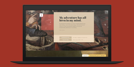
There are several nifty ways to go about pairing fonts for your design projects, including this machine learning-based tool and this Tinder-style app. But if you just want to see some great combinations, you’ll want to check out this excellent guide by designer Lou Levit.


It features 50 top-notch pairings that draw from Google’s extensive web font collection – so you can grab all the typefaces you like for free, and use them on web design projects – and they’re matched with beautiful classic art.


The pairings are organized and navigable by font style and mood (choose from Modern, Striking, Eccentric, Classic, Minimal, Neutral, and Warm). That’s handy for quickly finding a combination that suits your needs, whether it’s to professionally present information or announce an event. Plus, you can download the entire guide as a PDF.


Find the guide, as well as tips on pairing fonts and the handy PDF, over at ReliablePSD.

Jeff Domansky's insight:

This excellent guide by designer Lou Levit depicts 50 gorgeous font pairings along with beautiful classic works of art. Find the right one for your project.

No comment yet.
Scooped by Jeff Domansky
Scoop.it!

If You’re still using these Fonts… You need to stop. – The Mission

If You’re still using these Fonts… You need to stop. – The Mission | Public Relations & Social Marketing Insight | Scoop.it

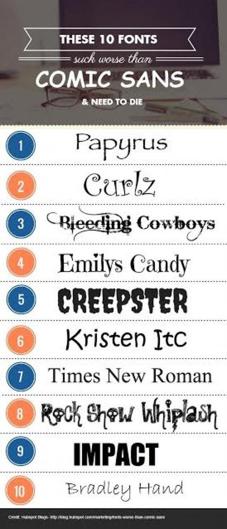
Like most rational people, I’ve never been a fan of Comic Sans. In fact, I die a little inside when I see that this font is still used on some websites and blogs! Comic Sans makes people bounce. It’s that awful.


But like I said, some fonts are even more offensive and awful. Here are 10 examples Carly Stec over at HubSpot came up — I made a visual out of her list because you have to see these bad boys to truly appreciate just how much they need to die....

Jeff Domansky's insight:

Bad fonts apocalypse now! Kudos to Larry Kim.

Stephen Buckley's curator insight, January 22, 2017 10:00 PM

This piece by Larry Kim is both important and comical. The article is about how some text fonts can be visually displeasing and turn off people who are visiting a web page. Notably, Kim compares the text font on a web page to the style of clothing a person wears. He argues that people will immediately think someone is "cool" if we like their style which he then argues that it is exact same paradigm with text fonts. Kim along with the help of Carly Stec from HubSpot have noted 10 fonts that "need to die" in the article. Although this article is an opinion piece and is not credible, the topic is extremely relevant to anyone who has a say in what text font is being used in any form of communication. I personally do not think that the need to cut certain text fonts out of our lives is a new idea. This is a topic that should be discussed at design tables before a font is used.