 Your new post is loading...
Online merchants could always use some free expert advice from the design community. There is a wide variety of free ebooks available to help. Here is a list of helpful ebooks on design. There are titles on typography, classic design, color theory, user-experience design, logos, brand building, creativity, and more. All of these ebooks are free.
While big businesses often have multiple decision makers with very specific ideas and guidelines to keep their existing brands consistent, smaller companies are usually more open to exploring new creative directions, and can move faster to implement them. If you need some more convincing that working with small businesses can result in some stunning creative work, we've put together a list of 15 small business branding examples to get you inspired for your next project...
The colors you choose while designing a website, poster or any other type of image will have a huge impact on whether or not the overall design is successful. After all, there is a lot of psychology behind the colors that people are attracted to, and designers need to incorporate this into everything they do.
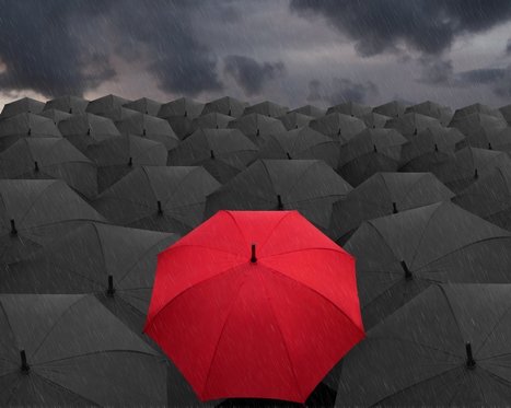
Color contrast plays a very valuable role, but it is often overlooked, undervalued and misunderstood. To avoid this problem, you must learn more about color contrast, including how and why you should use it. Once you go beyond the basics of knowing that red and orange aren’t good colors to create contrast but black and white are, you can begin to develop an enhanced aesthetic that will please clients and viewers.
Why is Color Contrast So Useful?
Color contrast, in a nutshell, provides visual intrigue and keeps viewers interested. Consider for a moment how boring it would be if an entire poster was made from one color or only included shades from the same color family. Although there are some instances when this does work from an artistic perspective, it’s not an approach that is likely to grab someone’s attention when they’re perusing store shelves, looking at movie posters or surfing the web. Therefore, it’s wise to use contrasting colors whenever appropriate....
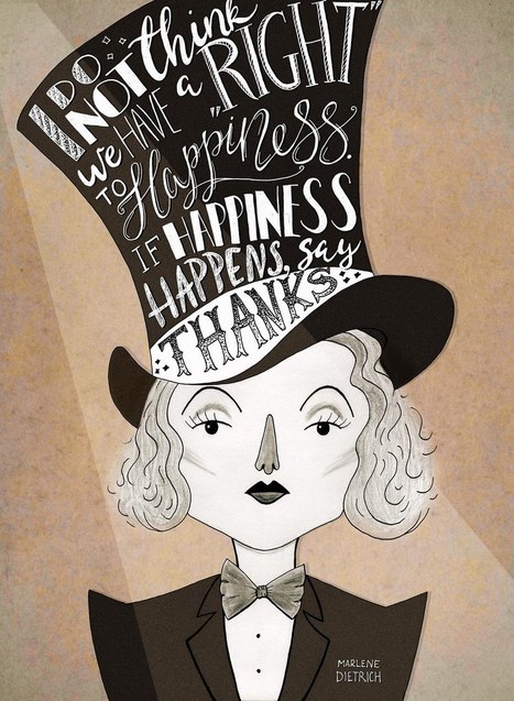
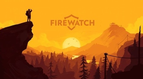
Posters offer a diverse canvas for graphic designers, and some of the very best are not only beautifully designed but also inspiring and thought-provoking. There are hundreds of stunning poster designs that are instantly eye-catching, but we’ve narrowed this list down to a few of the most intriguing examples from the current decade. Whether you prefer to be bold or understated, you’re certain to find something here that will get your creative juices flowing.
You can have words without a picture, or a picture without words, but when you bring them together you get something special: a piece of art with a message. We see examples of creative typography all over the place, from polished advertisements to street art. But how do you get from idea to finished product? Recently, 99designs teamed up with Skillshare to offer a classes to our designers on gaining typographic inspiration from your surroundings, adding visual concepts to individual words, hand lettering and shading, and custom logotypes. Take a look at some of the awesome results. And, if you’re feeling inspired, jump over to Skillshare and sign up for your trial!...
Why have I used the adjective 'sensible' in my headline, instead of something more click-worthy like 'crucial'? The answer is that web design trends in 2017 should be all about meeting the user's needs. Gone is the temptation to show off what the browser can do, in its place is a passion for proper design; form follows function. Ignore all the web design trends pieces that tip their hats to virtual reality or to eye-catching animation; 2017 is about utilitarianism. Here are the 10 trends I think will be most noticeable....
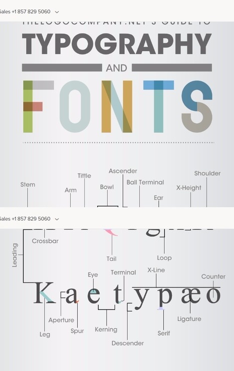
Typography is associated with great design for web and print. However, it was not so long ago that typesetting for printing presses was the norm. During this era of typesetting, many technical terms evolved for the construction and makeup of fonts and layout. It was like a secret code for typesetters, where few outside of the industry had any knowledge of the terms being used. The Logo Company has put together this clever graphic that decodes these technical terms associated with type and explains the meaning of each term in simple, plain English, that anyone can understand....
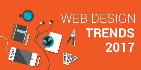
Are you considering creating a new website for your business? Want to know the trends that are expected to take charge in 2017?
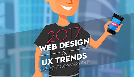
The Deep End take a look at the 10 web design trends they expect to see more of in this infographic....
Like all business, those in the real estate realm should be seeking uniqueness, clarity and memorability in their branding. So how do you go beyond the overused and generic images of houses, skyscrapers and rooftops? We’ve got 22 great creative examples of people who got creative with their real estate, property and mortgage company logos.
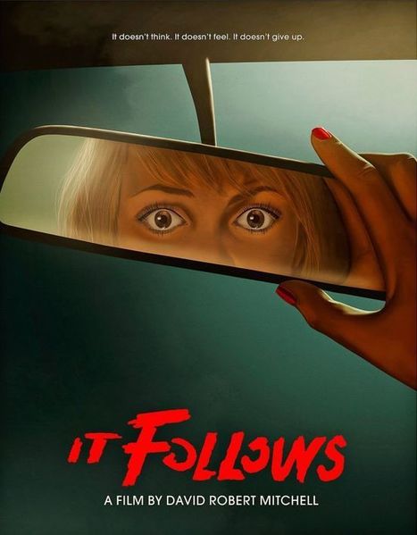
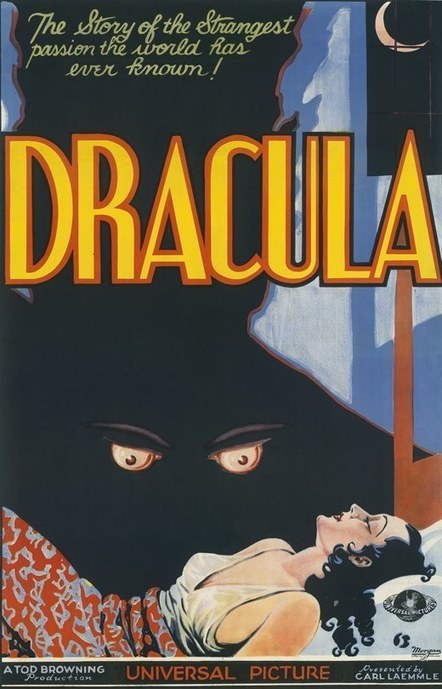
Horror movies have been around for about 120 years. Things have changed since Georges Méliès’s The Haunted Castle (although maybe not that much), not just with the movies themselves, but with the way they’re advertised, too. Movie posters (usually featuring what’s known as “key art,” the singular image that is the foundation for a movie’s marketing campaign) have been around since the beginning of cinema. Many of the earliest have been lost to history, due to extreme wear and tear. Before the advent of television, movies toured the country from theater to theater for months, sometimes years, and the lobby posters naturally followed along with them. They’d get torn, dirty, faded or worse, until the distributor would simply throw them away. Still, collectors managed to rescue some of the extant film posters and restore them. Since it’s October, we thought we’d take you through a historical tour of the best (and a few of the worst) horror movie posters of the past decades....
This week's Six Pack features a vivid array of bold stylings from Pheist (Hamburg, Germany), Hector Mansilla (Ciudad Victoria, Mexico), Richard Vergez (Brooklyn, United States), Sarah Matuszewski (Ludwigsburg, Germany), Raluca Bararu (Bucharest, Romania) and Dylan Morang (Maine, United States)....
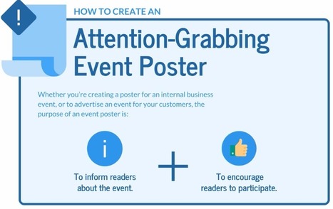
I come to you today with my best tips for how to create awesome, attention-grabbing event posters.
This article focuses specifically on how to create posters to advertise events. I’m going to write another article on how to create informational posters soon.
In this article, I’ll explain how to: - Create a hierarchy of information.
- Grab readers’ attention with a beautiful design.
- Design specifically for print.
- Design specifically for email....
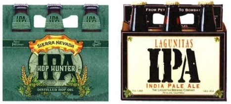
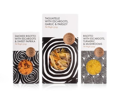
So what is product packaging? It’s a practical tool, yes. (I mean, how else are you going to effectively get beer into your mouth?) But it’s also more than that. Like any good design, packaging tells a story. It’s also a sensual experience, literally engaging us through sight, touch and sound (and possibly smell and taste, depending on the product/package). All of these details help us understand what the enclosed product is for, how it should be used, who should use it and, maybe most importantly, if we should buy a product or not. In the Ultimate Guide to Product Packaging Design we look at how to get your packaging to tell the story you want....
|
Ten years ago, a lot of breweries found they could get away with soliciting a friend to design their beer packaging. Not anymore.
With so many beers competing for attention on the shelves, standout beer labels have become a critical part of any brewery's marketing strategy.
So which breweries have come up with those really standout designs?
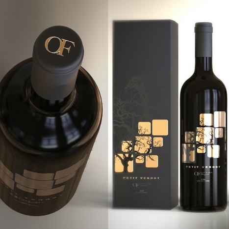
Your label is one of the first thing people are going to notice about your bottle. And a label can tell you a lot about the wine inside: what kind of occasion it’s best for, whether it’s a red or a white (or a sparkling or a rose), what varietal it is, what type of flavor to expect… seriously, your customer is drawing a LOT of information from your label. And because they’re looking for your label to get all of that information, you want to make sure that your label is an accurate representation of who you are and what your customer can expect from your wine. It’s a big deal! Here’s a roundup of 30 of our favorite cool wine labels for inspiration...
Curated directory of the best Product Pages
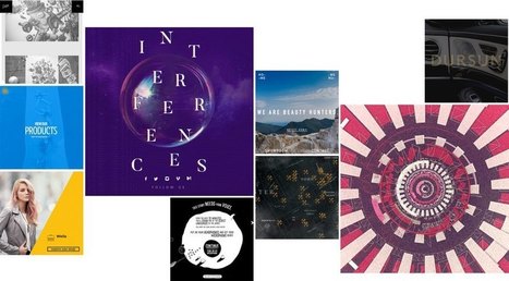
This best web design inspiration 2017 will let you know about the modern, creative and brilliant design. You can get fresh ideas to make yourself better. Here’s a wonderful, creative and awesome collection of web design inspiration 2017. Websites let people know about the brand, product, company etc. It helps people out to know about regarding thing. Feature, about, description is mentioned to give clear view. Web design in any website does matter a lot because you’re not going to show feature and about only but are responsible for all engagement you made for viewers. So, keep in mind while selecting any design as it leaves good or bad impact....
It’s that time of year where we look at the year that was and the year that will be. We’ve seen a lot of amazing website designs this year, and I’m eager to see what 2017 has in store for website and website design. 2017 is sure to bring some amazing website designs, but if we look hard enough, we can already start seeing some trends that are sure to dominate websites in 2017. Let’s take a look at the 10 website design trends we can expect to see in 2017....
With a new year just around the corner, it’s time to take a look at the future direction of web design. As technology advances and becomes more ingrained into every facet of our daily lives, users are demanding more and more from their online user experiences (UX).Personal, interactive, and relevant are three keywords which users want from their UX. Which basically means web designers now face the challenge of developing a website which understands and responds to its users throughout the process....
These technologies have combined to create a huge shift in the web design paradigm, creating, most notably, a responsive (or increasingly mobile-first) design philosophy. On the aesthetic side, 3 years ago flat design reigned supreme. And then Google introduced Material design, which brought us slightly out of abstraction. 2017 marks the year design takes one more step back into reality. Whether it’s through form, color choice or functionality, 2017 is a year of hybrids, where reality and technology collide to create a seamless browsing experience. Here are the 9 web design trends we think are going to bridge that gap...
Trends are mysterious things. Some stay for years and others are just a swift shimmer that leave as fast as they enter the scene. Still others shift and evolve with the times. Design is both the driving force and the result of this cycle of trends—with packaging design creating personal experiences (like the unboxing experience) that connect consumers to brands on a deeper level. With that in mind, here are the 9 packaging trends that we are predicting for 2017....
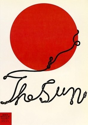
Typographic characters don’t always need to come from font files. Many of today’s brilliant designs manifest typographic characters through drawing, squiggling and doodling.
Meet Shigeo Fukuda, a master of manipulating lines into playful concepts. In the example to the left, Fukuda creates the words, “The Sun”, from a playful and winding doodle of a power cord emerging from behind a minimal rendition of the sun.
How would you create playful typography from an illustration or drawing? Think about ideas like creating words like “health” from illustrations of vegetables. Or create a rendering of a word like “summer” out of illustrations of melting ice cubes.
Get playful!...
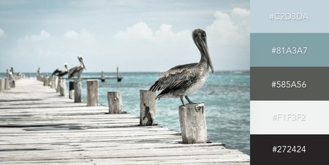
One of the keys to making your design come alive is choosing just the right color combination. Whether you’re attempting to evoke the feelings associated with a breathtaking landscape, a romantic sunset or a dynamic scene bursting with color, it takes a trained eye to bring together the perfect hues to drive your message home. To save you some time and effort in your search for the ideal color combination, we’ve created a list of beautiful color schemes you can use in any of your projects. These color presets are already available for you within Visme, so you can easily apply them to any of your own designs by simply clicking on the color combination of your choice, as seen below....
Minimalism is one of the most dominating styles of today- right from architecture, to design, to literature. It is a style used in almost every other form of art. People often confuse minimalism with absence of detail. Minimalism is certainly not a grand style, but it is also not an absence of detail or design either. Minimalists just focus on how much of useless content can be stripped away from an item without losing its key purpose and identity. Minimalism is simple in form and function, devoid of pointless decorations, yet lavish. What exactly do we understand from Minimalist design? The simplicity of minimalist web design may seem too simple, but it is under the surface that the real content lies. Don’t think minimalism is easier just because it is simple. It gets even more difficult because with fewer elements you still need to provide the same usage with less interface. The less-is-more attitude was first applied in architecture and then slowly moved on to other industries like- interior design, industrial design, and now web design. The basic idea was to eradicate any element that didn’t really contribute to the main purpose or function. 6 Elements to Consider in Minimalist Web Design...
Some trends last for ages while others are cyclical, but whether classic or fleeting, design trends are both inspiring and incredibly useful when it comes to your graphics work. So what’s been hot in 2016? The five styles that have dominated the year so far are outlined here to help you develop eye-catching and relevant concepts, while still staying true your unique creative vision.
We rounded up visual examples of each design trend using royalty-free stock graphics, which you can easily incorporate into your own projects. Here’s the breakdown....
|


Great design resources. Did I mention free?