


Daily Design Inspiration from selecting photography, architecture, graphic design and more. Our goal is to simply inspire your day and be creative!
Get Started for FREE
Sign up with Facebook Sign up with X
I don't have a Facebook or a X account


 Your new post is loading...
 Your new post is loading...
Your new post is loading...
Daily Design Inspiration from selecting photography, architecture, graphic design and more. Our goal is to simply inspire your day and be creative!

No comment yet.
Sign up to comment
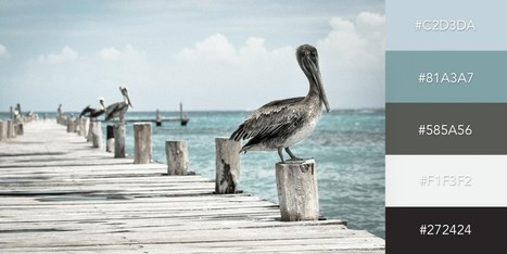
The colors you choose while designing a website, poster or any other type of image will have a huge impact on whether or not the overall design is successful. After all, there is a lot of psychology behind the colors that people are attracted to, and designers need to incorporate this into everything they do.
Jeff Domansky's insight:
Interesting post on the importance of color contrast in your design.
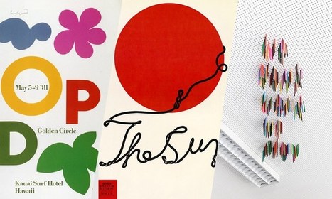
Posters offer a diverse canvas for graphic designers, and some of the very best are not only beautifully designed but also inspiring and thought-provoking. There are hundreds of stunning poster designs that are instantly eye-catching, but we’ve narrowed this list down to a few of the most intriguing examples from the current decade. Whether you prefer to be bold or understated, you’re certain to find something here that will get your creative juices flowing.
Jeff Domansky's insight:
Deliciously creative posters. Recommended viewing. 10/10
You can have words without a picture, or a picture without words, but when you bring them together you get something special: a piece of art with a message. We see examples of creative typography all over the place, from polished advertisements to street art. But how do you get from idea to finished product? Recently, 99designs teamed up with Skillshare to offer a classes to our designers on gaining typographic inspiration from your surroundings, adding visual concepts to individual words, hand lettering and shading, and custom logotypes. Take a look at some of the awesome results. And, if you’re feeling inspired, jump over to Skillshare and sign up for your trial!...
Jeff Domansky's insight:
Fresh creativity.
One of the keys to making your design come alive is choosing just the right color combination.
Whether you’re attempting to evoke the feelings associated with a breathtaking landscape, a romantic sunset or a dynamic scene bursting with color, it takes a trained eye to bring together the perfect hues to drive your message home.
To save you some time and effort in your search for the ideal color combination, we’ve created a list of beautiful color schemes you can use in any of your projects.
These color presets are already available for you within Visme, so you can easily apply them to any of your own designs by simply clicking on the color combination of your choice, as seen below....
Jeff Domansky's insight:
An original selection of 50 color combinations you can use in your infographic and presentation design. Excellent resource, highly recommended! 9.5/10

Jeff Domansky's curator insight,
October 14, 2016 10:40 AM
An original selection of 50 color combinations you can use in your infographic and presentation design. Excellent resource, highly recommended! 9.5/10
Some trends last for ages while others are cyclical, but whether classic or fleeting, design trends are both inspiring and incredibly useful when it comes to your graphics work. So what’s been hot in 2016? The five styles that have dominated the year so far are outlined here to help you develop eye-catching and relevant concepts, while still staying true your unique creative vision.
Jeff Domansky's insight:
Abstract Swiss is particularly interesting design.

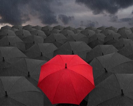
It’s the color of power and strength. As well as love and Disney romance. But the meaning of red goes way beyond fast cars and heart-shaped chocolate boxes. Through evolution, and thousands of years of human civilization, red has been used to tell stories, stir emotion and to get us to spend more money. Learn what the color means to different cultures around the world, and find out how to best use it for your business in our exploration of the color red.
Jeff Domansky's insight:
Red. It's the color of emotion and it can add emotion to your designs.
Organ designers, chief drone experience designers, cybernetic director. Those are some of the fanciful new roles that could be created by the global design industry in the next few years. But what about current design roles? How will they favor over the next 15 years? Will every company by 2030 have a chief design officer, or will they all go extinct? Should a generation of creatives who grew up worshipping Apple's Jonathan Ive put all their eggs in the industrial design basket? We talked to a dozen design leaders and thinkers from companies such as Frog, Artefact, and Ideo to find out which design jobs could die out in the next 15 years, and which could grow. There's no empirical evidence behind these picks, so they shouldn't be taken too seriously. Still, they represent the informed opinions of people who get paid to think about the future....
Jeff Domansky's insight:
Will you be a designosaur in the near future? Interesting to speculate in this Fast Company article.

Marion's curator insight,
January 13, 2017 12:05 PM
Design is meant to evolve. From a cosmetic role located at the end of the innovation process, its going to instill much more strategically throughout all the touchpoints a company has with its users.
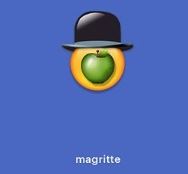
There's a lot of study about how the prevalence of emojis are changing the way we communicate. Linguists debate what we gain versus what we lose when we express sadness by texting a crying face rather than saying, "I'll miss you." But emojis aren't just about communication—they can be art, too.
That's the premise of a fun little campaign from Cantor Fine Art gallery in Hollywood, anyway, which for the past couple of weeks has been using its Instagram account to share emoji-fied versions of the world's greatest artists and their work—from Magritte's Son of Man to Vincent van Gogh to Georgia O'Keeffe's skulls to Keith Haring to Jackson Pollack. The breadth of the project is a big part of the fun (Damien Hirst works surprisingly well as an emoji!), but the campaign's faithfulness to both the artists and the emojis is what really elevates the project.
Emojis are a part of our culture and how we communicate now, for better or for worse, and while seeing a cute lil' Andy Warhol in sunglasses sipping from his can of Campbell's Soup is a fun gag, it does also raise the question of what a pop culture-obsessed figure like Warhol would make of this contemporary visual language. That's a fair bit of heavy lifting for a quirky campaign intended to draw attention to a fine art gallery in Los Angeles whose current show is called "Please Touch the Art," and it's the least pretentious way possible to get us thinking in those terms....
Jeff Domansky's insight:
Now this is a fun campaign from Cantor Fine Art Gallery in Hollywood.
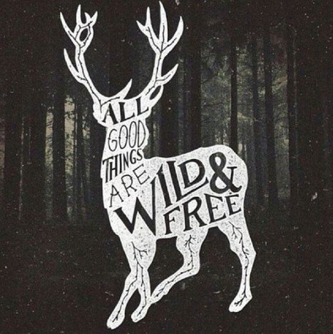
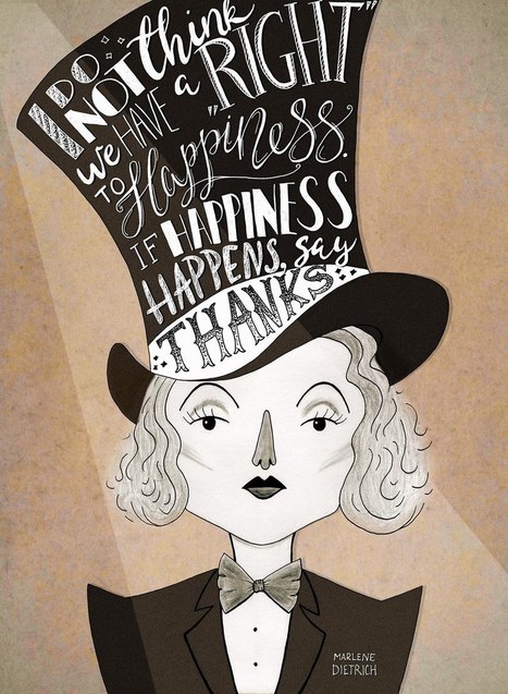
Picture quotes are one of the most pinned images on Pinterest.
Jeff Domansky's insight:
Lots of creative design ideas here with these picture quotes.

Stephania Savva, Ph.D's curator insight,
March 29, 2016 4:58 PM
Lots of creative design ideas here with these picture quotes. 
Sophie GAL's curator insight,
March 30, 2016 6:54 AM
Lots of creative design ideas here with these picture quotes.
Enter the rise of microsites. Unlike regular websites, microsites tend to be rather simplistic and easier to navigate. This isn't to say they won't make you want to poke around for a while, though. In fact, the really great ones do just that. Ready to see a few use cases? Check out the list below for some great examples of microsites in action....
Jeff Domansky's insight:
Check out these examples of companies and individuals that created awesome microsites -- and why they were so good.

Marco Favero's curator insight,
March 4, 2016 4:12 PM
Check out these examples of companies and individuals that created awesome microsites -- and why they were so good.

Sebastián Muñoz's curator insight,
March 7, 2016 10:11 AM
Check out these examples of companies and individuals that created awesome microsites -- and why they were so good. 
WikiBlinks's curator insight,
March 9, 2016 2:48 AM
Check out these examples of companies and individuals that created awesome microsites -- and why they were so good.

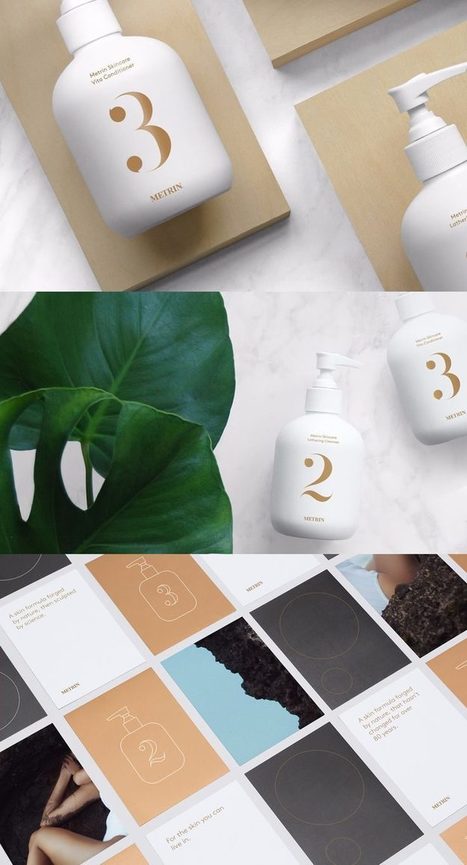
Collages uses diverse imagery and styles to produce a beautiful image layout.
Jeff Domansky's insight:
Creativity with your coffee: how to create collage compositions creatively.

Mike Allen's curator insight,
February 7, 2016 12:49 PM
image and colour together are key priorities for 70% of the population

From how Star Wars toys get designed to the power of type to Apple's fall from grace, here are the best features we wrote in 2015. Deep dives, thrilling tales of derring-design, and damning essays by industry giants like Don Norman—we've put together a list of our favorite design longreads of the year. We hope you enjoy reading them as much as we liked writing them....
Jeff Domansky's insight:
Great reading from Fast Company's Co.DESIGN blog.
|
While big businesses often have multiple decision makers with very specific ideas and guidelines to keep their existing brands consistent, smaller companies are usually more open to exploring new creative directions, and can move faster to implement them.
If you need some more convincing that working with small businesses can result in some stunning creative work, we've put together a list of 15 small business branding examples to get you inspired for your next project...
Jeff Domansky's insight:
Check out these stunning and unique examples of small business branding from HubSpot.
Jeff Domansky's insight:
Useful source for the best product page designs and inspiration.
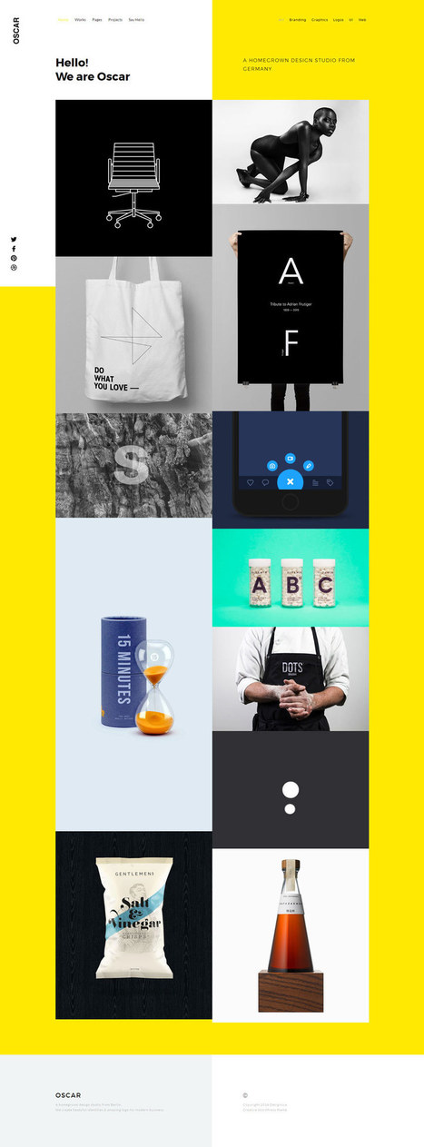
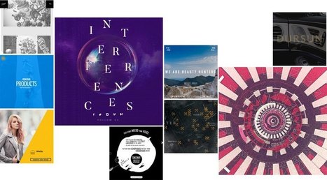
This best web design inspiration 2017 will let you know about the modern, creative and brilliant design. You can get fresh ideas to make yourself better. Here’s a wonderful, creative and awesome collection of web design inspiration 2017. Websites let people know about the brand, product, company etc. It helps people out to know about regarding thing. Feature, about, description is mentioned to give clear view. Web design in any website does matter a lot because you’re not going to show feature and about only but are responsible for all engagement you made for viewers. So, keep in mind while selecting any design as it leaves good or bad impact....
Jeff Domansky's insight:
A great collection of designs for inspiration.
These technologies have combined to create a huge shift in the web design paradigm, creating, most notably, a responsive (or increasingly mobile-first) design philosophy. On the aesthetic side, 3 years ago flat design reigned supreme. And then Google introduced Material design, which brought us slightly out of abstraction. 2017 marks the year design takes one more step back into reality. Whether it’s through form, color choice or functionality, 2017 is a year of hybrids, where reality and technology collide to create a seamless browsing experience. Here are the 9 web design trends we think are going to bridge that gap...
Jeff Domansky's insight:
From animated micro-interactions to split screens to gamification, these are the 9 web design trends we're predicting will be popular in 2017. Great reading and viewing! 10/10

This week's Six Pack features a vivid array of bold stylings from Pheist (Hamburg, Germany), Hector Mansilla (Ciudad Victoria, Mexico), Richard Vergez (Brooklyn, United States), Sarah Matuszewski (Ludwigsburg, Germany), Raluca Bararu (Bucharest, Romania) and Dylan Morang (Maine, United States)....
Jeff Domansky's insight:
A feast for creative eyes.
Good typography may be hard work, but designers shouldn’t forget to have some fun with it! While crafting fonts and typographic characters can sometimes feel stiff and overly mathematical, we want you to help you find the joy in creating more expressive and playful typography.
Jeff Domansky's insight:
Lots of creative inspiration here and tips on how to use fun and playful typography in your design..

There’s no denying it… Bright, bold colors have been a huge trend this year—not only a 2016 web design trend, but across all mediums. This color palette is popular with good reason; when bright color pops in design, it can conjure excitement, joy and intrigue. For that reason, it’s a great skill to master as a designer.
Jeff Domansky's insight:
Looking to add some design creativity to your blog? Lots of inspiration here. Recommended reading. 9/10

The Olympic Games typically choose only one poster to represent the host city—and for better and for worse, these posters tend to reflect the design aesthetic of their particular era.
Jeff Domansky's insight:
The Rio 2016 posters are a colorful representation of Brazilian culture.
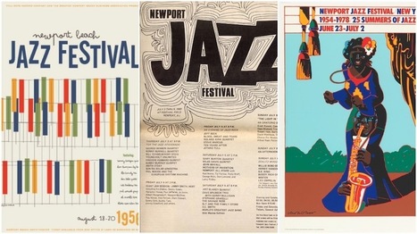
Today, music festivals number in the thousands, taking place around the globe and embracing all kinds of popular music. Here, we’ll look back at some of the biggest music festivals, from the mid 1950s to the present, and focus on an essential part of their culture: festival posters.
Jeff Domansky's insight:
Great creativity and design to go with this great collection of the best music Festival posters.

Static marketing content is as outdated as print-only newspapers. Just as day-old newspapers become litter in the streets, static digital content is useless to the average reader. With such an inundation of static marketing content, one piece hardly stands out from others, meaning brands blend and ideas fade.
Readers crave the dynamic nature of interactive digital content. An ion Interactive studymeasured the success and general feeling from marketers regarding interactive content. In terms of effectiveness, 93% of marketers say interactive media is great at educating buyers; 88% say it’s effective at differentiating brands, whereas static was found to be only 55% effective. Not convinced yet? Did you know that interactive content also drives 2X more conversions than static content?
Despite these numbers, many marketers shy away from interactive content. It might be because it has a reputation for being expensive and labor-intensive. But that is an unfair reputation. Creating interactive elements is, in fact, easy, fast and even free....
Jeff Domansky's insight:
Five ways to make your blog post more engaging and interactive for readers from HubSpot.

aitouaddaC's curator insight,
March 6, 2016 3:55 AM
Five ways to make your blog post more engaging and interactive for readers from HubSpot. 
rodrick rajive lal's curator insight,
March 8, 2016 11:12 AM
Five ways to make your blog post more engaging and interactive for readers from HubSpot.

Web design thrives on two things: innovation and imitation. Unfortunately, there's often a lot more of the latter. We all like to seize upon the latest trends, use them until they’re ubiquitous, and then look desperately for the next big thing. Think about sliders. They were all the rage a couple years ago. Today, they feel dated. What to do? Stop chasing microtrends, and start looking at the big picture. Here, we've isolated six web design ideas that are here to stay....
Jeff Domansky's insight:
Great look at six design trends worth noting.
When building a brand, there’s nothing more important than your logo – and no one wants to look dated. That means more experimentation with on-going trends, the resurfacing of classic styles and a few new surprises along the way. Without further ado, here are the 2016 logo design trends we’re sure you’ll love this year.
Jeff Domansky's insight:
What exciting logo design trends will 2016 hold? 99 Designs shares 10 can't-miss styles we're sure you'll love this year.

Brandmoor's curator insight,
March 7, 2016 12:14 PM
What exciting logo design trends will 2016 hold? 99 Designs shares 10 can't-miss styles we're sure you'll love this year. |


Abduzeedo has fresh visual design ideas - daily.