Public Relations & Social Marketing Insight
443.6K views | +10 today
Follow
Public Relations & Social Marketing Insight
Social marketing, PR insight & thought leadership - from The PR Coach
Curated by Jeff Domansky
Your new post is loading...
Scooped by Jeff Domansky
Scoop.it!

The Undeniable Power of Data Visualization and Infographics

The Undeniable Power of Data Visualization and Infographics | Public Relations & Social Marketing Insight | Scoop.it

It’s expected that only 6% of all data (read: information) comes from books and printed materials – the other 94% is digital.


90% of all data has been created and stored digitally within just the past 3 years, which is striking considering human recordkeeping dates back thousands of years!


To top that off, we’re generating about 2.5 quintillion bytes of data daily, which just adds to the amount of data we have available to us.


But the question is – what do we do with the data we collect? Many people (entrepreneurs, business owners, and data scientists) are beginning to visualize it....

Jeff Domansky's insight:

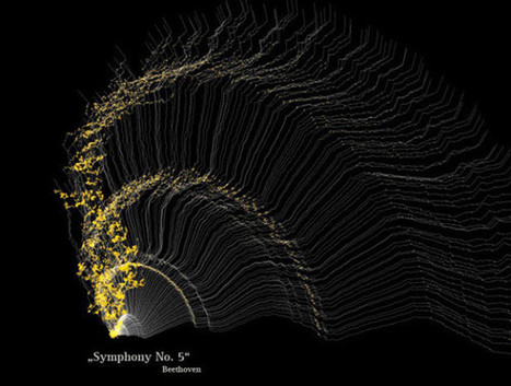
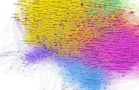
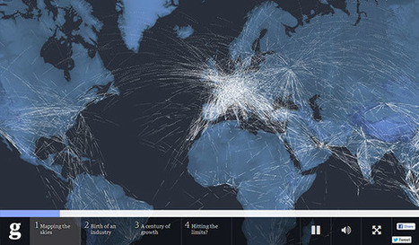
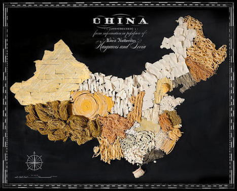
We are generating more data than ever. But what can you do with that data? Data visualization can help engage your audience and increase conversions.

No comment yet.
Scooped by Jeff Domansky
Scoop.it!

50 of the Greatest Data Visualization Examples

50 of the Greatest Data Visualization Examples | Public Relations & Social Marketing Insight | Scoop.it

Data presentation should be elegant, detailed and beautiful. There are different ways to show the data that can be a pie charts, tables, histograms, and bar graph. However, to send a clear and effective message to your readers, you just need more than just a simple table or histogram, etc.


There are some data visualization techniques that present your data much better than expected, intelligent, beautiful, original and in an excellent way. We have gathered some of the most attractive and unique ideas of data visualization examples....

Jeff Domansky's insight:

These data visualizations are really worth viewing. Recommended. 9/10

No comment yet.
Scooped by Jeff Domansky
Scoop.it!

The 37 best tools for data visualization

The 37 best tools for data visualization | Public Relations & Social Marketing Insight | Scoop.it

Not a web designer or developer? You may prefer free tools for creating infographics.


As author, data journalist and information designer David McCandless said in his TED talk: “By visualizing information, we turn it into a landscape that you can explore with your eyes, a sort of information map. And when you’re lost in information, an information map is kind of useful.”


There are many different ways of telling a story, but everything starts with an idea. So to help you get started we’ve rounded up some of the most awesome data visualization tools available on the web....

Jeff Domansky's insight:

This great list of valuable data visualization tools is recommended reading. 9/10

Winners Education's curator insight, March 26, 2015 12:24 PM

Adressing the visula part of the learning brain with easy-to-use, web-dased tools 

Vinicius Vinny Araujo's curator insight, April 17, 2015 12:55 AM

#data

Nora Morton's curator insight, April 22, 2015 6:23 PM

Colorful charts/graphs/maps are my type of eye candy!  This site illustrates the vast ways you can visually present data.  Among the many: iChart, Polymaps, Google Charts, Many Eyes, Leaflet, Exhibit, and Zing Chart. 

Scooped by Jeff Domansky
Scoop.it!

Review of 20 best big data visualization tools

Review of 20 best big data visualization tools | Public Relations & Social Marketing Insight | Scoop.it

Whether you’re looking to wow your audience at your next presentation or you are a developer looking for a practical way to visualize large sets of data, there are amazing tools out there for both parties. So many that it’s hard to find the right tool for your project.

Want to know the best part?

We made everything easy for you and prepared a series of reviews that cover all the features of the best data visualization tools out there. And we divided our reviews in two sections: data visualization tools for presentations and data visualization tools for developers.

Here are reviews of our 20 best tools for Big Data visualization....

Jeff Domansky's insight:

Valuable review and comparison of 20 best big data visualization tools. Got data, need pictures? Recommended reading. 9/10

No comment yet.
Scooped by Jeff Domansky
Scoop.it!

25 Interactive Infographics for the Designer in You | InstantShift

25 Interactive Infographics for the Designer in You | InstantShift | Public Relations & Social Marketing Insight | Scoop.it

The success of infographics has evolved since that time. Just a few years ago, infographics became extremely popular with the eruption of digital marketing and search engine optimization.


With their popularity came several changes in the way they were presented. Only the best of the best were shared on social media, resulting in higher brand awareness and consumer engagement.


As the traditional infographic evolved to keep up with consumers’ changing tastes, it brought the world the interactive infographic, which is becoming the most sought after form of data representation to date, even rendering some static infographics as outdated and irrelevant.


To help you stay ahead of the game with your graphic design and create an infographic with the potential to go viral, take a look at this list of awesome interactive infographics....

Jeff Domansky's insight:

Since the beginning of the century, infographics have had a powerful impact on the way we view web media.

No comment yet.
Scooped by Jeff Domansky
Scoop.it!

The 18 Best Infographics Of 2014

The 18 Best Infographics Of 2014 | Public Relations & Social Marketing Insight | Scoop.it

You could sift through piles of dense data sets in an attempt to understand the trends and discoveries that emerged in history, psychology, current events, and even fictional dragons in 2014. Or you could look at these infographics, which visualize otherwise overwhelming data as beautiful charts, graphs, and maps.


Co.Design's Infographic of the Day series regularly showcases the best in data visualization, and this past year saw many stellar examples of the power of the well-designed visualization to illuminate information about nearly any subject, from the serious (the daily activities of Congress) to the frivolous (a visual compendium of the world's best dogs).


We couldn't resist promoting Co.Design's own in-house data visualizations: the Great Wheel of Food Mashups and a map of each U.S. state's weirdest eating patterns (we're a bit food-fixated, apparently). Here, our favorite infographics from the past year.

Jeff Domansky's insight:

Co.Design 2014 saw stellar examples of the power of data visualization to shed light on nearly any subject, from politics to dogs. Good reading for fans of infographics and data visualization..

No comment yet.