Public Relations & Social Marketing Insight
443.6K views | +13 today
Follow
Public Relations & Social Marketing Insight
Social marketing, PR insight & thought leadership - from The PR Coach
Curated by Jeff Domansky
Your new post is loading...
Scooped by Jeff Domansky
Scoop.it!

5 Websites an Infographic Researcher Can’t Live Without | Neo Mamm

5 Websites an Infographic Researcher Can’t Live Without | Neo Mamm | Public Relations & Social Marketing Insight | Scoop.it

Researching may sound easy: with a quick Google search, almost anything can be found. But the internet also holds some gems for when you want to get that social or trend based angle.


Here are the top five websites that make my job easier. They can also be interesting to play about with too!...

Jeff Domansky's insight:

Five useful tools for content marketers and infographics makers.

No comment yet.
Rescooped by Jeff Domansky from elearning&knowledge_management
Scoop.it!

How to Create Stunning Infographics in 30 Minutes or Less | Lifehack

How to Create Stunning Infographics in 30 Minutes or Less | Lifehack | Public Relations & Social Marketing Insight | Scoop.it

Learn how to create stunning infographics - without spending hundreds of dollars on a graphic designer or losing your mind - in just 30 minutes or less.

From word clouds to network data visualizations, infographics have become a primary format for content in a relatively short period of time. Although the ‘infographic’ is nothing new, its proliferation and evolution has been nothing short of exponential in the past few years.

Whether you love them or hate them, the rising popularity of infographics can’t be denied.


Via Baiba Svenca, Abi Woldhuis, BookChook, michel verstrepen, Dolly Bhasin , Mayra Aixa Villar
Jeff Domansky's insight:

Really excellent how-to using the impressive Piktochart infographic tool.

Neil Ferree's curator insight, February 26, 2013 10:05 AM

Infographics done right and done well can generate lots of traffic to your http://bit.ly/RichSnippet and build your brand

Charles-Louis Mazerolles's curator insight, March 8, 2013 3:28 AM

good tool to know :-)

Scooped by Jeff Domansky
Scoop.it!

How You Can Use Infographics to Tell a Story | Social Media Club

How You Can Use Infographics to Tell a Story | Social Media Club | Public Relations & Social Marketing Insight | Scoop.it

Defined as “graphic visual representation of data, knowledge or information,” Infographics are being used in a variety of ways to tell a story.


Like everything on the web, the ‘good, bad and ugly’ of Infographics are all too apparent. Whether you use software such as Adobe Illustrator or use free infographic creator tools, knowing the do’s and don’ts of Infographic design is key to enhancing your credibility and trustworthiness in this age of information overload and cynicism.

Here are some suggestions on how to design your information to be heard, felt, seen and acted on...


[Useful info graphics tips and resources ~ Jeff]

No comment yet.
Scooped by Jeff Domansky
Scoop.it!

Bad Pitch Blog: The Evolution of the News Release: My #PRSAICON Infographic

Bad Pitch Blog: The Evolution of the News Release: My #PRSAICON Infographic | Public Relations & Social Marketing Insight | Scoop.it

Part of my presentation on media relations at #PRSAICON focuses on the news release paradox. It's seemingly got its own gravitational pull as one of the most mentioned tools in our industry. Yet it's little more than a simple format that hasn't changed much -- in more than a century.


Thousands of releases are distributed daily and we can't even agree upon what to call the format. And while releases haven't changed much, the use case for the news release has expanded beyond the media. It's just one of several changes I'll review before detailing how to turn this change into an opportunity.


Much Ado About Nothing?
Various, conflicting observations like the ones above have been compiled into the infographic below. Take a look, enjoy it and pass it around....


[Very interesting infographic on the news release, it's history and new presentation trends. Kevin Dugan's presentation to PRSA. ~ Jeff]

No comment yet.
Scooped by Jeff Domansky
Scoop.it!

Infographics: The Revolutionary Social Marketing Tool | All Twitter

Infographics: The Revolutionary Social Marketing Tool | All Twitter | Public Relations & Social Marketing Insight | Scoop.it

Did you know that infographics shared on Twitter receive almostten times as many retweets as traditional posts?


And it’s not just our favourite micro-blogging social network that eats these data visuals for breakfast – infographics shared on LinkedIn receive, on average, seven times as many shares as other submissions, and those added to Stumbleupon’s “ocean of awesome” generate 746 percent more pageviews than other kinds of content....

Jeff Domansky's insight:

Proof of the powerful impact of infographics, despite my sense they are nearing saturation point for some of us early adopters.

Vicente G. Moreno's curator insight, January 8, 2013 10:59 PM

Proof of the powerful impact of infographics, despite my sense they are nearing saturation point for some of us early adopters.

ben bernard's comment, January 9, 2013 11:52 PM
thanks ! http://www.scoop.it/t/direct-marketing-services my newly made scoop.it :)
Scooped by Jeff Domansky
Scoop.it!

Why Brands Must Embrace Visual Social Media in 2013 | Corporate Eye

Why Brands Must Embrace Visual Social Media in 2013 | Corporate Eye | Public Relations & Social Marketing Insight | Scoop.it

As 2013 begins, social media marketing has already grown a bit old school. Today, the marketing world is still hot on the social media marketing trail, but the trail has diverged. There are different paths with cheerleaders along the way no matter which path a marketer follows.


Ideally, marketers should find the path down the middle that marries all of the elements of social media marketing, but most are not there yet. Many of today’s marketers are still choosing a single path to focus on or jumping back and forth.

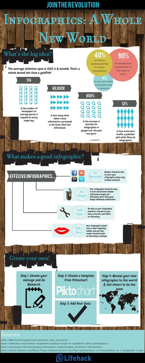
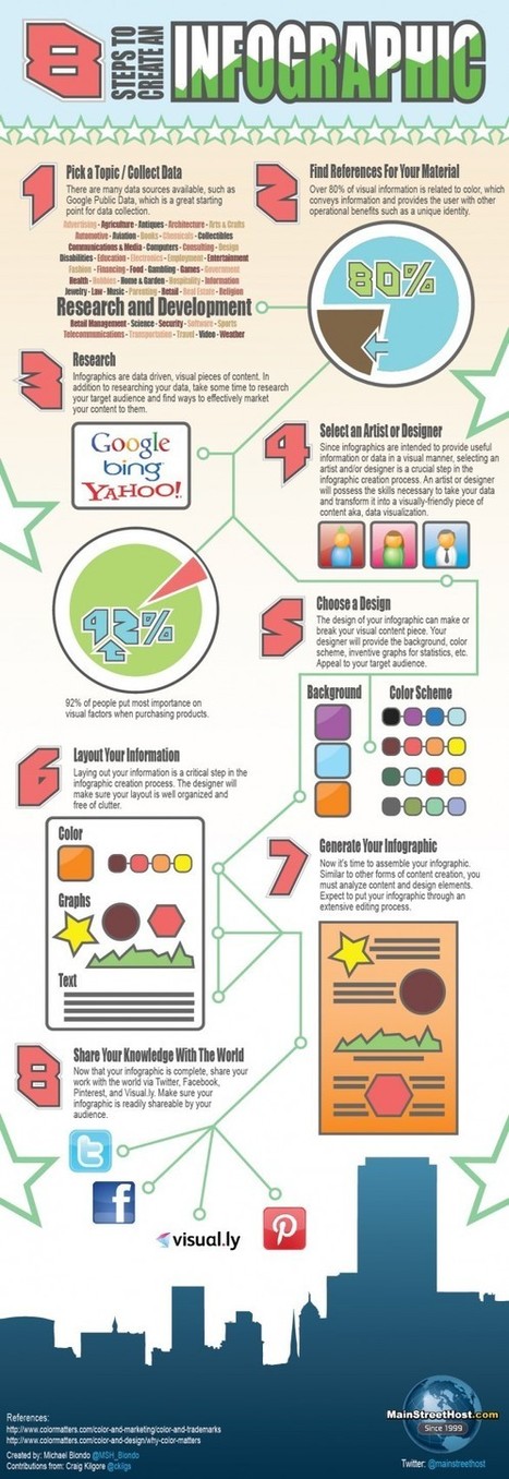
For example, those paths include the data and metrics focus, the storytelling focus, the visual focus, and more. This article hones in on the visual focus with the help of two great infographics that visually share the data and tell the story of visual storytelling. Appropriate, don’t you think?...

Jeff Domansky's insight:

Some smart thinking and insight for marketing and PR pros...

Martin (Marty) Smith's comment, January 4, 2013 4:13 PM
Jeff. Funny thing is I was just arranging to video a session for tomorrow. Visual is king in 2013. Great Scoop. Marty
Martin (Marty) Smith's curator insight, January 4, 2013 4:14 PM

Truer words have NOT been spoken. Embrace the visualization of EVERYTHING or get passed over. Rocking great scoop by Jeff. 

Scooped by Jeff Domansky
Scoop.it!

10 Steps To Designing An Amazing Infographic | Fast Company

10 Steps To Designing An Amazing Infographic | Fast Company | Public Relations & Social Marketing Insight | Scoop.it
Information can be useful--and even beautiful--but only when it’s presented well. In an age of information overload, any guidance through the clutter comes as a welcome relief. That’s one reason for the recent popularity of information graphics.


Infographics are visual designs that help to explain complicated data in a simple way (mental-health emergencies at Burning Man, anyone?). But how are they created? What can we learn from the designer’s process? And what does an infographic designer know about storks delivering babies?...


[Useful checklist for creating infographics ~ Jeff]

No comment yet.