Public Relations & Social Marketing Insight
443.6K views | +8 today
Follow
Public Relations & Social Marketing Insight
Social marketing, PR insight & thought leadership - from The PR Coach
Curated by Jeff Domansky
Your new post is loading...
Scooped by Jeff Domansky
Scoop.it!

24 Walls and Fences from Fiction | Visual.ly

24 Walls and Fences from Fiction | Visual.ly | Public Relations & Social Marketing Insight | Scoop.it
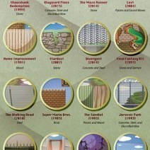
From the Secret Garden to Pacific Rim, this infographic details 24 fictional fences and walls from our favorite movies, television shows, video games.
Jeff Domansky's insight:
Very creative design.
No comment yet.
Scooped by Jeff Domansky
Scoop.it!

How Complex Systems And Chaos Theory Work, According To Emoji

How Complex Systems And Chaos Theory Work, According To Emoji | Public Relations & Social Marketing Insight | Scoop.it

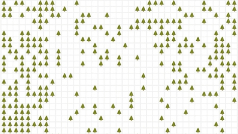
Emoji are a great way to express yourself. Through Simulating the World, the latest interactive web toy by artist Nicky Case, they're more than just cute stickers. They become a tool for thinking about systems, illuminating how everything from forest fires to flu pandemics start, or spread out of control.


Simulating the World is a time-lapsed grid that is semi-randomly populated with whatever emoji you choose, according to certain user-defined rules: what happens when an emoji spawns to another emoji that is different, for example. It doesn't sound like much, but used intelligently, this emoji grid is enough to simulate, if not predict, how all sorts of systems work: how a bolt of lightning can decimate a forest during a drought year, for example, or how neighborhoods can desegregate over time....

Jeff Domansky's insight:

How do neighborhoods become segregated, forest fires spread, and herd immunity work? Emoji can help explain it all. Cool design you'd never suspect.

Jasper Molina's curator insight, March 10, 2016 1:22 AM

How do neighborhoods become segregated, forest fires spread, and herd immunity work? Emoji can help explain it all. Cool design you'd never suspect.

Scooped by Jeff Domansky
Scoop.it!

Best Infographics of 2015: Beware, You’ll Get Hooked on These

Best Infographics of 2015: Beware, You’ll Get Hooked on These | Public Relations & Social Marketing Insight | Scoop.it

The best infographics are like good novels: They grab you by the collar, transport you to another world and refuse to let go until the real world steps in and gives you a rude awakening.


This is how I felt when I picked up Gareth Cook’s The Best American Infographics 2015, the third volume in a series of infographic compilations.


Like an avid reader absorbed in a gripping tale, I found myself poring over these visual stories, eager to distill the meaning contained within each of them.


From breath-taking illustrations to ingenious visualizations, these beautiful data worlds introduced me, in each case, to a reality I didn’t know existed. At first glance, they might seem like abstract eye candy, but if you take the time to delve into each of them, they can change your perspective of the world like nothing else can....

Jeff Domansky's insight:

A review of Gareth Cook's The Best Infographics of 2015 and a list of Visme's top picks. Good viewing.

No comment yet.
Scooped by Jeff Domansky
Scoop.it!

45 Complex Topics Explained Perfectly By Infographics – Canva

45 Complex Topics Explained Perfectly By Infographics – Canva | Public Relations & Social Marketing Insight | Scoop.it

Infographics have become the design darling of visual marketing.


It’s no wonder organizations and individuals are taking advantage of them as a communication tool. We’ve scoured the web to compile a collection of 45 inspiring infographics that show what’s possible in this design category. Browse through them to get some ideas for your next project....

Jeff Domansky's insight:

Take a look at how these infographics transformed tedious data into enlightening visuals — and learn some interesting trivia while you're at it!

Jeff Domansky's curator insight, September 19, 2015 6:05 AM

Take a look at how these infographics transformed tedious data into enlightening visuals — and learn some interesting trivia while you're at it!

Marco Favero's curator insight, September 21, 2015 2:41 AM

aggiungere la vostra comprensione ...

Jasmin Davies-Hodge's curator insight, September 21, 2015 4:13 AM

#infographics an excellent visual communication tool

Scooped by Jeff Domansky
Scoop.it!

The 18 Best Infographics Of 2014

The 18 Best Infographics Of 2014 | Public Relations & Social Marketing Insight | Scoop.it

You could sift through piles of dense data sets in an attempt to understand the trends and discoveries that emerged in history, psychology, current events, and even fictional dragons in 2014. Or you could look at these infographics, which visualize otherwise overwhelming data as beautiful charts, graphs, and maps.


Co.Design's Infographic of the Day series regularly showcases the best in data visualization, and this past year saw many stellar examples of the power of the well-designed visualization to illuminate information about nearly any subject, from the serious (the daily activities of Congress) to the frivolous (a visual compendium of the world's best dogs).


We couldn't resist promoting Co.Design's own in-house data visualizations: the Great Wheel of Food Mashups and a map of each U.S. state's weirdest eating patterns (we're a bit food-fixated, apparently). Here, our favorite infographics from the past year.

Jeff Domansky's insight:

Co.Design 2014 saw stellar examples of the power of data visualization to shed light on nearly any subject, from politics to dogs. Good reading for fans of infographics and data visualization..

No comment yet.
Scooped by Jeff Domansky
Scoop.it!

25 Ideas to Transform Ho-Hum Infographics into Something Extraordinary - Copyblogger

25 Ideas to Transform Ho-Hum Infographics into Something Extraordinary - Copyblogger | Public Relations & Social Marketing Insight | Scoop.it

A few weeks ago here on Copyblogger, Demian Farnworth presented the infographic as the Salvador Dalí of content marketing — the most interesting person at the cocktail party.


More than just a superficial presence, an infographic is a significant asset pillar with diverse possibilities that help you grow your media empire.Today, let’s equate the Internet to the world of pop music. In this case, infographics are The Beatles....

Jeff Domansky's insight:

Expand your audience and grow your online media empire with these 25 infographic ideas that help you distribute your educational content in innovative ways.

Jeff Domansky's curator insight, October 15, 2014 2:02 PM

Expand your audience and grow your online media empire with these 25 infographic ideas that help you distribute your educational content in innovative ways.

Marco Favero's curator insight, October 15, 2014 3:51 PM

aggiungi la tua intuizione ...

Scooped by Jeff Domansky
Scoop.it!

10 Free Tools For Creating Infographics & Visualizing Data | SmashingApps

10 Free Tools For Creating Infographics & Visualizing Data | SmashingApps | Public Relations & Social Marketing Insight | Scoop.it

Are you looking for some free to use web tools that can help you create beautiful Infographics and visualize data? Well, if your answer is yes, then you are lucky enough to land on the right page. In this round up, we are presenting 10 useful tools to create beautiful infographics and let you visualize data. These tools will make creating infographics simpler for you and also save time as well....

Jeff Domansky's insight:

SmashingApps offers up a great list of visual design and marketing tools.

Abrasives All's curator insight, October 11, 2014 1:35 AM

This is exactly what I want, thanks for sharing 

Scooped by Jeff Domansky
Scoop.it!

Using Data-Centered Storytelling To Enchant & Engage Your Email Audience

Using Data-Centered Storytelling To Enchant & Engage Your Email Audience | Public Relations & Social Marketing Insight | Scoop.it

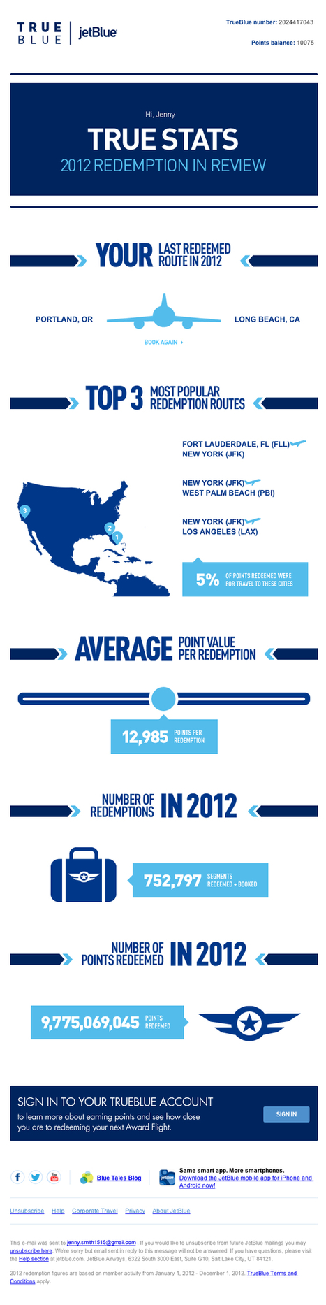
Our goal as savvy email marketers is to look beyond the lure of the one-time conversion and strive to build an ongoing relationship between consumers and our brands. Why is this goal so important? Because it’s been proven through many a marketing study that engaged customers become loyal customers and loyal customers are the most valuable segment in any list or database.


This type of highly engaged, loyal customer typically has higher overall lifetime value than the casual consumer. They’re also more likely to be an evangelist, introducing new customers to your brand in a very personal way and building the next layer of loyal customers.


But, how can you help to build a stronger bond with your customer base? In my last article, I outlined ways to stimulate an unengaged audience by increasing the relevancy of your email creative by including more dynamic content. Sharing relevant content demonstrates to customers that we know them as individuals and are dedicated to providing them with useful information, products or services. Using historical and behavior data is a great way to present content that’s tailored to their individual needs and preferences, but you also need to engage with your audience on an emotional level in order to achieve the goal of creating a true brand-loyal customer....


Let’s explore four creative ways in which email marketers have used data as a platform to build creative that forms a bond between their customers and their brand....

Jeff Domansky's insight:

This post highlights the importance of customer engagement and how data can be used to tell interesting and meaningful stories. The four examples demonstrate how.

No comment yet.
Scooped by Jeff Domansky
Scoop.it!

ISIS Damage to Libya's Oil infrustructure | Visual.ly

ISIS Damage to Libya's Oil infrustructure | Visual.ly | Public Relations & Social Marketing Insight | Scoop.it

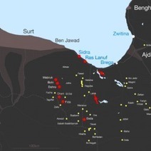
Since Islamic State (IS) has damaged many of Libya's Oil fields, ports and pipelines. This info graphics helps clarify the location of the damaged infrastructure relevant to locations where ISIS is present in Libya.

Jeff Domansky's insight:

Fascinating, if tragic, visual story.

No comment yet.
Scooped by Jeff Domansky
Scoop.it!

10 best design infographics of 2015 | Creative Bloq

10 best design infographics of 2015 | Creative Bloq | Public Relations & Social Marketing Insight | Scoop.it

It's fair to say that 2015 has been an explosive year for infographics. Thanks to viral posts that explore everything from the risks of drinking diet coke, to quick funny hits exploring the creative process, the last twelve months have seen some amazing data visualizations.


Unsuprisingly, some of the most beautiful and educational infographics in 2015 have been all about design, so we've collected 10 of the best below to round off your year and kickstart your creativity for 2016....

Jeff Domansky's insight:

Creative Bloq rounds up the biggest design infographics from the last year in this info-stuffed list.

Jeff Domansky's curator insight, January 16, 2016 2:51 AM

Creative Bloq rounds up the biggest design infographics from the last year in this info-stuffed list.

Scooped by Jeff Domansky
Scoop.it!

Infographic Design: 6 Ways To Use Icons - Venngage

Infographic Design: 6 Ways To Use Icons - Venngage | Public Relations & Social Marketing Insight | Scoop.it

Do you want to make your infographics iconic? Okay, so we don’t mean “iconic” in the usual sense. We mean using icons in your infographic design. Icons are those little illustrative graphic images/clip art that represent an object, action or idea. They are often stylized and simplified designs. N


Using icons can make your infographic design more cohesive and more professional. With Venngage you can choose from over 10,000 icons in our icon library and stylize them to your preference by editing their colors, sizes and positions.  Here are some tips for how to use icons in your infographics....

Jeff Domansky's insight:

6 ways to use icons in your infographic design. Quick infographic tips from Venngage.

Jeff Domansky's curator insight, October 21, 2015 10:57 AM

6 ways to use icons in your infographic design. Quick infographic tips from Venngage.

Scooped by Jeff Domansky
Scoop.it!

Watch How The US Stole Land From Native Americans | Co.Design

Watch How The US Stole Land From Native Americans | Co.Design | Public Relations & Social Marketing Insight | Scoop.it

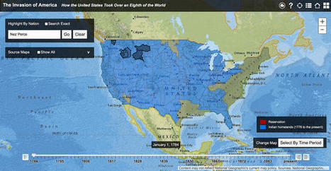
This land was not our land.


As late as 1750—some 150 years after Britain established Jamestown and fully 250 years after Europeans first set foot in the continent—[Native Americans] constituted a majority of the population in North America, a fact not adequately reflected in textbooks," Claudio Saunt writes in an accompanying article. "Even a century later, in 1850, they still retained formal possession of much of the western half of the continent."


With Saunt's map, you can watch the shift occur. Each part is clickable, with information on the treaties that were used to negotiate cessions available via links in pop-up boxes. You can also search for a location or any Native American nation, such as Cherokee or Sioux, to see the land they once possessed. Color coding distinguishes between native lands (blue) and reservations (orange). The latter have dwindled significantly since their creation....

Jeff Domansky's insight:

Absolutely fascinating and sobering data visualization looks at settlement in the US as it took lands from the original residents.

Alison J. Garrow's curator insight, April 6, 2015 3:48 PM

Module Six


When the Europeans first came to what is now the United States it was holding many things that we take advantage of today, like trees that are constantly being cut down and not being replanted else where but having buildings built that is polluting the air. When the Europeans started to take over the land it started in the eat/southeast area and moved west/northwest and worked its way through the country till almost all of the land was taken over. Europeans fought the Native Americans to get their land and gain their supplies, many individuals died trying to keep what was rightfully theirs to begin with. White supremacy takes a big detail in this action. Europeans thought that they deserved the land and took what they thought was rightfully theirs, which is not how it was suppose to be. Native Americans fought for what they believed was theirs just like we do but we also fight for anything that we "think" it ours or should be. Europeans were theoretically the child in the sand box that did not like to share.  

Kasey Murray's curator insight, April 24, 2015 12:36 PM

Shows how whites took over native american land.

Scooped by Jeff Domansky
Scoop.it!

40 Creative Infographics for Designers and Developers | TheNeoDesign.com

40 Creative Infographics for Designers and Developers | TheNeoDesign.com | Public Relations & Social Marketing Insight | Scoop.it

Months back we came up with the superb collection of nice, visually appealing infographics (Creative Infographics for Designers and Developers) witnessing which designers and developers would easily relate as each one of them was visual graphics talking about designers and developers.Here is our latest compilation 40 creative infographics for designers and developers. Hit a jump to take the glimpse of each....

Jeff Domansky's insight:

Great list showcasing creative infographics for designers and developers that will inspire you, make you learn new things and much more.

Jeff Domansky's curator insight, December 24, 2014 1:44 AM

Great collection of info graphics to inspire you.

Marco Favero's curator insight, December 24, 2014 6:17 AM

aggiungi la tua intuizione ...

Scooped by Jeff Domansky
Scoop.it!

Best Infographics of the Year: Nate Silver on 3 Keys to Great Information Design

Best Infographics of the Year: Nate Silver on 3 Keys to Great Information Design | Public Relations & Social Marketing Insight | Scoop.it

"More isn't always better: no more in information design than in poetry..."


Nate Silver, the author of The Signal and the Noise, considers the two factors that make an infographic compelling — providing a window into its creator’s mind and telling a story that “couldn’t be told in any other way.”


He writes:

Design has traditionally been seen as a field for “right-brained” types: those who think visually and spatially rather than with symbols like words and numbers. But modern information design is equal parts art and science, form and function, architecture and engineering. It combines the best of at least three fields of achievement: aesthetics, technology, and journalism.


By aesthetics, I mean all the usual things, but especially proportionality. For information designers, this quality is not so abstract as it might be in other mediums. Their goal is tangible: to convey as much information as possible given some set of constraints....

Jeff Domansky's insight:

Great exploration of infographics by Maria Popova at BrainPickings. Highly recommended   9.5/10

No comment yet.
Scooped by Jeff Domansky
Scoop.it!

Famous movie quotes as charts

Famous movie quotes as charts | Public Relations & Social Marketing Insight | Scoop.it

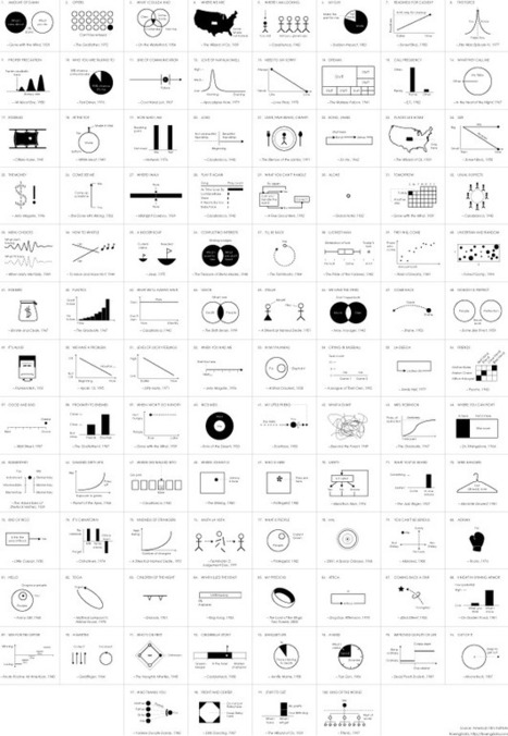
In celebration of their 100-year anniversary, the American Film Institute selected the 100 most memorable quotes from American cinema, and a few years ago, for kicks and giggles, I put the first eight quotes into chart form. I planned to chartify all 100, but I got distracted.


Lately though, finishing what I started became my distraction. So here it is: the 100 most memorable quotes in chart form and I can finally put it to rest. See the big version for more detaildetail...

Jeff Domansky's insight:

Nathan Yau had some time on his hands and so he created this very cool depiction of 100 most famous American film quotes in chart form. Fun reading if you check the large format version out.

No comment yet.
Scooped by Jeff Domansky
Scoop.it!

10 Beer Infographics that are Awesome | Neo Mamm

10 Beer Infographics that are Awesome | Neo Mamm | Public Relations & Social Marketing Insight | Scoop.it

From the history of beer to what to do with an empty, these infographics will provide you with a whole variety of knowledge about one of man’s most loved drinks: beer.

Jeff Domansky's insight:

Where would we be without beer? You'll learn some amazing facts about beer in these 10 infographics. Here's just a taste ;-)

-  Egyptian children were sometimes baptized with beer

-  in the 1600s, midwives created ultra-strong beer to ease the pain of childbirth

-  in 1773, the Sons of liberty gathered at the Green Dragon Tavern, had a few beers, and agreed to start a revolution

-  annual beer consumption in the US is 22 gallons per person

-  in the US today there are 1,482 craft breweries operating

-  9,000 BC Neolithic humans evolved from hunter gatherers to farmers. Was it the bread or the beer?

-  2,400 BC Sumerians invent the straw to avoid sediments in the bottom of beer

-  Plato said: "He was a wise man who invented beer."

-  takes 18 minutes to burn off the calories from a regular beer compared to 15 minutes for a pint of Guinness. Go figure.


I could go on but that would just make me thirsty for more. Just enjoy these 10 awesome infographics. Cheers!

No comment yet.