Public Relations & Social Marketing Insight
443.6K views | +13 today
Follow
Public Relations & Social Marketing Insight
Social marketing, PR insight & thought leadership - from The PR Coach
Curated by Jeff Domansky
Your new post is loading...
Scooped by Jeff Domansky
Scoop.it!

Best Infographics of 2015: Beware, You’ll Get Hooked on These

Best Infographics of 2015: Beware, You’ll Get Hooked on These | Public Relations & Social Marketing Insight | Scoop.it

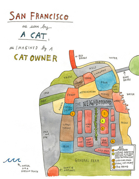
The best infographics are like good novels: They grab you by the collar, transport you to another world and refuse to let go until the real world steps in and gives you a rude awakening.


This is how I felt when I picked up Gareth Cook’s The Best American Infographics 2015, the third volume in a series of infographic compilations.


Like an avid reader absorbed in a gripping tale, I found myself poring over these visual stories, eager to distill the meaning contained within each of them.


From breath-taking illustrations to ingenious visualizations, these beautiful data worlds introduced me, in each case, to a reality I didn’t know existed. At first glance, they might seem like abstract eye candy, but if you take the time to delve into each of them, they can change your perspective of the world like nothing else can....

Jeff Domansky's insight:

A review of Gareth Cook's The Best Infographics of 2015 and a list of Visme's top picks. Good viewing.

No comment yet.
Scooped by Jeff Domansky
Scoop.it!

Best Infographics of the Year: Nate Silver on 3 Keys to Great Information Design

Best Infographics of the Year: Nate Silver on 3 Keys to Great Information Design | Public Relations & Social Marketing Insight | Scoop.it

"More isn't always better: no more in information design than in poetry..."


Nate Silver, the author of The Signal and the Noise, considers the two factors that make an infographic compelling — providing a window into its creator’s mind and telling a story that “couldn’t be told in any other way.”


He writes:

Design has traditionally been seen as a field for “right-brained” types: those who think visually and spatially rather than with symbols like words and numbers. But modern information design is equal parts art and science, form and function, architecture and engineering. It combines the best of at least three fields of achievement: aesthetics, technology, and journalism.


By aesthetics, I mean all the usual things, but especially proportionality. For information designers, this quality is not so abstract as it might be in other mediums. Their goal is tangible: to convey as much information as possible given some set of constraints....

Jeff Domansky's insight:

Great exploration of infographics by Maria Popova at BrainPickings. Highly recommended   9.5/10

No comment yet.