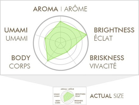
This is an ode to a data visualization I found on my box of tea. It's a perfect reminder of how we sometimes get carried away as marketers, especially as our tools make visualization easier.
...I’m not attacking the company that made this, and I’m not going to “out” them here – their product is actually pretty great. I just want to use this visualization to illustrate some of the wrong ways to do things, in hopes that we can all raise our game a bit.
But It’s So Pretty! I admit – the earth tones are nice, and it’s not entirely unappealing. I guess, for a moment, it made me feel better about shelling out $11 for an ounce-and-a-half of leaves. Maybe that’s even good marketing, although I really doubt this 1” tall graphic on the back of the box has ever swayed anyone’s decision. I’m not trying to say that it’s an ugly picture. The problem is that it’s a pleasant distraction disguised as meaningful data.
The job of a data-visualization is to communicate an idea better than the raw data itself could. Of course, that also implies that there’s actual data behind the visualization. So, how do we get it wrong?...


 Your new post is loading...


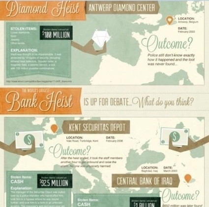


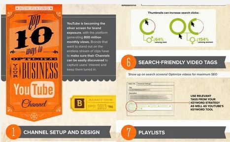


Take a look at how these infographics transformed tedious data into enlightening visuals — and learn some interesting trivia while you're at it!
aggiungere la vostra comprensione ...
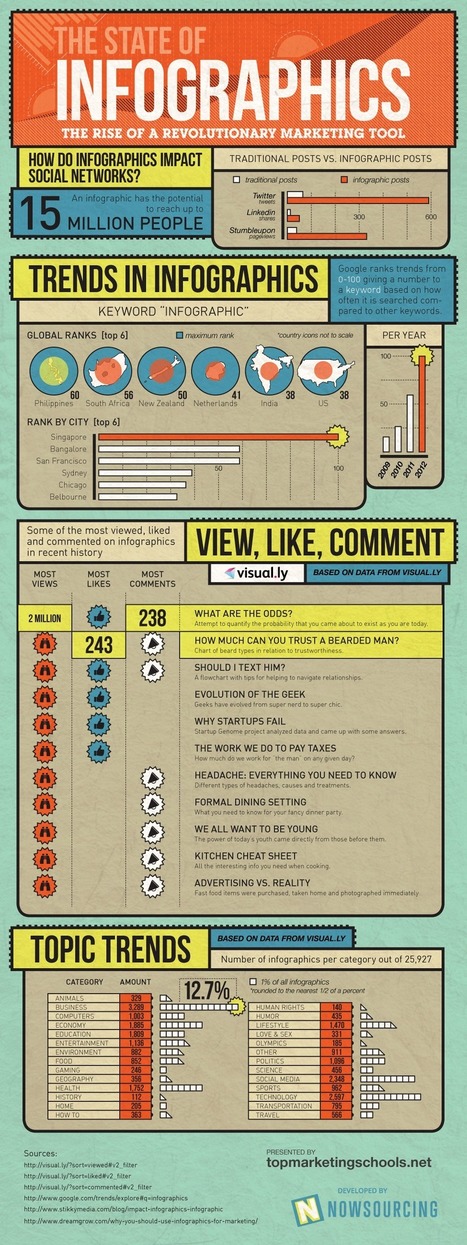
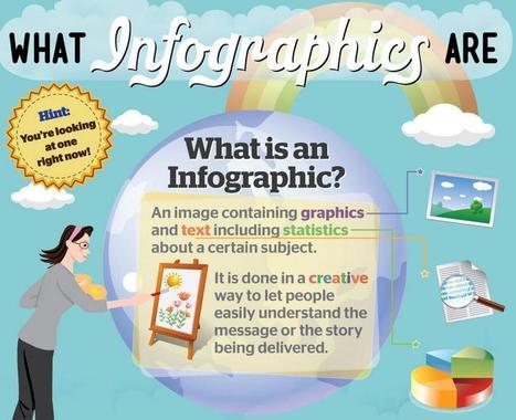
#infographics an excellent visual communication tool