


 Your new post is loading...

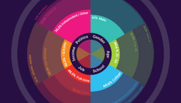

What makes an infographic successful? As designers, we want it to achieve a balance of two main things: Did the reader get the message we wanted them to get?
...To the surprise of the researchers, bar graphs and charts did poorly. It turns out (news flash) they all kinda look the same. The most memorable images contained “human recognizable objects.” Think mundane stuff like photos or illustrations of bottles, animals and shoes, not to mention people.
Other important points:
- Color made a huge difference: the more, the better.
- Images with more clutter were highly memorable. How much more memorable? A lot.
- Images with lots of circles and rounded corner graphics also ranked high.


Research worth noting for content, marketing, PR and design pros.