 Your new post is loading...
Infographics, an effective form of content marketing, are everywhere on the Web, but it isn't always easy to come up with good designs when you want to create one yourself, especially if you're not skilled in design and visual content. Fortunately, you have plenty of options. Many blogs and other publications offer tips and tricks to help improve your visual content, and sites like online infographic maker Visme (which I founded) and applications such as PowerPoint offer templates to help you get started. Templates help you get a general feel about what works for an infographic and what doesn't, which can then allow you to branch out with your own designs. Often, though, in the business world, a lot of templates are simply tweaked to create an infographic; the basic template remains intact. After all, if it isn't broke, why fix it? So here are five of the most popular templates, the reasons they work so well, and a few tips and tricks to help you make them your own....
What makes people want to share an infographic?
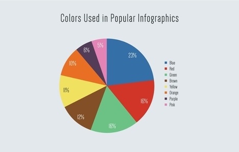
Is it a certain color scheme that catches the eye? Do certain formats work better than others? Or, in the end, is it all about the content? At Visme, we set out to answer these questions by performing a content analysis of the most shared infographics on social media.
Using BuzzSumo, we identified every infographic with more than 5,000 shares across some major social media platforms -- Facebook, Pinterest, Twitter, LinkedIn, and Google+ -- and analyzed them for different characteristics. Those were things like word count, size, colors used, format, and topic.
Here's what we found after analyzing over 200 infographics -- and takeaways on how you can apply these insights to your own infographics, making them more shareable....
If you ask us, infographics aren't going anywhere.
This year alone, we've covered how essential they are to SEO, and the numerous resources available to create beautiful infographics of your own.
And yes -- when it comes to infographics, we do like to play favorites. That's why we went scoured the web for some of the best infographics of 2016. Their topics are vast and their formats are many, but this year, we truly saw some excellent examples of informative design....
Sure, articles let brands talk directly to customers about solving problems, like how to save for a home while paying off student loans, for example. Blog posts have relatively low overhead compared to, say, a national ad campaign or video product release, and in some industries such as finance, they are necessary to edge out competitors trying to capture the same audience. But a content plan with only blog posts is like a diet that consists solely of bananas. Sure they provide some value and it’s safe to eat one per day, but without diversity you’re going to become malnourished. The problem for many brands is they don’t have the data to justify alternative approaches that may cost more than a 600-word article. When our data scientists examined 3,200 stories produced on the Contently platform over the last year, they found that a different type of content outperforms blog posts across most industries: - Infographics reach 54 percent more readers than blog posts. - The median cost to reach one reader for an infographic was $0.04 versus $1.77 for a blog post. -Infographics have a 73 percent completion rate. Blog posts have a 66 percent completion rate....
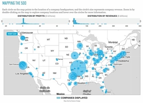
Visualizing the Fortune 500 is an experiment by the team at Fortune magazine. This is an interactive data visualization site that shows the location of each company's headquarters and the size of the circle represents the company's annual revenue.
People visit and revisit the Fortune 500 for lots of reasons, chief among them: job prospects, sales leads, corporate research and investor information. And bragging rights, of course. Below are two visualizations that allow you to explore the Fortune 500. On the map you'll find every one of the U.S. headquarters from the 2016 list, on the line chart below it, you'll see how each of the companies on the 2016 list has moved through the ranks for the past 20 years.
They also show an interactive visualization of how the companies have moved through the ranks over the last 20 year history of the Fortune 500....
Infographics take complex data and information and translate it into easy-to-understand visuals. In today’s fast-paced world, graphic designers need to get the point across simply and efficiently. In this article, we’ll take a look at several infographics and their inherent qualities, then offers a brief tutorial to help you create your own!...
Infographics are a powerful tool for capturing the attention of your target audiences. In fact, businesses that publish infographics grow their traffic an average of 12% more than those that don't.
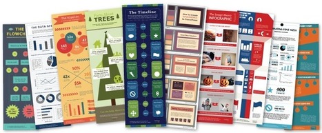
The hard part, of course, is finding the time and resources to create these infographics.That's why we've created ten fully customizable infographic templates that will give you the inspiration and foundation you need to build your own infographics right in PowerPoint....
The mere thought of creating your own infographic can be scary and often is thought of as a complex task that can entail tens of hours.
Visme is about simplifying the infographic creation process, so we thought: why not use our own tool to show you how to create your own infographic?
We collaborated with Randy Krum of Cool Infographics, an expert in data visualization and author of the book “cool Infographics” to create a simple interactive infographic that breaks down the process of designing an infographic into 5 easy to understand steps.
Check it out and rollover each section for more information....
I’ve never met anyone who dreamed of integrating EHR software or auditing SOX compliance as a child. And I certainly don’t recall my mother sewing together a B2B content marketer costume for my first Halloween.*
But we’re actually in excellent company. The trouble is, however, your business can no longer rely on boring, boilerplate text to fill its funnel. That’s why I’d encourage you to spice up your content cookbook with a bit of infographic marketing. ,*It was a Peter Pan costume, and it was flawless.
Why do infographics outperform vanilla text?...
|
Infographics can also be a helpful device to generate more leads. Generally, the same rules apply here as for creating any effective visual content -- it serves as a conversion path as a result of shareability and informative nature. But what are the specifics there? What are the different ways to create the infographics that are going to generate leads? We identified five of our favorite ways to go about doing that, and outlined them below....
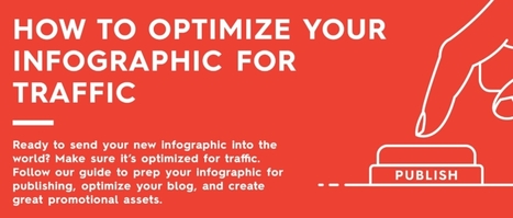
Just because you have an infographic designed does not mean it’s ready to go. There are a few more steps necessary to ensure success. You need to proofread. You need to publish. And, of course, you need to promote. Basically, you need to know how to optimize your infographic to get the most traffic. Unfortunately, we see many brands make rookie mistakes in all three of these areas. Whether it’s an unoptimized file name, broken share buttons, or pixelated images, these details can seriously hurt your infographic’s success. If you want to get the most eyes on your infographic, there’s more to do than you think. But don’t worry. Because our parent company Column Five likes to make things easier for you, they created this handy checklist to help you optimize your next infographic. They even put it in infographic form and checklist form. Feel free to print them out, bookmark them, or embed them on your site. Follow their tips and you’ll know your infographic is really ready to be published. On that note, you can also take a look at these deep dives into how to optimize your infographic for SEO and how to optimize your blogfor content distribution. Good luck out there!...
If you have a ton of data and you want to tell a good story, interactive infographics are a fantastic tool. They entice your audience to explore the content, whether it’s a data set or a guided storytelling experience, and they can provide far more information than a static infographic. So, what makes a good interactive infographic? Whether it’s super simple or incredibly complex, it comes down to good design, engaging interactivity, and an interesting subject. The options are pretty much endless. If you’re thinking about experimenting with interactive infographics or looking for some serious inspiration for your next project, we’ve rounded up our favorites. Scroll through the whole list (they’re listed, not ranked), and click on the images to visit the interactive infographic....
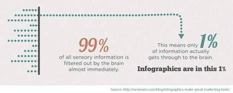
Visuals have a huge impact in marketing. Not only do they make content more sharable -- 40 times as much -- but they help us retain information. When details are paired with an image, we remember 55% more of it. That can be pulled off with infographics -- the nifty images that visually break down complex statistics. They're customizable, sharable, and they're easier to create than you might think. Sure, you could hire a professional to create the infographics for you. But if you're restricted by budgets or time, there are some great DIY resources out there for making compelling visuals. We scouted the web for some of them -- check them out below. (And for more on how to create an infographic, check out these tips.)...
By combining great visuals, great data, and great copy, they stimulate powerful learning centers in the brain, helping connect ideas much quicker than images or text alone. So, how do you put them to work for you? Whether you’re a newb who’s never worked on one before or an OG who’s done it a million times, remember that all good infographics start with good infographic ideas. I’ve sat through a couple thousand infographic brainstorms, and I know firsthand that coming up with a killer idea doesn’t always happen at will. So, to make things easier—and share some hard-earned knowledge—I’ve compiled a list of some of the more tried-and-true ways to come up with great infographic ideas, as well as a few examples to inspire you. I hope it helps your next brainstorm....
Via Ana Cristina Pratas
In terms of visually displaying information, infographics serve as an ideal way to convey a complex idea in an interesting and manageable format. Whether it's a comprehensive side-by-side comparison, a lengthy timeline, or robust collection of numbers and statistics, a well-designed infographic can help you make your point without fussing over a ton of words.
The big issue is, of course, the amount of time needed to create infographics. Nearly 66% of marketers reported that both lack of time and staff resources are the biggest challenge to creating effective visual marketing, according to a report from Digiday and Chute.
That's where we come in. We've created 20 fully customizable infographic templates that will give you the inspiration and foundation you need to build your own infographics -- 15 templates in PowerPoint with an additional five versions in Adobe Illustrator. Here's a sneak peak at what you can expect:...
When it comes to digital marketing, there are few techniques more widely used than the infographic. And when used effectively, they can provide a serious boost to any content marketing campaign. As noted by Forbes, “When your content is compelling, design can and should be used to communicate this information.” Many companies have found infographics to be an effective manner to communicate content in a clear and concise manner.
The problem is, many infographics produced today are pretty horrendous. Many are confusing or simply fail to provide relevant facts. And while some infographics are able to stand on their own, others become completely useless when removed from the context of the article with which they were originally published. Perhaps that’s part of the reason why infographic production has fallen in decline in recent years.
But effective infographics can supercharge a content marketing campaign, and indeed, continue to be more effective than other types of online content. Research by BuzzSumo found that on average, infographics vastly outperformed all other types of content in terms of online shares—especially on social media....
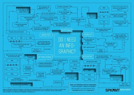
This infographic about infographics utilizes a cool blueprint flowchart concept.. something you’d think of as stereotypical for a blueprint. It’s cool, but it might be a tad ironic – it’s harder to read than you’d like it to be. Let’s jump into the things that you should focus on to make sure your infographic looks simple, readable and beautiful.
|


![15 Customizable Infographic Templates for PowerPoint [Free Download] | Public Relations & Social Marketing Insight | Scoop.it](https://img.scoop.it/L0tDVg9NsiVawXTRHsBEZzl72eJkfbmt4t8yenImKBVvK0kTmF0xjctABnaLJIm9)


MarketingProfs shares 5 types of infographic templates that work well, with tips to help you create your own infographics.