


 Your new post is loading...

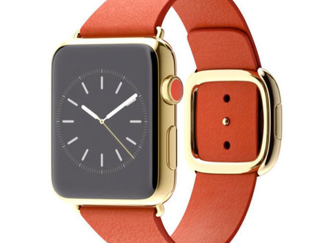

Like other smartwatches, Apple's Watch is embracing skeuomorphism.
But that's okay: It needs to.
Whatever the Apple Watch is, it's not a watch. Not really. Nor is any smartwatch: the Moto 360, the Pebble, or the Samsung Gear Live. It's an entirely new class of device. But it doesn't look like a new device. It mostly resembles a watch. That's because Apple (and other gadget makers) are turning to an old frenemy to help wrap their heads around these things: skeuomorphic design.
What is skeuomorphism? In the software world, it's all those buttons, shadows, gradients, chrome, and textures that designers use to make digital software resemble the real-world objects they're meant to replace. It's the calendar app bound in virtual cowhide, or the podcast app that looks like an ancient reel-to-reel tape recorder. It's a design language of digital fakery that Apple stuck to until Jony Ive blew out of the airlock with iOS 7. In the case of the Apple Watch, it's the wrist-based computer that resembles an analog timepiece in form alone.
But despite Apple's big move away from these principles last year, it had hood reason to follow along with other smartwatch makers and revisit the concept with its watch: Skeuomorphism is good at teaching people how to use new technology. In the words of our own John Pavlus, the iPhone's use of skeuomorphism was "a canny and monstrously effective solution to a daunting problem: how to make an input method once only seen in science fiction movies seem as normal and friendly as... well, as dialing a phone."...


Word of the day - skeuomorphism. It's also valuable design principle worth knowing when you look at wearable technology and other high tech design principles.