 Your new post is loading...
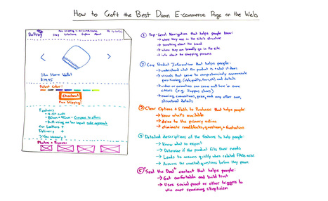
Howdy all and welcome to a special edition of Whiteboard Friday. My name is Rand Fishkin. I'm the founder of Moz, and today I want to talk with you about how to craft the best damn ecommerce page on the web. I'm actually going to be using the example of one of my very favorite ecommerce pages. That is the Bellroy Slim Wallet page. Now, Bellroy, actually, all of their pages, Bellroy makes wallets and they market them online primarily. They make some fantastic products. I've been an owner of one for a long time, and it was this very page that convinced me to buy it. So what better example to use?
So what I want to do today is walk us through the elements of a fantastic ecommerce page, talk about some things where I think perhaps even Bellroy could improve, and then walk through, at the very end, the process for improving your own ecommerce page....
It’s an easy mistake to make.
You slap some words on your About page, wrench them apart, shovel in a bit fluff, a pinch of jargon; and give it no more thought. Because it’s not that important, right?
Not exactly.
You see, this is where so many of us get it wrong, and leak piles of cash in the process. Even though we may pay it less attention, our About page is one of our most visited - which makes it low-hanging fruit, just waiting to be plucked.
By which I mean, if your visitors aren’t captivated, bewitched, mesmerized or just plain hungry-for-more after reading your About page, you can grab yourself a hanky and wave them goodbye.
In other words, you just lost a sale.
Because your About page isn’t just about painstakingly-crafted words that make you look good. Your About page is like speed dating
Let me explain.
If your pricing page isn't well designed and user-friendly, you're going to lose people.
What does a great pricing page look like? To help inspire you, we found 11 of the best examples of pricing page design. You'll notice the best pricing pages have clean layouts, use simple language that speaks to the customer, and aim to inspire trust between the business and the user. Check them out.
Design is an important part of shaping the user experience, but it's the strategy behind the website that will make it work. Before you start creating design concepts, there are a few fundamental questions to consider first.
Taking the time to discuss these big-picture considerations with your sales, marketing, customer service and leadership teams will ensure everyone is on the same page before you start creating new pages. Here are seven essential questions that should be part of that discussion....
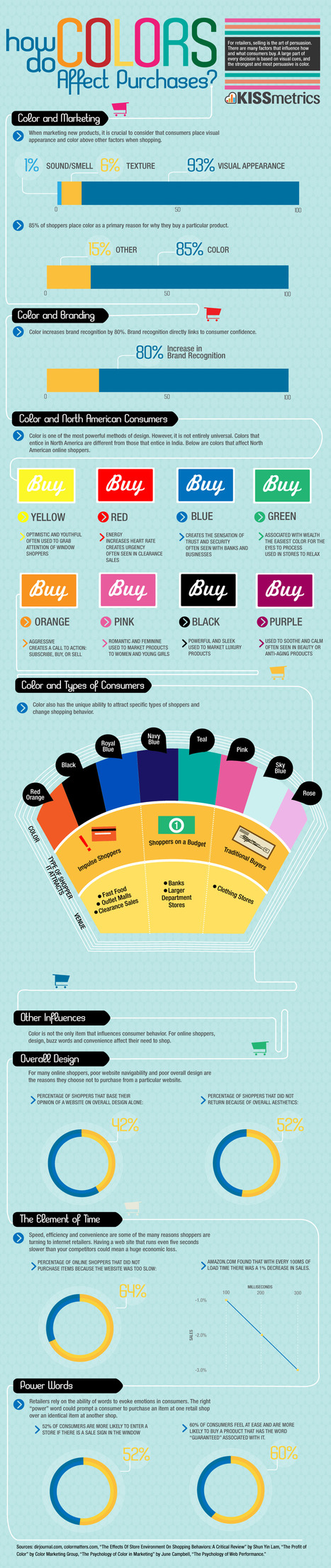
Sometimes it’s the simplest things that can make the biggest difference. One small factor in UX that can make a huge difference is color.
In fact, 85% of shoppers rate color as a primary reason for why they buy a product. It’s important to use the right colors to get the most out of your UX.
This infographic by Kissmetrics will guide your through making the right color choices for your design. The infographic describes the emotions associated with each color so that you can choose the one that best fits with your overall design.
It also talks about which colors best appeal to which type of consumer so that you can tailor your design to appeal to your customer base....
After my article on using neuroscience and psychology to boost your social media marketing, I thought a follow-up was warranted, this time for website and landing page conversions.
The psychology of web design has been a highly tested field, including relaying on triggers to entice users to complete an action. There are several different forces behind human behavior, like the classic FOMO (“fear of missing out”), curiosity, and the use of color to convey a message or feeling.
The following triggers are proven ways to increase action on your website....
The psychology of colour is a fascinating subject. Different colours and shades can have drastic impacts on what we can do and how we feel. Studies have shown, for example, that weightlifters in blue rooms can handle more weight and that eaters in restaurants with red, orange and yellow colour schemes eat more food faster (which is why almost all fast food joints have those colours inside). Pastel greens and blues are calming, and white looks clean and sterile.
Colours have these impacts on us for a variety of reasons, be they cultural, environmental or based on our past experiences, and many people are taking advantage of the associations we have with colours. Website owners and internet marketers in particular are turning to this fascinating subject to see just how the psychology of colour affects how users respond to call to action buttons. Below is what these owners are learning and how you can apply the lessons to your own site....
Whoa! A very cool trip down the Internet memory lane... The internet's embarrassing middle school yearbook.
This cartoon is too true for most websites! Usability? Target? Utility? Most don't give what users want... ~ Jeff
|
When it comes down to it, design is all about making choices. Each color, shape, line, font, text, and graphic you use will ultimately influence the message you're trying to get across.
I’ve often been in conversations with people who know they should get better at design, but they don’t feel they have a “natural sense” for creativity. However, I argue that learning to design well has as much to do with psychology and user behavior as it does creativity.
But learning the "psychology of design" doesn’t mean picking up a playbook that'll tell you the right and wrong way to design something. That's just not the way it works.
What brushing up on psychological principles (as they relate to design) will do is help you understand what goes into the creation of intuitive, intentional design experiences.
Want to learn more? We'll dive into a handful of psychological principles below to help you get the wheels turning....
Banner ads – we see them everywhere.
Normally they’re bright, flashy, and encroach on your internet experience. We’ve all tried our best to become immune to them. It’s safe to say they’ve got quite a bad rap.
In actuality, web banner ads are great tools to spread a message to a large audience. But with so many terrible examples of banner ads pummeling us every day, how do you stand out (in a good way) and really make an impression?
To save you some time, we’ve taken the liberty of curating 50 great examples of web banner advertisements to help and inspire you to create your own....
Designing newspapers, magazines and books has become particularly challenging as digital takes over most of our communications. While we must learn to adapt our concepts to various screen sizes, paper will always be an essential medium for creative expression.
Throughout this article, I’ll introduce 50 incredible newspaper designs (and the design lessons they bestow) to inspire your work....
Hand-picked collection of brand style guide examples, pattern libraries and design manuals for inspiration. Find all the best style guides in one place. Maintained by Saijo George, find me on Twitter or LinkedIn.
Web Design Basics
Love these five web design basics:
* Learn TYPE Design.
* Pick Great Fonts That Fit Your TONE.
* Pick 3 Color Palette & STICK TO IT.
* Photos = RIGHT SIZE.
* When In Doubt, Give It SPACE.
This last tip is our favorite. Nothing we hate more than claustrophobic web design. Problem is claustrophobia is easy to create. We all WANT to do so much.
When I was an Ecommerce Director we studied our links carefully. We found that 5% of our links received 90% of the clicks. That equation turned out to be a fractal. No matter how small we cut it, no matter how we shifted the design, a small % of the links dominated.
This means MOST of what WE, as designers, think is important isn't. We learned to be Google - Vicious about what we added. Adding meant something had to COME OFF the design. This strange User Interface math means you have more ROOM than you realize.
Find what matters and LINK IT. Design what matters and eliminate the flotsam and jetsam so you have SPACE around what matters since it is that SPACE that signals IMPORTANCE to your visitors. .
Via Martin (Marty) Smith
A grey website design looks very professional and gives a very neat and sophisticated feel. Grey is one of the most widely used colors in web designs because it is a neutral color that is a perfect option to be used for website backgrounds.
Here, we are presenting a creative and inspirational collection of some clean grey website designs for you. All the website designs presented in this collection are handpicked. This means we have spent hours in finding out the best and creative grey website designs. We went through hundreds of websites to find the cream of the crop. Enjoy!
Pantone Color Institute kicked things off by naming emerald green as its official 2013 colour. Fashion, interior design, graphic design and other industries followed suit by using the basic colour wheel as inspiration for 2013 colour trends. Here I'll look at five of the biggest colour trends in web design. You don't have to follow them, but it's important to know what they are...
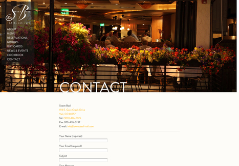
...For some, this is that last page on the site map where you just throw a bunch of information. You can leave it up to the person to decide how they want to contact you and what they want to contact you about. For others, this is the last attempt to get your potential customer to give you their business. The contact page is much more important than many give it credit. Many basic websites just throw some numbers and e-mails up and move along. But in most cases, this is the page your customer sees before they decide they want you on their project. Or before they decide they want to visit you to purchase your product. It’s extremely important to make sure your contact page delivers in the best way possible. It can be a tricky thing to handle, so today, we’ve gathered 20 sites with great contact pages and forms to give you a bit of a creative boost....
|


Rand Fishkin reviews e-commerce page best practices and offers valuable tips.