 Your new post is loading...
I moved five times in the last year. And every single time I moved, I forgot to sign up to have my mail forwarded to my new address.
Mail forwarding is an important step in any moving process, as it ensures you don't lose any valuable information that's sent to you. And the same can be said for your website: If you're moving a website from one URL to another, you need to take the necessary steps to ensure your visitors get sent to the right place. In the world of tech, this is called a 301 redirect.
A 301 redirect is key to maintaining a website's domain authority and search rankings when the site's URL is changed for any reason. It easily sends visitors and search engines to a different URL than the one they originally requested -- without having to actually type in a different URL....
Despite the difference in setting, the people who come into your website aren’t all that different from people who shop in a store. Your storefront is just a virtual one. Just like shoppers casually walk through a store, letting their eyes wander, so too will your readers scan your content. People don’t read from beginning to end in most cases, they usually browse, looking for specific cues that entice them to read on.
People on the internet are looking for several things when they visit your website, these actionable concepts will be further exemplified in the coming approaches, but keep these characteristics in mind as you read...
Though it's tempting to simply create a mobile version of your website and pat yourself on the back for a job well done and move on to another project, search habits are changing. Now, responsive websites are the best choice for an optimal customer experience. Marketers can't sit on their laurels when it comes to Web design.
It's vital that Web design evolve and change to meet consumer needs, especially because a study by Google and Nielsen reveals that more than half of mobile purchases occur within an hour of initial search, making mobile optimization more important than ever. Here are 7 quick ways you can make sure your site is truly optimized for all users....
One Page Love is a one page website design gallery showcasing the best single page website designs from around the web.
Looking for some inspiration as you build you next website?
Design is valuable, an investment, and will pay dividends over the life of your business. First and foremost, your website may be one of the first things that a potential customer sees related to your brand. If they come to a website that looks like it was built in 1995 using Adobe Dreamweaver, this will reflect poorly on the brand.
Worse, a bad design may be enough to send someone running back to Google and into the arms of a competitor that has a website that is easy on the eyes. A good design is simple. The arch-enemy of a good website is complexity. Why?...
It’s easy to see that more an more designers are embracing the minimalistic approach to web design. Now there are websites that eliminate unnecessary elements and keep only what really matters, designs that are clean and intuitive, like the ones we will show here today. We have different examples of clean and minimal sites with beautiful navigation, neat menus and nice type to keep you inspired, take a look....
A lot of times, services and app websites are a little bit neglected by designers, and this is why finding a well designed service/app site can be a challenge. But if you really dig around, you can find something inspiring, like the ones we will show here today.
From good use of images and type, to videos and navigation, these websites are good examples that you need to deliver a good webpage to present your service or application to attract users. Remember that the user needs to understand what you are offering. So make sure people understand your product/idea and have all the info they need, otherwise you may lose users...
Many businesses get caught up in the "look" of a website design or redesign, but we find that almost all of our clients need to pay more attention to “how inbound their website is.”
For this to be achieved, we always ensure we've hit these 8 key steps that result in good inbound website design. We recommend to always check for the following to transition to an inbound-friendly website....
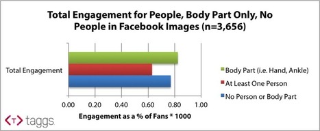
Marketers often spend hours selecting and producing visual content to post on Facebook brand pages. Creatives, strategists, and managers can go round-and-around debating which images work and which don’t for a brand. Sometimes they debate over whether or not the brand should show people in brand images, and everyone has their differing opinions.
At Taggs, we decided to bring data to help settle the debate – Do people pictured in brand images help or hurt Facebook engagement?
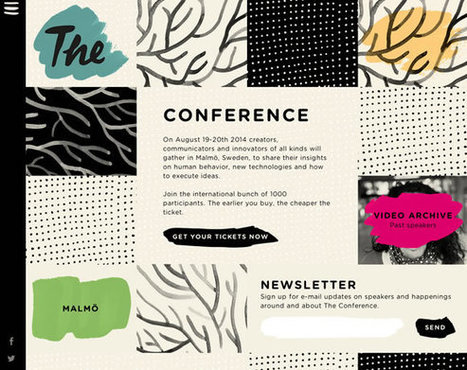
...One of the latest trends (or fads..depending on how you look at it) to come about within the past few years is the “single page” or “one page” website.
What is a Single Page Website? A single page website is comprised of a single HTML or dynamically generated page with a horizontal navigation that leads you to different sections of the page instead of your traditional navigation buttons that when clicked would take you to a new page. The user just scrolls down the one page to that particular content’s section or clicks a link and “jumps” to the correct section. The effect is pretty cool, kind of like being on an elevator and whizzing past the other site sections to arrive at your destination....
Considering how Twitter's main site has seemed to regress in recent times and greater attention has been placed on the mobile app, we've decided to give the site a makeover and show how the site can be improved... We understand that Twitter is designed more for mobile, but considering how neglected its desktop site feels – and especially since it is its main source of revenue – we decided to take matters into our own hands and present our vision of how Twitter should look and feel. The Aim Before starting the redesign, it was important to look at what Twitter does right first and incorporate those features into the new look. For one, its simplicity is its greatest strength, and so the overall aim was to evolve the platform instead of creating an entirely new interface from scratch. While it’s very tempting to fill the entire page with different columns and boxes to give users more features to interact with, doing so would make the page busier, which would compromise the overall experience. Therefore, we limited the design to two columns and placed tweets on the left-hand column to maintain consistency....
|
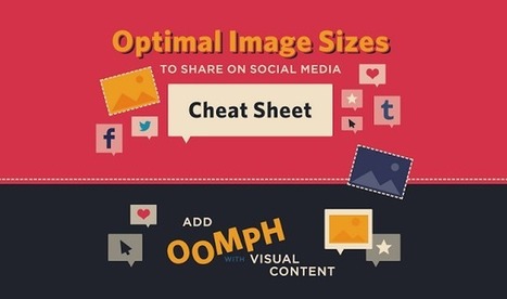
When it comes to social media, it’s a pretty well-known fact that images automatically do well. Users are attracted to visuals much more than they are plain text. However, sharing an image that isn’t the right size can be terrible for you or your brand.
SurePayroll has created an infographic (featured below), giving you the inside scoop on making sure your image is perfect, no matter where you choose to share it.
From Twitter and Facebook, to Pinterest and Tumblr, this infographic has guidelines for getting your image sizing right on the seven most popular social media sites. The next time you have an image you’d like to share, double check the size before posting to ensure that your picture isn’t too big – or too small – to make an impact....
Decisions, decisions, decisions! Every day we are faced with a constant series of decisions. Whether it is deciding to eat that piece of cake, or make a career change, the decisions we make shape our lives and who we are.
We like to think that all of our decisions are rational and that we are in control, however our unconscious mind, drives how we respond to advertising, brands, products, and in the end determines all of our buying decision. As a result, our landing page design plays an integral role in how our brains make a decision to buy a product or not. The reasons unconscious triggers determine our decisions can be found in the structure of our brain. We can break our mind into three separate parts....
By combining scientific studies on color with some design principles, you can create a great call-to-action button for your website and improve its conversion rate drastically.
A CTA-button has 4 important tools to achieve this: placement,shape (and size), message and color. In this article I will talk about the aspect of color. But first things first…
...Another concept which is being heavily challenged by the rise of the touch-screen device is traditional menu and multiple-page based website design. Given that a significant amount of web browsing is done on screens of ever shrinking sizes, this doesn’t really work as well as it used to. Enter The Single Page LayoutThe single page layout is one which eschews having multiple pages, each encapsulating a piece of text or some media. Instead, we use a single continuous page which contains absolutely everything.
This design paradigm has found countless fans within the web developer community, and has found itself used in a variety of settings, including marketing pages and personal portfolios. This adulation has had the effect of spawning countless Javascript libraries, which make it easy to create single page websites (of which my favorite is fullPage.js). But why? What makes this paradigm work? Here are three reasons why....
French company founded in 2012, has just launched an all-in-one website creation platform that allows users to build and launch sites that automatically adapt to a range of devices without needing to know any code at all.
While drag-and-drop website tools are nothing new, they often take a bit of manual tweaking – or you later find that a subsequent update has broken part of the site, or certain elements don’t play nicely together. Pikock claims, however, that it doesn’t just focus on being easy to use.....
A lot of trends come and go in web design, but textures and patterns are always around. A good use of textures and patterns can add personality, depth and interest to a website. This is probably the reason why these are still popular among designers. Today, to prove that textures are still around, we’ve got some inspiring examples of websites using them. From super subtle textures, to big colorful patterned backgrounds, there are some beautiful examples here....
At EyeQuant, we do a lot of eye-tracking as part of our mission to teach computers to see the web like humans do. The main purpose of our studies is to find the statistical patterns that power our attention models (which you can use to instantly test your websites!)
Today, we’re sharing 3 of the most surprising insights we found. A lot of you have asked us about general rules of thumb around what drives (and doesn’t drive) attention – in this post you’ll learn why rules of thumb are difficult to establish and how a lot of the common ideas we have about human attention are more complicated than they seem. In fact, what you’re about to read is going to be rather surprising and we’re hoping to dispel some common myths about attention and web design with data. :)...
So often, small business owners come across this issue…they build the website, optimize the content and wonder why they don’t have droves of clients visiting the site.
Or worse, they build a website knowing that the only traffic they’re likely to attract is from current clients who refer their friends; making their website nothing more than a very expensive business card.Online marketing can be a boon to your business if you know how to work it.In this post, I’m going to give you the secret sauce to making your website a lead and capture center, not just a billboard of your services...
Your website is the hub of your inbound marketing efforts. Every piece of content you create or campaign you run should be designed to drive traffic to your website and landing pages, giving you the chance to convert visitors into leads and customers. It makes sense, then, to start by looking at insights from your web analytics platform, such as Google’s free Google Analytics, or a paid platform like HubSpot .
Let's review the 8 essential metrics you should be tracking on your website and its landing pages, and how you can use these metrics to optimize and improve your website’s performance....
If your 'About' page ain't too nifty, check out these examples and fix it up in a jiffy. When you’re building a website, it’s tempting to get distracted by all the bells and whistles of the design process and forget all about creating compelling content. But having awesome content on your website is crucial to making inbound marketing work for your business. So how do you balance your remarkable content creation with your website design needs? Why, with your 'About Us' page, of course! For a remarkable 'About Us' page, all you need to do is figure out your company's unique identity, and then share it with the world....
|


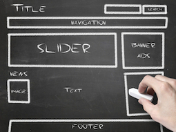


Here's a practical website design tip worth noting in order to ensure your traffic moves with you when you redirect it to a new URL.