 Your new post is loading...
There are several nifty ways to go about pairing fonts for your design projects, including this machine learning-based tool and this Tinder-style app. But if you just want to see some great combinations, you’ll want to check out this excellent guide by designer Lou Levit. It features 50 top-notch pairings that draw from Google’s extensive web font collection – so you can grab all the typefaces you like for free, and use them on web design projects – and they’re matched with beautiful classic art. The pairings are organized and navigable by font style and mood (choose from Modern, Striking, Eccentric, Classic, Minimal, Neutral, and Warm). That’s handy for quickly finding a combination that suits your needs, whether it’s to professionally present information or announce an event. Plus, you can download the entire guide as a PDF. Find the guide, as well as tips on pairing fonts and the handy PDF, over at ReliablePSD.
Lorem ipsum has become the industry standard for design mockups and prototypes. By adding a little bit of Latin to a mockup, you’re able to show clients a more complete version of your design without actually having to invest time and effort drafting copy. But despite all its benefits, seeing the same random Latin text in every design can get a little boring for you and your clients. So if you have a client who’s got a sense of humour or if you’re just tired of going the traditional route in your mockups, here are 15 creative and funny lorem ipsum text generators that are sure to lighten the mood at any client meeting....
I moved five times in the last year. And every single time I moved, I forgot to sign up to have my mail forwarded to my new address.
Mail forwarding is an important step in any moving process, as it ensures you don't lose any valuable information that's sent to you. And the same can be said for your website: If you're moving a website from one URL to another, you need to take the necessary steps to ensure your visitors get sent to the right place. In the world of tech, this is called a 301 redirect.
A 301 redirect is key to maintaining a website's domain authority and search rankings when the site's URL is changed for any reason. It easily sends visitors and search engines to a different URL than the one they originally requested -- without having to actually type in a different URL....
Good typography may be hard work, but designers shouldn’t forget to have some fun with it! While crafting fonts and typographic characters can sometimes feel stiff and overly mathematical, we want you to help you find the joy in creating more expressive and playful typography.
Of course, this approach is great for children-oriented design projects—but let’s not limit ourselves. After all… not every coffee shop, ice cream store and logo needs to look posh. Let’s find the more creative side of typography and get goofy!
In this article, we’ll spotlight some examples of playful typography and show you how to join in the fun with your own work....
When you think of great website design, you probably think about a website's homepage, or their blog, or their product pages. But what about a website's 'Contact Us' page? Far too many website designers put contact pages near the bottom of their priority list in terms of copywriting and design. Think about how many contact pages you've stumbled upon that look like they were built in the 1990s, even if the rest of the website is beautiful and updated. That, my friends, is a huge mistake. Your 'Contact Us' page is one of the top four most important pages on your website. For most companies, it's typically one of the most-visited site pages. So, what do great 'Contact Us' pages look like?...
Picture quotes are one of the most pinned images on Pinterest.
The more visually striking your picture and quote combination is, the more shareable it will be. People can use them on social media, turn them into printable wall quotes, or download them as desktop wallpaper — that’s maximum visibility for you or your brand.
So whether you want to take your graphics to the next level or create your own for the first time, let’s go through some ways you can do the same for your quotes using some of the most eye-catching examples on the web....
In this post, we have compiled together some of best modern sans serif fonts for your latest project or to inspire you for your next assignment. In case, you want to work with a bunch of them together, do check out Canva’s Ultimate Guide to Font Pairing.
The fonts are all listed as free to use for personal and commercial uses, so let your creativity run wild. To start using any of them right away, download and upload them straight to Canva. Here’s how....
As Buffer writes, over 90% of our assessment of a product is made on color alone, so it makes sense that color should be considered with care for every design decision, particularly on websites. Chances are, if we don’t like the color palette, we’re not going to stay on the site for very long.
To get you started on your own palette, we’ve gathered 50 beautiful websites with versatile color schemes you can take inspiration from. So without further ado, let’s get knee-deep in some beautiful colors.
What if you wanted to place text or an arrow on your Facebook cover photo without it getting covered by the profile photo? And what about the shared link thumbnails on Facebook or in-stream photos on Twitter ... how big should those be?
If you're looking for a detailed guide to social media photo sizes -- including recommended dimensions, minimum and maximum dimensions, image scale, and more -- then this is it.
The infographic below from Jamie Spencer of MakeAWebsiteHub.com is a great reference to bookmark or keep close-at-hand the next time you're creating an image for your social media profile.
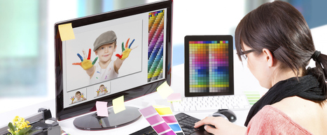
So, while I wouldn’t say I’m naturally artistic, I have learned how to create compelling visual content. And so can you.
While there are many tools out there to help even the most inartistic of us to create compelling visuals, some parts of graphic design take a little more background knowledge.
Take picking the right colors, for instance. It's something that might seem easy at first, but when you're staring down a color wheel, you're going to wish you had some information on what you're looking at. Well, consider this your introductory course to color theory. Read on to learn about the terms, tools, and tips you should know to pick the best colors for your designs....
Typography is an important but often under-represented part of a website's layout. With so much focus being placed on the presentational aspects of CSS and the use of large images and media that choke bandwidth restraints; it’s nice to occasionally remember that textual content can also make an impact on users and their experience. Content remains king, and a few good fonts can make even the simplest of sites look smart - though not so many that you have to wait for ages for the text to be visible.
Because of this, I’m going to show you a few handpicked examples of sites that make their content look terrific, and why you should consider following their example in your own work. We’re going to take a journey of how elegant typography can make a site shine; looking at the bold, creative, navigational, simplistic and interactive content that makes the designer's voice speak volumes - so let’s get started!...
At the beginning of my journey, I sought advice from graphic designer friends. They were telling me the same thing over and over: "Learn Photoshop, Illustrator, and InDesign;" "Read a book about basic design principles." As much as these tips helped, there were still holes in my knowledge that couldn't be filled by software lessons or books. Anyone who's tried to teach themselves creative concepts understands the pain points associated with trying to balance learning fundamentals, navigating new tools, and developing a personal style.
The following tips are pieces of advice I wish I had been given at the onset of my DIY graphic design journey. I hope they help you smooth some bumps in the road. (And for more great tips, resources, and inspiratoin, be sure to subscribe to HubSpot's Design Blog.)...
A huge list of tools, apps, icons, and backgrounds for creating amazing, professional images for social media and marketing....
|
Whether it’s a brand promotion, video, news update or even a meme, visual content rules the social media landscape. What has become so important is effectively conveying your brand on social media through images and video.
In this quick-scroll world of social media, the visual face of your brand is often times the first thing your audience sees and possibly the one thing they remember. It’s hard to cut and paste an image and reuse it across all of your social networks unless you have a tool like Landscape.
Sprout Social’s very own tool is free to use to resize, crop and scale social media image sizes. And along with our resizing tool, we’ve provided all the specific dimensions and a few quick tips to help you decide which image best fits each position....
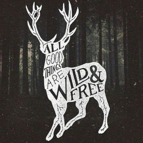
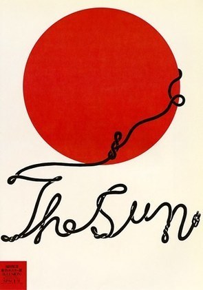
Typographic characters don’t always need to come from font files. Many of today’s brilliant designs manifest typographic characters through drawing, squiggling and doodling.
Meet Shigeo Fukuda, a master of manipulating lines into playful concepts. In the example to the left, Fukuda creates the words, “The Sun”, from a playful and winding doodle of a power cord emerging from behind a minimal rendition of the sun.
How would you create playful typography from an illustration or drawing? Think about ideas like creating words like “health” from illustrations of vegetables. Or create a rendering of a word like “summer” out of illustrations of melting ice cubes.
Get playful!...
Social media is an extremely valuable tool for promoting your marketing content. But with so many social networks providing their own individual content sharing and follow buttons, it's often difficult to know which social media button to use for what purpose. To address this, we've put together a comprehensive guide to help you understand the differences between the share and follow buttons for six of the biggest social networks (Twitter, Facebook, LinkedIn, YouTube, Instagram, and Pinterest), as well as how to implement them on your website, blog, and other content....
Typeface selection plays a critical role in the readability of your content. Although it may be one of the overlooked aspects when it comes to designing websites. One of the main finding of Nielsen Norman Group Eye-tracking Study of Web Readers was “Text Attracts Attention Before Graphics”. The study revealed:
“Of users’ first three eye-fixations on a page, only 22% were on graphics; 78% were on text”.
As a web designer, you need to pay more attention to typography.To make your design more effective and impactful we have compiled a huge list of typography tools and resources available on the Internet. If you are serious about web design and want to improve your skills, Take time to work your way through this resources.…
Color blocking is nothing new. It’s long been designers’ go-to trick for chopping up large pieces of content, crafting call-outs and adding visual interest to an otherwise plain page. But in today’s design world, color blocking has evolved into a stunning minimalist trend that’s a perfect fit for spring.
Gone are the convoluted colors and clunky squares that too often transform quality design into an eyesore. Now it’s all about airy white space, pastel hues and clean lines. The results are beautiful and soft, confident and more modern – ideal for boutiques, chic websites and stylish brochures.
Curious how to put this update into action? We’ve gathered 18 inspiring designs from 99designs and beyond that prove how compelling this contemporary style can be....
Keeping up to date with the latest social media logos can be a challenge. And even once you’ve found the correct logos it can also take some time to understand the brand guidelines: - How much spacing should be around the logo? - What colors should I use? - What size should be it be? etc, To help you save time, we put together this resource to keep you updated on the latest social media logos. Alongside the most recent logos for Facebook, Twitter, YouTube and more, we’ve also included the key guidelines for the usage of each logo as well....
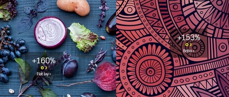
You’ve probably seen Flat Lay designs, even if you haven’t heard the term. Flat Lay design refers to a shot of items lying flat on a table, floor or other surface, shot from above. You see these kinds of images on eCommerce sites and other websites frequently. The Flat Lay design trend is up 160 percent according to the just-released Creative Trends 2016 report by Shutterstock.
This fascinating report outlines a number of other visual and creative trends that Shutterstock predicts will be popular during 2016.
If you’re looking for design ideas for your website, social media headers, advertisements or other graphics — this is one report you need to check out....
When people arrive on your site, they will be forming their first impression within 50 milliseconds. They will then be deciding whether or not to stay on the site within 10 seconds.
This miniscule amount of time makes it hard to pull in new visitors with text or great offers. Customers are drawn in or repelled by your web page based upon appearance.
The importance of images and other visual content in website success has become even more apparent in recent years. Brands that already use custom visual content see conversion rates that are about seven times higher than other sites, according to an infographic from SocialMediaToday...
As we mentioned last week, picking the right colors is the single most important decision you can make when designing an infographic. Most designers realize this, and for years they’ve been trying to answer one question: is there a science to picking colors that work well together or is it just subjective? Why do some colors match, while others look strange?
The internet has been debating this for a while without much consensus, but I believe the real answer is both: it’s an art and a science. Every design decision is heavily influenced by a designer’s intuition and sense of aesthetics, but there is also a strong scientific component that conveys if a color works well with another.
Expert designers use it to validate their intuition, but we are going to learn how to use color theory to pair beautiful colors together....
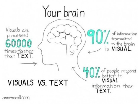
The posts on this blog are typically 2,000 words long. Would you honestly read them if they were nothing but text? Sure, some of you would (and that’s amazing, thank you), but I could never blame anyone for not wanting to read a giant block of text.
This is why articles that include images get 94% more total views than articles that don’t.
Remember though, that stat is just an average. If you use images well, your traffic could increase even more.
It’s a win-win: you get more pageviews, and your readers get to enjoy reading more digestible content.
While social media isn’t the same as your blog posts, it illustrates the power of great images.
Posts on Facebook that include an image get 53% more likes than posts without an image. Additionally, they also make up 93% of the most engaging posts....
It's of importance as people become more mobile and the need to make things more compact arises.
Understanding Icons What are these icons for? Well, icons actually have a pretty wide scope, depending on how you look at it.
See those little boxes on your smartphone that represent different applications? Those are icons. Did you notice those little boxes on your favorite website, that, when clicked, would trigger a new action such as open a new email window or identify a link being promoted, such as a Twitter or a Facebook profile? These are all icons....
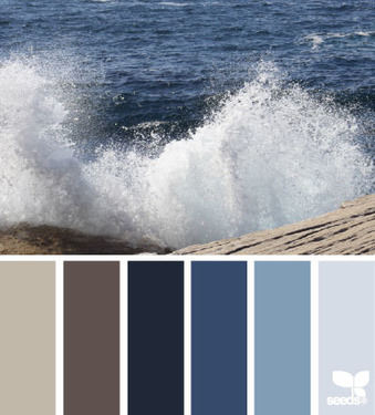
We found some really beautiful, perfect color palettes with lovely colors. These can be used for any kind of design projects, from websites to logos and prints. All these perfect color palettes can be found on Design Seeds website, a website which celebrates colors found in nature.
Some of these perfect color palettes have pastel colors, light colors, while others have bolder tones and darker nuances. Which one do you like most?...
|


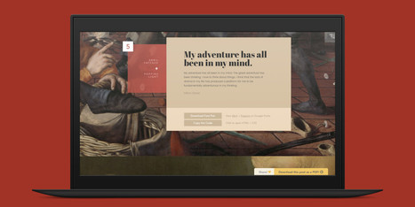


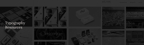


This excellent guide by designer Lou Levit depicts 50 gorgeous font pairings along with beautiful classic works of art. Find the right one for your project.