Public Relations & Social Marketing Insight
443.6K views | +0 today
Follow
Public Relations & Social Marketing Insight
Social marketing, PR insight & thought leadership - from The PR Coach
Curated by Jeff Domansky
Your new post is loading...
Scooped by Jeff Domansky
Scoop.it!

Designing for mobile | Tom Fishburne

Designing for mobile | Tom Fishburne | Public Relations & Social Marketing Insight | Scoop.it

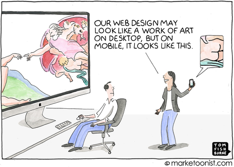
In 2015, Google introduced an algorithm update known as “Mobilegeddon” that prioritized mobile-friendly websites and was a wakeup call for marketers.

And yet, with customers increasingly mobile first, many brands still treat mobile visitors as mini desktop visitors.

Ericcson published a neuroscience study last year that found that the stress caused by using smartphones to find content and complete tasks on the mobile web is akin to watching a horror movie. They found that heart rate increases 38% with mobile content delays.

Jeff Domansky's insight:

Note the Ericcson research showing the stress of finding mobile content on the web is as big as watching a horror movie. Don't add to that horror show. Make your content mobile ready.

No comment yet.
Scooped by Jeff Domansky
Scoop.it!

16 drop-dead gorgeous examples of mobile design inspiration

16 drop-dead gorgeous examples of mobile design inspiration | Public Relations & Social Marketing Insight | Scoop.it

Mobile apps and responsive websites are looking - and working - better than ever, as designers come to terms with the parameters involved. Smaller screens, it seems, do not necessarily make for poorer experiences.

Jeff Domansky's insight:

What a great app for skiers too LOL.

malek's curator insight, September 26, 2013 5:59 PM

True "drop-dead gorgeous" designs of responsive web. RW design picks the right resolution of device it's being served on. Flexible images and fluid grids then size correctly to fit the screen. 

Nathalie Prinet-Houairi's curator insight, September 27, 2013 8:26 AM

Visuel, visuel, toujours visuel: l'important dans la "user interface"

Scooped by Jeff Domansky
Scoop.it!

Website Mobile-Friendly Checklist: Get Seen On the Go - Conductor Blog

Website Mobile-Friendly Checklist: Get Seen On the Go - Conductor Blog | Public Relations & Social Marketing Insight | Scoop.it

Now that Google has officially confirmed that there are more searches on mobile than desktop, sites that aren’t mobile-friendly just won’t cut it anymore. After all, it’s bad for business — 70% of these mobile searches convert to some sort of online action within the first hour.


That’s why we put together a checklist of the mobile friendly best practices (from our #MobileReady webinar) to help arm you. You can download the checklist here....

Jeff Domansky's insight:

Don’t fall off a traffic cliff: make sure to check out this checklist that offers both technical and strategic advice on making sure you're mobile friendly.

No comment yet.