 Your new post is loading...
Selling services online is an entirely different ballgame than selling products. There are separate processes, marketing techniques, and web design principles you must follow. You can’t pitch services in the same way as products and you must understand the advantages and disadvantages that come with the service industry. With the right web design ideas, your company can easily meet and exceed the business success of your product-selling peers. Optimize your website with these six tips..
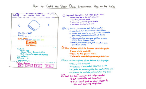
Howdy all and welcome to a special edition of Whiteboard Friday. My name is Rand Fishkin. I'm the founder of Moz, and today I want to talk with you about how to craft the best damn ecommerce page on the web. I'm actually going to be using the example of one of my very favorite ecommerce pages. That is the Bellroy Slim Wallet page. Now, Bellroy, actually, all of their pages, Bellroy makes wallets and they market them online primarily. They make some fantastic products. I've been an owner of one for a long time, and it was this very page that convinced me to buy it. So what better example to use?
So what I want to do today is walk us through the elements of a fantastic ecommerce page, talk about some things where I think perhaps even Bellroy could improve, and then walk through, at the very end, the process for improving your own ecommerce page....
Social media is an extremely valuable tool for promoting your marketing content. But with so many social networks providing their own individual content sharing and follow buttons, it's often difficult to know which social media button to use for what purpose. To address this, we've put together a comprehensive guide to help you understand the differences between the share and follow buttons for six of the biggest social networks (Twitter, Facebook, LinkedIn, YouTube, Instagram, and Pinterest), as well as how to implement them on your website, blog, and other content....
There are only six things that you want a business website to do: 1. get found 2. natural search 3. answer questions 4. bring in enquiries 5. get prospects to reveal their identity 6. showcase expertise. What this means is that an effective website should be shortcutting the amount of time it takes to get a new customer. Three tests to do now. So how can you tell if your current website is performing? Here are 3 tests you can run which are free and will take you around five minutes to do...
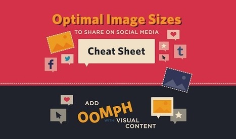
What if you wanted to place text or an arrow on your Facebook cover photo without it getting covered by the profile photo? And what about the shared link thumbnails on Facebook or in-stream photos on Twitter ... how big should those be?
If you're looking for a detailed guide to social media photo sizes -- including recommended dimensions, minimum and maximum dimensions, image scale, and more -- then this is it.
The infographic below from Jamie Spencer of MakeAWebsiteHub.com is a great reference to bookmark or keep close-at-hand the next time you're creating an image for your social media profile.
If your pricing page isn't well designed and user-friendly, you're going to lose people.
What does a great pricing page look like? To help inspire you, we found 11 of the best examples of pricing page design. You'll notice the best pricing pages have clean layouts, use simple language that speaks to the customer, and aim to inspire trust between the business and the user. Check them out.
When it comes to social media, it’s a pretty well-known fact that images automatically do well. Users are attracted to visuals much more than they are plain text. However, sharing an image that isn’t the right size can be terrible for you or your brand.
SurePayroll has created an infographic (featured below), giving you the inside scoop on making sure your image is perfect, no matter where you choose to share it.
From Twitter and Facebook, to Pinterest and Tumblr, this infographic has guidelines for getting your image sizing right on the seven most popular social media sites. The next time you have an image you’d like to share, double check the size before posting to ensure that your picture isn’t too big – or too small – to make an impact....
Tired of chasing down sizes for images in your financial institution’s social media channels? Here’s everything you need for Facebook, Twitter, YouTube and Linkedin.
I know there are some really bad small business websites out there, but some fresh numbers paint an alarming picture. The stats come from “SMB DigitalScape,” a data tool that’s being jointly promoted by BIA/Kelsey and vSplash, the company that created the tool. The numbers were distributed Monday in conjunction with the beginning of BIA/Kelsey’s ILM East show. How bad is the picture? Consider these pullouts...
|
Whether it’s a brand promotion, video, news update or even a meme, visual content rules the social media landscape. What has become so important is effectively conveying your brand on social media through images and video.
In this quick-scroll world of social media, the visual face of your brand is often times the first thing your audience sees and possibly the one thing they remember. It’s hard to cut and paste an image and reuse it across all of your social networks unless you have a tool like Landscape.
Sprout Social’s very own tool is free to use to resize, crop and scale social media image sizes. And along with our resizing tool, we’ve provided all the specific dimensions and a few quick tips to help you decide which image best fits each position....
I moved five times in the last year. And every single time I moved, I forgot to sign up to have my mail forwarded to my new address.
Mail forwarding is an important step in any moving process, as it ensures you don't lose any valuable information that's sent to you. And the same can be said for your website: If you're moving a website from one URL to another, you need to take the necessary steps to ensure your visitors get sent to the right place. In the world of tech, this is called a 301 redirect.
A 301 redirect is key to maintaining a website's domain authority and search rankings when the site's URL is changed for any reason. It easily sends visitors and search engines to a different URL than the one they originally requested -- without having to actually type in a different URL....
It’s an easy mistake to make.
You slap some words on your About page, wrench them apart, shovel in a bit fluff, a pinch of jargon; and give it no more thought. Because it’s not that important, right?
Not exactly.
You see, this is where so many of us get it wrong, and leak piles of cash in the process. Even though we may pay it less attention, our About page is one of our most visited - which makes it low-hanging fruit, just waiting to be plucked.
By which I mean, if your visitors aren’t captivated, bewitched, mesmerized or just plain hungry-for-more after reading your About page, you can grab yourself a hanky and wave them goodbye.
In other words, you just lost a sale.
Because your About page isn’t just about painstakingly-crafted words that make you look good. Your About page is like speed dating
Let me explain.
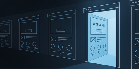
When it comes to your welcome page design, there are many patterns to choose from. You can launch your new users into a product tour, or create a personalized experience. You can have them populate their feed with relevant content or do something entirely unique.
Whatever your pattern, your user onboarding starts with your welcome message. Here are 12 design tips to optimize your welcome page
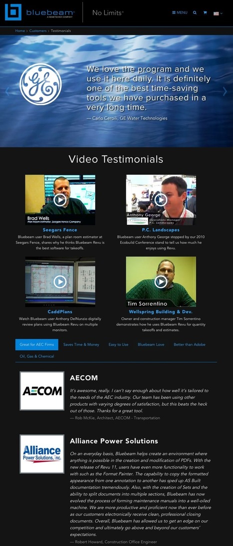
To prove the value of what you have to offer, why not let your happy customers do the talking?
Your testimonial page serves as a platform to show off how others have benefited from your product or service, making it a powerful tool for establishing trust and encouraging potential buyers to take action. Plus, having a testimonial page serves as yet another indexed page on your website containing content covering product features, pain points, and keywords you're trying to rank for.
What are some examples of great testimonial pages? Here are 11 of the best examples out there to inspire you....
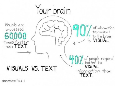
The posts on this blog are typically 2,000 words long. Would you honestly read them if they were nothing but text? Sure, some of you would (and that’s amazing, thank you), but I could never blame anyone for not wanting to read a giant block of text.
This is why articles that include images get 94% more total views than articles that don’t.
Remember though, that stat is just an average. If you use images well, your traffic could increase even more.
It’s a win-win: you get more pageviews, and your readers get to enjoy reading more digestible content.
While social media isn’t the same as your blog posts, it illustrates the power of great images.
Posts on Facebook that include an image get 53% more likes than posts without an image. Additionally, they also make up 93% of the most engaging posts....
Hand-picked collection of brand style guide examples, pattern libraries and design manuals for inspiration. Find all the best style guides in one place. Maintained by Saijo George, find me on Twitter or LinkedIn.
Go to the home page of your business website. Do it. Yes, right now. How long does it take you to locate your phone number? Okay, now, look at an interior page, like a product page or “About” page. How long did it take you to find your phone number then? Last test: find a smartphone or tablet and pull your website up. You guessed it – how long did it take to find your phone number here? If it takes you more than five seconds to locate your phone number in any of these scenarios, your website has a serious problem....
|


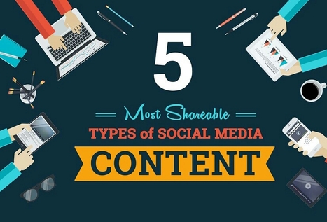


Here's how to help your posts go viral.