 Your new post is loading...
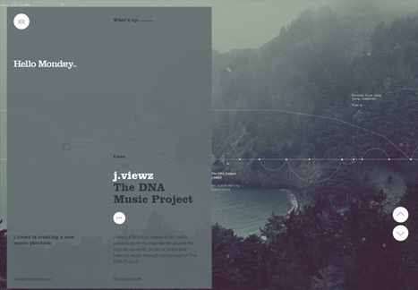
This is the resource for you: How to Design a Website: 5 Brilliant Homepage Designs to Get You Started. In this free lookbook, you can explore homepage designs from businesses all over the world in several different industries, including: - Agency & Studio - Entertainment -Food & Drink -Nonprofit -Software & Tech -Ecommerce & Retail...
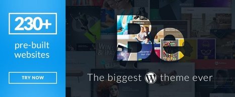
If you’re feeling overwhelmed when attempting to select a theme for a WordPress site that will work for you, you’re not alone. There are so many to choose from, that after a while, all the good candidates begin to look alike. The real problem could be that you’re unsure of what theme characteristics to look for. After all, you want to build more than just websites; you want to build web experiences.Here’s what to look for....
I moved five times in the last year. And every single time I moved, I forgot to sign up to have my mail forwarded to my new address.
Mail forwarding is an important step in any moving process, as it ensures you don't lose any valuable information that's sent to you. And the same can be said for your website: If you're moving a website from one URL to another, you need to take the necessary steps to ensure your visitors get sent to the right place. In the world of tech, this is called a 301 redirect.
A 301 redirect is key to maintaining a website's domain authority and search rankings when the site's URL is changed for any reason. It easily sends visitors and search engines to a different URL than the one they originally requested -- without having to actually type in a different URL....
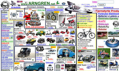
Craigslist is one of the ugliest websites on the Internet. The home page is an indistinct wall of links and text, the site is tough to navigate, the postings are cluttered, and the design has barely changed in the past 15 years. At a time when websites are competing to offer the best digital experiences, Craigslist is the pinnacle of user unfriendliness. And that's exactly what makes it brilliant, says Pascal Deville.
Deville is founder of Brutalist Websites, a site dedicated to the most frustrating design on the web. The site takes its name from the controversial architectural movement Brutalism. To some, Brutalist buildings are poetry in concrete; to others, they're chilly monoliths. Web design, Deville argues, has a similar dichotomy. Here's how he describes a Brutalist website:
In its ruggedness and lack of concern to look comfortable or easy, Brutalism can be seen as a reaction by a younger generation to the lightness, optimism, and frivolity of today's web design.
Appropriately, Deville's website has some of the hallmarks of the content it espouses—a rudimentary layout, one of the most basic typefaces (Courier), an infinite scroll, and no tabs or ways to sort the dozens of blog posts....
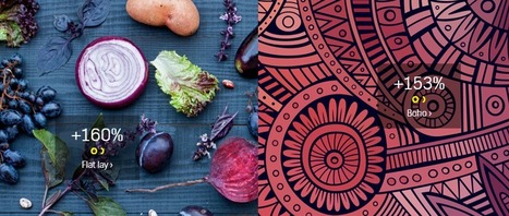
You’ve probably seen Flat Lay designs, even if you haven’t heard the term. Flat Lay design refers to a shot of items lying flat on a table, floor or other surface, shot from above. You see these kinds of images on eCommerce sites and other websites frequently. The Flat Lay design trend is up 160 percent according to the just-released Creative Trends 2016 report by Shutterstock.
This fascinating report outlines a number of other visual and creative trends that Shutterstock predicts will be popular during 2016.
If you’re looking for design ideas for your website, social media headers, advertisements or other graphics — this is one report you need to check out....
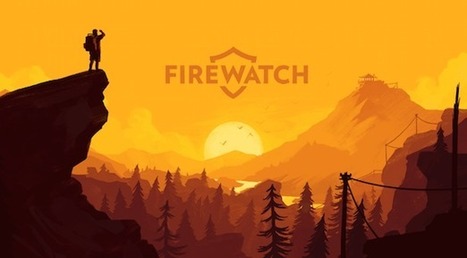
Web design has a big influence on internet presence, affecting things like how traffic interacts with a website (bounce- and conversion-rates) to how effective the site is in the context of SEO and branding. While content is obviously crucial to any site, the aesthetic presentation of that content is equally important. To get a feel for good web design and visually arresting content, here are 20 of the most beautiful websites in 2015.
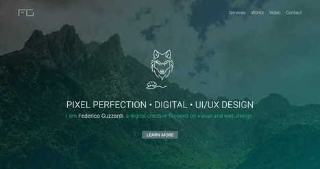
Your portfolio website is one of the first things your clients will see, so it’s important to get its design just right. Are you designing your very first portfolio website? Or do you need motivation to redesign an existing one? Check out these excellent portfolio websites for ideas and inspiration.
Typography is an important but often under-represented part of a website's layout. With so much focus being placed on the presentational aspects of CSS and the use of large images and media that choke bandwidth restraints; it’s nice to occasionally remember that textual content can also make an impact on users and their experience. Content remains king, and a few good fonts can make even the simplest of sites look smart - though not so many that you have to wait for ages for the text to be visible.
Because of this, I’m going to show you a few handpicked examples of sites that make their content look terrific, and why you should consider following their example in your own work. We’re going to take a journey of how elegant typography can make a site shine; looking at the bold, creative, navigational, simplistic and interactive content that makes the designer's voice speak volumes - so let’s get started!...
Every year web design trends come and go, and it’s necessary for designers to keep up with them in order to stay up-to-date. Designers see each other’s work, browse likes and comments, and draw conclusions. Although minor trends pop up all the time, we’ll only talk about one of the major trends in this article: single page design.
If you’re a practicing web designer, then you have a few favorite tools for website creation.
What are they, when and why do you use them, and do they stand the test of time? Have a look at what else is out there. Get inspired and potentially discover essential means to build websites for your clients this year.
Check the list below with 15 hand-picked platforms and tools for creatives in our profession. Most of them found their place here because they’re proven to be helpful, and easy to use. In 2015, we’re definitely looking at more streamlined ways to complete client projects....
Digital marketers and web designers love rotating banners, which allow multiple pieces of content to occupy a single prominent space on a web page. (Synonymous terms include image sliders, carousels and animated sliders.)
On the surface, the idea seems like a great way to keep several competing departments happy, giving them all a piece of prime real estate on the page. But there’s just one problem: your visitors probably won’t consciously pay attention to them. The evil truth of rotating banners is that they do the opposite of what’s intended, distracting users away from your most important content.
If you’re still using an image slider on your homepage or landing page, here’s a quick roundup of research that may help you better understand how this popular design solution could be killing your conversions....
If you’re looking for examples of niche, it’s difficult to imagine a slimmer area of focus than one page websites. It sounds obvious, but you’re building a site for an audience — so why wouldn’t you consider their experience and ways to communicate with them?
Hope explained that he personally contacted the teams behind the first 500 sites he found to let them know they’d been featured and ask if they thought their work had been presented in the best way possible.
They then visited his site and shared the fact that they’d been featured with their followers on social media, forming the foundation of One Page Love’s own following. When they asked if he could make an award banner for their own sites so they could show thatthey’d been featured, he did it — now they’re passively sending him traffic.
Hope suggested that you focus on your users’ experience – don’t make them jump through hoops to find the content, enter a gallery, or navigate around. Don’t have unnecessary clutter, ugly ads or, as he puts it a “social Christmas tree of sharing buttons” if they don’t add any value. Make it easy for visitors to follow you and subscribe to your site, and try out new features often to see what works best for them...
This checklist is intended to assist small business owners. It outlines the must have elements for your website so you can ensure it has the best chance of succeeding online. This is the first in a short series which aims primarily to benefit small businesses with regards to their websites and online success. Consequently it might also help if you’re a web designer building small sites for businesses on a budget. This small business website checklist will be most relevant for small sites or simple ecommerce sites because it’s a general checklist, but it’s amazing how many bigger (and often expensive) websites belonging to large companies fail to adhere to some basic web design fundamentals. The list below will enable you to quickly check the most fundamental elements are in place on your website and it should take you no longer than 30 minutes to carry out the checks....
|
One Page Love is a One Page website design gallery showcasing the best Single Page website designs from around the web.
Why have I used the adjective 'sensible' in my headline, instead of something more click-worthy like 'crucial'? The answer is that web design trends in 2017 should be all about meeting the user's needs. Gone is the temptation to show off what the browser can do, in its place is a passion for proper design; form follows function. Ignore all the web design trends pieces that tip their hats to virtual reality or to eye-catching animation; 2017 is about utilitarianism. Here are the 10 trends I think will be most noticeable....
When you think of great website design, you probably think about a website's homepage, or their blog, or their product pages. But what about a website's 'Contact Us' page? Far too many website designers put contact pages near the bottom of their priority list in terms of copywriting and design. Think about how many contact pages you've stumbled upon that look like they were built in the 1990s, even if the rest of the website is beautiful and updated. That, my friends, is a huge mistake. Your 'Contact Us' page is one of the top four most important pages on your website. For most companies, it's typically one of the most-visited site pages. So, what do great 'Contact Us' pages look like?...
Light colors are easy on the eye, which means that they aren’t as likely to take attention away from the main goal or goals of a site. Negative space, on the other hand, makes websites look less cluttered and easier to navigate. Even though negative space can actually be filled with any color, white is typically the safest bet. For example, a brand like Best Buy is associated with the colors blue and yellow, but the company primarily uses these colors in the navigation menu of its site, which leaves plenty of whitespace to help guide visitors' eyes to calls-to-action (CTAs) like "Shop" and "Find out more."
Some brands, however, are okay with challenging the rules of Web design and are doing so with colorful designs that are pushing the best-practice boundaries. Although colorful designs are certainly not for everyone, they can be successful when they are executed correctly and used for the right brand. For some inspiration, check out the six colorful websites featured below...
Your small business website is the online face of your business. But what do you put on your site. Members of the small business community, this week, shared some helpful tips on building a better business website.
Via Daniel Watson
Sometimes websites are just so darn ugly. You have to wonder what they were thinking about when they slapped it together. However, if you want users to take an interest in your website you can learn from all the mistakes of previous website admins.
While it might be a bit ugly below, every website is a goldmine of information on how not to design a website. When you put together the lessons, you can determine the best way to design your own site....
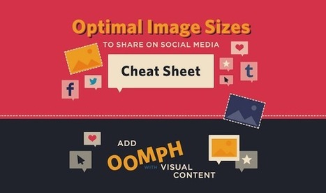
When it comes to social media, it’s a pretty well-known fact that images automatically do well. Users are attracted to visuals much more than they are plain text. However, sharing an image that isn’t the right size can be terrible for you or your brand.
SurePayroll has created an infographic (featured below), giving you the inside scoop on making sure your image is perfect, no matter where you choose to share it.
From Twitter and Facebook, to Pinterest and Tumblr, this infographic has guidelines for getting your image sizing right on the seven most popular social media sites. The next time you have an image you’d like to share, double check the size before posting to ensure that your picture isn’t too big – or too small – to make an impact....
Responsive web design has been discussed for the last several years. And, there's a perfectly good explanation why. Responsive web design can be viewed as the welcome mat for a website, which has to satisfy visitors who are viewing the site on multiple devices.
However, when only 18 percent of the web (at most) are making use of responsive web design, there remains a lot of work ahead for website owners. If you want to improve the experience of your customers, boost your search engine ranking, and stay relevant, then you definitely should consider giving your site a responsive web design update. And, here are 25 templates to help get you started....
Yes, we are a tad late, but it’s always a great post to see how trends have moved forward, or how designs last year are now this years trends.
It’s interesting to look at where 2015 will take us. Is the trend of flat web design over? We certainly won’t be missing responsive web design this year, with more and more devices being created and used to surf the web. Or will go back to mobile only websites. Only time will tell.
We would love to pull our favourite out from this lot posted below, but we simply cannot, there are too many great designs in all shapes and sizes, what is your favourite ?...
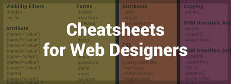
It doesn’t matter how many years of experience you have of a programming language, framework or CMS, you will always need to, from time to time, refer to the official documentation or, and more than likely, a handy quick reference cheatsheet, as it’s literally impossible to remember and know absolutely everything.
In this post I have collected an avalanche of useful cheatsheets, references, guides, checklists and docs, covering almost all aspects of web design, that will not only help to improve your productivity, but will also help to solve some of those frustrating programming issues that often arise (I’m looking at you PHP!).Just click on the ‘view’ button beside each resource and either save the PDF or bookmark the page....
If you're a small business owner and you run your own website with Wordpress, check out this list of common errors and how to avoid them.Wordpress has made it easy for anybody to set up a site and blog, but there are a number of pitfalls that you can easily avoid by following these tips!
For bloggers and web designers nothing can be more important than time saving tools to maintain their creative process. Thankfully there’s a range of free web design tools available that can be extremely useful in some situations.In this article,
I have compiled 33 best web design tools to help you improve your skills and manage your daily tasks much easier and quicker. Whether you are professional web designer or a beginner, hopefully you’ll find something useful here....
|


![How to Design a Website: 50 Brilliant Homepage Designs to Get You Started [Free Ebook] | Public Relations & Social Marketing Insight | Scoop.it](https://img.scoop.it/UtEj4rkdv2Ta7O-g8YMytzl72eJkfbmt4t8yenImKBVvK0kTmF0xjctABnaLJIm9)


![Starting a website? Tips on going niche, working smart and growing fast [WCCT] | Public Relations & Social Marketing Insight | Scoop.it](https://img.scoop.it/4TpVOxjwv_F9OS5pp7yvEDl72eJkfbmt4t8yenImKBVvK0kTmF0xjctABnaLJIm9)


Get inspired by these 50 examples of amazing homepage designs from HubSpot. A useful resource.