 Your new post is loading...
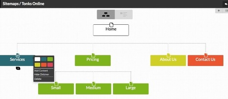
SITEMAPS IN SECONDS
Jump from vague ideas to a concrete plan with just a few clicks. Every time you plan a website, WriteMaps helps you to stay 100% focused on the planning, and not lose time on formatting.
SHARE YOUR SITEMAP
Simply share your sitemap with a unique URL to get input and signoff from your team or client. With just one click, they have eyes on the sitemap, no wasting time with creating accounts.
COLLECT PAGE CONTENT
Share with your client or copywriter to fill with content. With WriteMaps, all your content is neatly organised and you can jump to the content of any page instantly and without fuss.
This is the resource for you: How to Design a Website: 5 Brilliant Homepage Designs to Get You Started. In this free lookbook, you can explore homepage designs from businesses all over the world in several different industries, including: - Agency & Studio - Entertainment -Food & Drink -Nonprofit -Software & Tech -Ecommerce & Retail...
If you’re feeling overwhelmed when attempting to select a theme for a WordPress site that will work for you, you’re not alone. There are so many to choose from, that after a while, all the good candidates begin to look alike. The real problem could be that you’re unsure of what theme characteristics to look for. After all, you want to build more than just websites; you want to build web experiences.Here’s what to look for....
Today’s website is like yesterday’s business card. It supplies a first impression of your company and is the biggest deciding factor for prospects who might want to learn more about the goods and services that you have to sell. Here’s a sobering statistic if you’re still wondering about a website’s ability to push fence sitters off the top in your direction in 2017. Research tells us 70 to 80% of people who buy products online research the company first through their website. While 96% of SMBs use social media as one of their marketing tools, not everyone understands the need to have a website as a solid foundation in place as the starting point for all your other marketing efforts to point back to. In other words, good Internet marketing is about building your house with his many floors as you want, provided you have a solid base with the website so it doesn’t just sink into the sand....
Some trends last for ages while others are cyclical, but whether classic or fleeting, design trends are both inspiring and incredibly useful when it comes to your graphics work. So what’s been hot in 2016? The five styles that have dominated the year so far are outlined here to help you develop eye-catching and relevant concepts, while still staying true your unique creative vision.
We rounded up visual examples of each design trend using royalty-free stock graphics, which you can easily incorporate into your own projects. Here’s the breakdown....
26% of the web is built on WordPress and with good reason. Whether you are an experienced developer or HTML illiterate, WordPress provides an amazing base from which virtually anything can be built.
As a local business owner or marketer for local businesses, there’s a good chance you fall closer to the “HTML illiterate” side of that equation, and that’s okay.
In this guide, we’ll be taking you step-by-step through the process of optimizing your local business SEO via WordPress. We’ll show you every plugin and tool you need to maximize the benefits while minimizing the time and money you’re required to invest....
Light colors are easy on the eye, which means that they aren’t as likely to take attention away from the main goal or goals of a site. Negative space, on the other hand, makes websites look less cluttered and easier to navigate. Even though negative space can actually be filled with any color, white is typically the safest bet. For example, a brand like Best Buy is associated with the colors blue and yellow, but the company primarily uses these colors in the navigation menu of its site, which leaves plenty of whitespace to help guide visitors' eyes to calls-to-action (CTAs) like "Shop" and "Find out more."
Some brands, however, are okay with challenging the rules of Web design and are doing so with colorful designs that are pushing the best-practice boundaries. Although colorful designs are certainly not for everyone, they can be successful when they are executed correctly and used for the right brand. For some inspiration, check out the six colorful websites featured below...
This article includes a compilation of 20 business consulting WordPress themes available for free download.
Who may be interested in this type of product? We are sure that business owners and financial advisors, who want to promote their projects online and draw more customers and more money, as well as professional and amateur designers who want to save time and effort, will appreciate the showcased freebies.
Moreover, all the free WordPress themes listed below were developed by reputable companies and incorporate all the latest features (like responsiveness, parallax effect, clean layouts and so on) that any decent website needs to meet today’s expectations....
Your small business website is the online face of your business. But what do you put on your site. Members of the small business community, this week, shared some helpful tips on building a better business website.
Via Daniel Watson
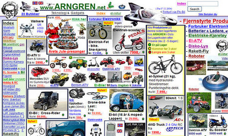
Sometimes websites are just so darn ugly. You have to wonder what they were thinking about when they slapped it together. However, if you want users to take an interest in your website you can learn from all the mistakes of previous website admins.
While it might be a bit ugly below, every website is a goldmine of information on how not to design a website. When you put together the lessons, you can determine the best way to design your own site....
Your portfolio website is one of the first things your clients will see, so it’s important to get its design just right. Are you designing your very first portfolio website? Or do you need motivation to redesign an existing one? Check out these excellent portfolio websites for ideas and inspiration.
Typography is an important but often under-represented part of a website's layout. With so much focus being placed on the presentational aspects of CSS and the use of large images and media that choke bandwidth restraints; it’s nice to occasionally remember that textual content can also make an impact on users and their experience. Content remains king, and a few good fonts can make even the simplest of sites look smart - though not so many that you have to wait for ages for the text to be visible.
Because of this, I’m going to show you a few handpicked examples of sites that make their content look terrific, and why you should consider following their example in your own work. We’re going to take a journey of how elegant typography can make a site shine; looking at the bold, creative, navigational, simplistic and interactive content that makes the designer's voice speak volumes - so let’s get started!...
Here is an awesome showcase of creative side menu websites that we have prepared with the aim to provide you the dose of inspiration for your upcoming design projects. Other than coming up with a website that has side menus you can suggest other guys in your field too for them to take inspiration and work on coming up with the one for themselves.
I personally liked them all as these are visually stunning and creative. With the belief that you all will like them too let us begin with the compilation of creative side menus websites. Check it out!...
|
The best part about all of this is that WordPress, for the most part, is free to use, and there are about 50,000 free plugins available to the public. For any entrepreneur who’s on a startup budget, this is a very attractive feature of the CMS tool.
But how do you know which plugins you need?
Which ones are best for busy business owners who need a website that can (almost) run on its own? For every client that we manage WordPress sites for, we make sure that these eight plugins are installed and activated.
One Page Love is a One Page website design gallery showcasing the best Single Page website designs from around the web.
Why have I used the adjective 'sensible' in my headline, instead of something more click-worthy like 'crucial'? The answer is that web design trends in 2017 should be all about meeting the user's needs. Gone is the temptation to show off what the browser can do, in its place is a passion for proper design; form follows function. Ignore all the web design trends pieces that tip their hats to virtual reality or to eye-catching animation; 2017 is about utilitarianism. Here are the 10 trends I think will be most noticeable....
I moved five times in the last year. And every single time I moved, I forgot to sign up to have my mail forwarded to my new address.
Mail forwarding is an important step in any moving process, as it ensures you don't lose any valuable information that's sent to you. And the same can be said for your website: If you're moving a website from one URL to another, you need to take the necessary steps to ensure your visitors get sent to the right place. In the world of tech, this is called a 301 redirect.
A 301 redirect is key to maintaining a website's domain authority and search rankings when the site's URL is changed for any reason. It easily sends visitors and search engines to a different URL than the one they originally requested -- without having to actually type in a different URL....
When you think of great website design, you probably think about a website's homepage, or their blog, or their product pages. But what about a website's 'Contact Us' page? Far too many website designers put contact pages near the bottom of their priority list in terms of copywriting and design. Think about how many contact pages you've stumbled upon that look like they were built in the 1990s, even if the rest of the website is beautiful and updated. That, my friends, is a huge mistake. Your 'Contact Us' page is one of the top four most important pages on your website. For most companies, it's typically one of the most-visited site pages. So, what do great 'Contact Us' pages look like?...
Craigslist is one of the ugliest websites on the Internet. The home page is an indistinct wall of links and text, the site is tough to navigate, the postings are cluttered, and the design has barely changed in the past 15 years. At a time when websites are competing to offer the best digital experiences, Craigslist is the pinnacle of user unfriendliness. And that's exactly what makes it brilliant, says Pascal Deville.
Deville is founder of Brutalist Websites, a site dedicated to the most frustrating design on the web. The site takes its name from the controversial architectural movement Brutalism. To some, Brutalist buildings are poetry in concrete; to others, they're chilly monoliths. Web design, Deville argues, has a similar dichotomy. Here's how he describes a Brutalist website:
In its ruggedness and lack of concern to look comfortable or easy, Brutalism can be seen as a reaction by a younger generation to the lightness, optimism, and frivolity of today's web design.
Appropriately, Deville's website has some of the hallmarks of the content it espouses—a rudimentary layout, one of the most basic typefaces (Courier), an infinite scroll, and no tabs or ways to sort the dozens of blog posts....
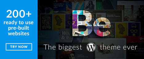
Multipurpose WordPress themes make it possible for any web designer to build a truly amazing website. Where these web tools really strut their stuff however, is when they are put to use by a web designer who must satisfy multiple clients in need of a variety of website types.
The reason is simple. Each of these multipurpose themes comes with an array of thoroughly-tested core features. Each has a selection of pre-built websites or layouts. All are easy to use, and none of them require any coding knowledge in order to create powerful websites, web apps, or blogs.
No matter which one you choose, you can expect your productivity to experience a definite uptick. The same will be true with the quality of the end products you deliver to your clients. As an aid in making just the right choice, ask yourself the following....
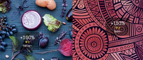
You’ve probably seen Flat Lay designs, even if you haven’t heard the term. Flat Lay design refers to a shot of items lying flat on a table, floor or other surface, shot from above. You see these kinds of images on eCommerce sites and other websites frequently. The Flat Lay design trend is up 160 percent according to the just-released Creative Trends 2016 report by Shutterstock.
This fascinating report outlines a number of other visual and creative trends that Shutterstock predicts will be popular during 2016.
If you’re looking for design ideas for your website, social media headers, advertisements or other graphics — this is one report you need to check out....
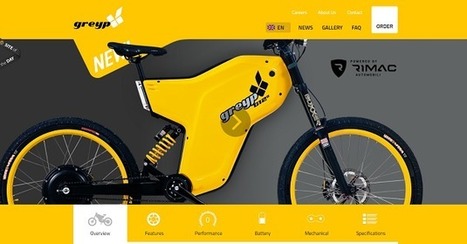
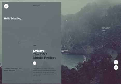
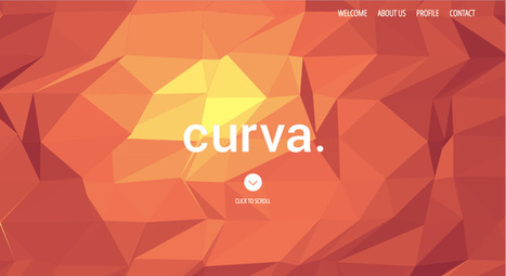
Web design has a big influence on internet presence, affecting things like how traffic interacts with a website (bounce- and conversion-rates) to how effective the site is in the context of SEO and branding. While content is obviously crucial to any site, the aesthetic presentation of that content is equally important. To get a feel for good web design and visually arresting content, here are 20 of the most beautiful websites in 2015.
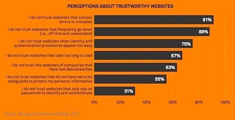
Consumers say content errors and inaccuracies are the top issues that make them distrust a company's website, according to a recent report from Neustar and the Ponemon Institute.
The report was based on data from a survey of 750 adults living in the United States (52% women; 48% men).
Some 91% of respondents say they do not trust websites that contain errors and inaccuracies.
Website unavailability is the next biggest red flag for consumers, with 88% of respondents saying they do not trust websites that frequently go down.
Five other factors that inspire mistrust: authentication that appears too easy (75% of respondents do not trust), long load times (67%), previous data breaches (63%), a lack of security safeguards (55%), and a reliance on only passwords for identification (31%)....
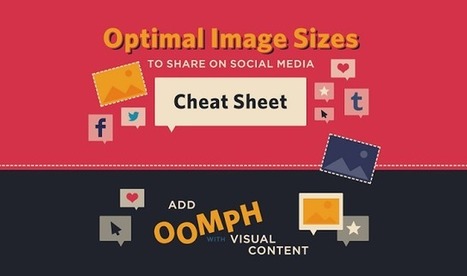
When it comes to social media, it’s a pretty well-known fact that images automatically do well. Users are attracted to visuals much more than they are plain text. However, sharing an image that isn’t the right size can be terrible for you or your brand.
SurePayroll has created an infographic (featured below), giving you the inside scoop on making sure your image is perfect, no matter where you choose to share it.
From Twitter and Facebook, to Pinterest and Tumblr, this infographic has guidelines for getting your image sizing right on the seven most popular social media sites. The next time you have an image you’d like to share, double check the size before posting to ensure that your picture isn’t too big – or too small – to make an impact....
WordPress is so much more than just a tool for creating great blogs. It is now equally great at creating websites! Whether you want build portfolio site for showcasing your work, ecommerce site for selling product online, blog or business site, here are 71 free WordPress themes which is fully functional on mobile, tablet and desktop. Enjoy !....
|


![How to Design a Website: 50 Brilliant Homepage Designs to Get You Started [Free Ebook] | Public Relations & Social Marketing Insight | Scoop.it](https://img.scoop.it/UtEj4rkdv2Ta7O-g8YMytzl72eJkfbmt4t8yenImKBVvK0kTmF0xjctABnaLJIm9)


Ever wish you had a simple tool to help you sketch out ideas for a website? Welcome to WriteMaps, an awesome freemium tool. I use it regularly and highly recommend it. Easy to use, intuitive, and even the premium features are not too expensive. 10/10